Guides & Tutorials (beta)
Gauge Control
The Gauge Control offers a versatile means to represent diverse numerical and state data, with flexibility, dynamism, and extensive customization options. Built entirely in Markup, it leverages Markup's rendering capabilities and adaptability. Codejock Gauges are fully DPI-responsive, maintaining drawing quality while scaled to any size. The actual gauge implementation is achieved through Codejock's proprietary JavaScript extension for XAML, simplifying the entry level for gauge developers. Furthermore, gauge configurations (traits) can be stored in either JSON format or dynamic JavaScript code that evaluates JSON configuration data.
Given the varied nature of data users may wish to represent on a gauge, along with the customization needs, our approach emphasizes remarkable flexibility in configuring gauges. This means a single implementation of a gauge can yield countless visual variations and behaviors by simply adjusting a traits configuration file without any code alterations. While Codejock offers basic pre-designed gauges, users can tailor more sophisticated ones to their exact requirements by tweaking the gauge traits configuration file. In addition, Codejock offers consulting and development services for complex gauges, contact us for details.
The aim of this article is to furnish comprehensive guidance on modifying the Gauge Control traits file.
Architecture
The following is a simplified overview of the Gauge architecture, outlining its fundamental components:

Let's break down each level of the Gauge architecture:
-
Gauge Control: At the highest level is the Gauge control itself. This control is placed on a window within the application interface. It offers methods and properties for loading and accessing the actual representation of the gauge, as well as its configuration, reflected data, and behavior.
-
Gauge Type: The next level of abstraction is the gauge type. Each Gauge control can operate on only one gauge type at a time, although the implementation doesn't limit the number of possible gauge types. A gauge type, by itself, doesn't perform much action and can be considered as a Model for a gauge. It primarily provides access to common properties specific to a particular abstract gauge type and ensures that any loaded gauge is compatible with its underlying type. Currently, the implementation provides only two gauge types:
-
Meter: Designed to represent numerical data within a certain range and dimensions. Its key properties include the displayed value, minimum and maximum possible values. Examples of Meter gauge types range from analogue or digital thermometers to speedometers, barometers, and more.
-
State: This type represents a finite number of states, with a basic property being a numerical identifier for the current state. Examples include light indicators for on/off states, battery or coverage level indicators, toggle switches, semaphores, and check marks.
-
-
Gauge Style: Below the gauge types lie the core gauge implementation that defines a generic gauge style. Each gauge type can load a single gauge style at a time, with no limitation on the number of possible gauges for a particular style. A style implementation resides in a separate XAML file, declaring all graphical primitives, while an embedded scripting block defines the gauge's behavior and appearance based on the provided configuration traits.
-
Gauge Traits: Finally, the lowest level entails configuration traits. This layer comprises common traits utilized by all gauges, alongside unique traits specific to each gauge style for appearance and behavior configuration. Traits can be stored as fixed data in JSON format or within a JavaScript function definition signature, enabling dynamic trait evaluation. This flexibility allows for configurable traits, accommodating scenarios where resource paths are determined only upon gauge loading.
Each of these layers will be expounded upon in further detail within this article.
Gauge Loading
To initiate gauge loading, the process begins with loading its traits and style. Once this step is successfully completed, the gauge becomes operable through its type object, which is accessible via the Gauge control object.
- Loading gauge traits from a JS/JSON file
ToolkitPro:
IStreamPtr pTraitsStream;
VERIFY(SUCCEEDED(XTPCreateReadOnlyFileStream(strGaugeDir + _T("\\State\\Image\\MultiState\\traits.js"), &pTraitsStream)));
Alternatively the following convenience functions can be used for loading traits of markup streams:
XTPCreateFileStream, XTPCreateReadOnlyResourceStream, XTPCreateReadOnlyStreamOnUri
SuitePro (VB):
Dim Traits As New GaugeTraits
Traits.Load GaugeDir + "\State\Image\MultiState\traits.js"
- (only if applicable) Loading initialization traits from a JSON file
Some gauges require additional initialization traits to be passed to the loading procedure. The need to perform this steps is indicated by the presence of init_traits.json file in a gauge resource directory. If the initialization traits are provided, they get combined with evaluated traits and the the initialization traits values are preferred over the evaluated values if name collisions are detected.
ToolkitPro:
CString strTraitsArgs;
VERIFy(XTPLoadFileText(strGaugeDir + _T("\\State\\Image\\MultiState\\Battery\\init_traits.json"), strTraitsArgs));
SuitePro (VB):
Traits.TraitsArgument = ReadFileText(GaugeDir + "\Gauges\State\Image\MultiState\Battery\init_traits.json")
- Creating a traits collection object from the loaded data stream and specifying a resource path in the file system
ToolitPro:
CXTPGaugeTraits traits(*pTraitsStream, strTraitsArgs);
traits.SetResourcePath(strGaugeDir + _T("\\State\\Image\\MultiState\\Battery"));
SuitePro (VB):
Traits.ResourcePath = GaugeDir + "\State\Image\MultiState\Battery"
When a gauge utilizes configurable images, typically the images need to be loaded from specific locations. Since the exact image resource location is often not known in advance, the traits only specify the image file names and utilize the provided resource path to construct the actual file locations. It's important to note that resource file locations aren't limited to the file system; they can also be loaded from a resource module. This approach enables the consolidation of a library of gauges, along with their resources and related scripts, within a single resource DLL. In such cases, the resource location must be specified as a resource module:
ToolkitPro:
HMODULE hGaugeLib = ...;
CXTPGaugeTraits traits(*pTraitsStream, strTraitsArgs);
traits.SetResourceModule(hGaugeLib);
SuitePro (VB):
Traits.ResourceModule = ModuleHandle
- (optional) Traits customization
In certain cases it may be required to override known trait values before loading a gauge as some traits may get appliled only once upon gauge loading and cannot be changed at runtime. Each of such value can be customized using CXTPGaugeTraits::SetCustomTrait method with a full JSON object path specified in JavaScript syntax and a new value.
ToolkitPro:
traits.SetCustomTrait(_T("transparent"), COleVariant(VARIANT_TRUE, VT_BOOL));
traits.SetCustomTrait(_T("backgroundColor"), L"#ff00ff");
traits.SetCustomTrait(_T("toggleBySpaceBar"), COleVariant(VARIANT_TRUE, VT_FALSE));
SuitePro (VB):
Traits.SetCustomTrait "transparent", True
Traits.SetCustomTrait "backgroundColor", "#ff00ff"
Traits.SetCustomTrait "toggleBySpaceBar", False
- Loading gauge style
IStreamPtr pGaugeStream;
VERIFY(SUCCEEDED(XTPCreateReadOnlyFileStream(strGaugeDir + _T("\\State\\Image\\style.xaml"), &pGaugeStream)));
- Loading the gauge into the Gauge control
ToolkitPro:
CXTPGaugeMeterType* pStateGauge = m_wndGauge.LoadStateType(*pGaugeStream, traits);
VERIFY(NULL != pStateGauge);
For this particular example CXTPGaugeCtrl::LoadStateType is used because a
Battery is of the State type. If it was a gauge of the Meter type then
the CXTPGaugeCtrl::LoadMeterType would have to be used instead.
SuitePro (VB):
If ctlGauge.LoadStateType(GaugeDir + "\State\Image\style.xaml", Traits) Is Nothing Then
  ' Unable to load
End If
- Updating gauge state via its type specific object:
ToolkitPro:
pStateGauge->SetState(1);
pStateGauge->Update();
SuitePro (VB):
With ctlGauge.Type.State
    .State = 1
    .Update
End With
Some gauge traits are used only once when a gauge is being loaded, so changing their value later has no effect, for such traits consider traits customization described earlier. And changing those traits that can be updated at runtime should follow a call of the Update method for the changes to take effect.
Gauge Style Markup
All gauge markup script must adhere to a standardized structure at the top level and include a defined script entry. Below is an empty template for a Meter gauge. Templates for gauges of different types will share the same structure, with only the type name and common default traits specified in the GaugeLib.init call differing. It's essential to keep all named markup objects with their pre-defined attributes unchanged across all gauges. While the detailed walkthrough of the actual gauge implementation is omitted in this article, a shallow overview is provided to enhance understanding of its structure.
<Page
     xmlns='http://schemas.microsoft.com/winfx/2006/xaml/presentation'
     xmlns:x='http://schemas.microsoft.com/winfx/2006/xaml'
     xmlns:xtp='urn:schemas-codejock-com:xaml-extensions'>

   <Viewbox Stretch='Uniform'>
     <Canvas Name='Canvas' HorizontalAlignment='Center' VerticalAlignment='Center' Background='{x:Static SystemColors.WindowBrush}' Width='1000' Height='1000'>
       <Image Name='Back' Canvas.Left='0' Canvas.Top='0' Width='1000' Height='1000'/>
       <Image Name='BackOverlay' Canvas.Left='0' Canvas.Top='0' Width='1000' Height='1000'/>

       <!-- Gauge specific markup goes here -->

       <Image Name='FrontOverlay' Canvas.Left='0' Canvas.Top='0' Width='1000' Height='1000'/>
     </Canvas>

     <xtp:Script Language='JScript' Requires='lib:runtime, lib:gauge'>
     // <![CDATA[

     function onInit() {
         // TODO: required gauge initialization handler
     }

     function onUpdate() {
         // TODO: required gauge update handler
     }

     function onInput(message, wParam, lParam) {
         // TODO: optional gauge input handler
     }

     function onShutdown() {
         // TODO: optional gauge shutdown handler
     }

     GaugeLib.init({
       init: onInit,         // required
       update: onUpdate,     // required
       input: onInput,       // optional
       shutdown: onShutdown, // optional
       traits: {             // required
         type: 'Meter',

         // Meter specific common default traits
         min: 0,
         max: 100,
         current: 0
       }
     });

     //]]>
     </xtp:Script>

   </Viewbox>
</Page>
Gauge Traits
As mentioned earlier, gauge traits can be represented either in JSON format or as a JavaScript function that returns an evaluated traits object. Additionally, there are several common traits that are not specific to any particular gauge. These include:
-
backgroundColor: An optional string defining the background color value in XAML-compatible format (Red,White,Blue, etc.), or an RGB color in HTML format (e.g.,#AABBCC). The default color value uses the system-defined window color. -
transparent: An optional boolean value specifying whether the gauge has a transparent background or not. Further explanation is provided below in this article. The default value isfalse. See Gauge transparency for more details. -
background: The only required common trait specifying an image to be displayed on the gauge background. Its value can be either a full image path or an image traits object. The format of an image traits object is described further in this article. -
backgroundOverlay: An optional image path or image traits object defining another image to be displayed on top of the background image. -
foregroundOverlay: An optional image path or image traits object defining another image to be displayed on top of all gauge elements. Combining background and overlay images allows for advanced effects such as glass, etc. -
viewboxStretch: An optional viewbox stretch mode constant defining how the XAML viewbox is stretched when the Gauge control size is changed. It can have one of the following values: None, Fill, Uniform, UniformToFill. -
actions: An optional JavaScript object that exposes a set of the traits specific actions to be invoked from the client code usingCXTPGaugeBaseType::InvokeActionmethod call. Ifinitaction is specified, it will be called automatically upon gauge initialization as a function of typefunction(gauge) {}.
A simple JSON trait file for the Meter type could resemble the following:
{
    "backgroundColor"   : "Brown",
    "background"        : "file://C:\Data\MyGauge\background.svg",
    "foregroundOverlay" : "file://C:\Data\MyGauge\foreground-overlay.svg",

    "min"     : 0,
    "max"     : 100,
    "current" : 50
}
Certainly, hardcoded image locations are often not acceptable. Here's an example of how to define the traits file in JavaScript, allowing for the evaluation of image locations using the resource location information provided during traits loading in an application:
function (ctx) {
  var rt = ctx.libs['runtime'];
  return {
    backgroundColor   : 'Brown',
    background        : rt.resource('background.svg'),
    foregroundOverlay : rt.resource('foreground-overlay.svg'),
    min     : 0,
    max     : 100,
    current : 50
  };
}
The traits file will begin with the keyword function and contain the implementation of a single JavaScript function that returns an evaluated traits object. This function accepts only one argument, named ctx, which is an object structured as follows:
{
    arg: [object|null],
    libs: {
        runtime: [object]
    }
}
The arg object value is an optional object that can be specified in the client
code during gauge traits collection initialization. Its sole purpose is to
facilitate data exchange between the client code and traits execution for
further customization.
Traits evaluation can be simplified by leveraging the capabilities of JavaScript and the built-in gauge runtime library. For example, trait object templates can be utilized to define all common properties once and then derive a template object:
function (ctx) {
  var rt = ctx.libs['runtime'];

  var templates = {
    labels: {
      large: {
        cx: 2,
        cy: .2,
        rx: 1,
        ry: .8,
        foreground: '#282828',
        background: null,
        fontSize: 40,
        fontFamily: 'Arial',
        format: '%i'
      },
      small: {
        cx: 2,
        cy: .2,
        rx: 1,
        ry: .8,
        foreground: "#282828",
        background: null,
        fontSize: 30,
        fontFamily: 'Arial',
        format: '%i'
      }
    }
  };

  return {
    backgroundColor   : 'Brown',
    background        : rt.resource('background.svg'),
    foregroundOverlay : rt.resource('foreground-overlay.svg'),
    min     : 0,
    max     : 100,
    current : 50,
    text1   : rt.extend(templates.labels.large, {
        cx: 2,
        cy: .2,
        rx: 1,
        ry: .8,
        format: '-%i'
    }),
    text2   : rt.extend(templates.labels.small, {
        cx: 2,
        cy: .2,
        rx: 1,
        ry: .8,
        format: 'Value: %i'
    })
  };
}
Coordinate System
To ensure smooth scaling of the gauge elements without binding to fixed coordinates, the gauge coordinate system utilizes ranges [-1..1] across the Y and X axes. These axes are directed downward and to the right respectively, with the center point (0,0) positioned at the physical gauge center. Therefore, the top left gauge corner has coordinates (-1, -1), and the bottom right corner has coordinates (1, 1). All position values, absolute and relative offsets, element sizes, and point coordinates must be specified in this coordinate system in the trait files.
Image Traits
- An image can be specified in two different ways in a traits file:
{
    icon  : rt.resource('icon.svg')
}
- Using a JavaScript object that describes image properties such as size, relative offset, opacity, etc.:
{
    icon: {
        // Image traits
        src     : rt.resource('icon.svg'),
        opacity : 0.5,

        // Location traits
        x       : 0.5,
        y       : 0.5,
        cx      : 0.2,
        cy      : 0.2,
        rx      : 0.01,
        ry      : 0.03,
        angle   : 45,
        crx     : 0.01,
        cry     : 0.01
    }
}
The numerical attributes of the image traits object can be animated (see Animations and transitions). The image traits object consists of the following properties:
-
src: A required string that identifies image location to be used as a value of the Image.Source XAML attribute.
-
opacity: An image opacity level in the range [0..1], where 0 makes the image fully transparent and 1 makes it fully opaque. The default value is 1. The location traits properties format is explained later in the article.
Font Traits
The font traits object describes text formatting options, for example:
{
    // Font traits
    fontSize: 10,
    fontFamily: 'Arial',
    foreground: 'Red',
    background: 'Black'

    // Location traits
    x       : 0.5,
    y       : 0.5,
    cx      : 0.2,
    cy      : 0.2,
    rx      : 0.01,
    ry      : 0.03,
    angle   : 45,
    crx     : 0.01,
    cry     : 0.01
}
The location traits properties format is described below.
Location Traits
The location traits are not a separate object by themselves, but rather a subset of common traits that specify element location. They are particularly used in image and text traits objects, and their properties have the following meanings:
-
xandy: The absolute coordinates of the top-left corner of the element. The default value for both is 0. -
cxandcy: The displayed width and height of the element. If not specified, the actual element size is used. -
rxandry: The relative offset of the assumed top-left corner of the element from the real top-left corner coordinates. For example, ifrxis set, then for all calculations where the element's top-left position is needed, the value will be computed asx + rx, while the element itself will remain at position(x, y). These are not used if not specified. -
angle: The value of the element's rotation angle in degrees relative to its upright position. If specified, the element is rotated clockwise around its computed rotation center. The default value of 0 leaves the element in its default orientation. -
crxandcry: the relative offset of the element's rotation center. It is always computed from the assumed top-left corner coordinates. If not specified, then the top-left corner serves as the rotation center. For example, if element traits are{..., cx: 1, cy: 1, crx: 0.5, cry: 0.5, angle: 45 }, then the element will be rotated exactly around its center instead of the top-left corner.
The location traits object can also include properties of the view traits object described below.
View Traits
The view traits are a subset of the properties that configure a view of an element or a set of elements. These properties can be included along with the location traits, or they can be part of a parent object or any other object that will be used as a source of view traits for a particular gauge implementation:
{
    // Top level traits
    background: rt.resource('background.svg'),
    min: 0,
    max: 100,
    current: 0,

    // Common view traits for images below
    zoom: 0.5,
    offset: { x: 0.5, y: 0.5 },

    icon1: rt.extend(templates.icon, {
      src: rt.resource('icon1.svg')
    }),
    icon2: rt.extend(templates.icon, {
      src: rt.resource('icon2.svg')
    }),
    icon3: rt.extend(templates.icon, {
      src: rt.resource('icon3.svg'),

      // View traits specific for Icon3
      zoom: 1,
      offset: { x: -1, y: -1 },
    })
}
The view traits properties include:
-
zoom: A multiplier value that is applied to all related location and size metrics of applicable elements. -
offset.x,offset.y: The absolute offset values that get added toxandylocation properties of applicable elements.
Animations and Transitions
Location, image, and text traits can be animated using a specified effect and animation time. Animation involves sequentially changing the specified numeric properties from their start to their stop values within the specified time frame, using the specified animation effect. A special traits object format is required to enable traits animation. For example, a static image can be described with the following image traits object:
{
  src: rt.resource('state0.svg'),
  cx: 1,
  cy: 1,
  x: -.5,
  y: 0
}
To achieve the desired effect of smoothly transitioning the image along the X-axis from left to right over half a second while simultaneously fading it in, an easing effect needs to be applied for a seamless transition. This can be accomplished by modifying the image traits object as follows:
{
  transition: {
    effect: 'easeInBounce',
    time: 500,
    res: 25
  },
  start: {
    src: rt.resource('state0.svg'),
    cx: 1,
    cey: 1,
    x: -.5,
    y: 0,
    opacity: 0
  },
  stop: {
    x: -.5,
    opacity: 1
  }
},
The above transition is applied only for showing an image. When showing and hiding require different transition effects, each even will need a separate declaration of its transition configuration:
{
  show: {
    transition: {
      effect: 'easeInSine',
      time: 100,
      res: 25
    },
    start: {
      y: -1,
      opacity: 0
    },
    stop: {
      opacity: 1
    }
  },
  hide: {
    transition: {
      effect: 'easeOutSine',
      time: 100,
      res: 25
    },
    start: {
      y: -1,
      opacity: 1
    },
    stop: {
      opacity: 0
    }
}
The transition object describes transition configuration:
-
time: Specifies animation duration represented in milliseconds -
res: Specified animation resolution, i.e. the number of milliseconds after which the animated properties get updated. -
effect: A required string that specified the easing effect to be used for this transition. The list of supported values is provided below, and detailed information along with preview of every easing method can be found at https://gizma.com/easing:easeInSineeaseOutSineeaseInOutSineeaseInQuadeaseOutQuadeaseInOutQuadeaseInCubiceaseOutCubiceaseInOutCubiceaseInQuarteaseOutQuarteaseInOutQuarteaseInQuinteaseOutQuinteaseInOutQuinteaseInExpoeaseOutExpoeaseInOutExpoeaseInCirceaseOutCirceaseInOutCirceaseInBackeaseOutBackeaseInOutBackeaseInElasticeaseOutElasticeaseInOutElasticeaseInBounceeaseOutBounceeaseInOutBounce
The start object describes the initial state of the
animated traits. In this example opacity: 0 is added to the initial image
traits object to make image fully transparent when animation starts.
The stop object describes the final state of the animated traits. In this example only
animation of x and opacity properties is specified, their values will get
updated during the animation execution, and other properties will remain
intact.
The `show` object contains transition description for showing an object. And the `hide` object respectively contains transition description for hiding an object
Gauge Transparency
In the preceding section of this article, we discussed how transparency in
gauges can be enabled by setting the backgroundColor: ... and transparent: true
common traits. Once transparency is enabled, the specified background color
serves as an alpha color key value. This means that any pixels matching that
color value will become invisible. It's crucial to carefully select a background
color that is entirely unique and not used in any images within the gauge.
Additionally, this color should not result from semi-transparent image overlaps
or animated color/opacity transitions. Otherwise, the gauge will display visual
"holes" wherever that color appears.
Furthermore, it's important to note that due to the native implementation of child control transparency in the Windows operating system, certain application manifest entries need to be added.
<compatibility xmlns="urn:schemas-microsoft-com:compatibility.v1">
  <application>

    <!-- Windows 7 and Windows Server 2008 R2 -->
    <supportedOS Id="{35138b9a-5d96-4fbd-8e2d-a2440225f93a}" />

    <!-- Windows Windows 8 and Windows Server 2012 -->
    <supportedOS Id="{4a2f28e3-53b9-4441-ba9c-d69d4a4a6e38}" />

    <!-- Windows 8.1 and Windows Server 2012 R2 -->
    <supportedOS Id="{1f676c76-80e1-4239-95bb-83d0f6d0da78}" />

    <!-- Windows 10, Windows 11, Windows Server 2016, Windows Server 2019 and Windows Server 2022 -->
    <supportedOS Id="{8e0f7a12-bfb3-4fe8-b9a5-48fd50a15a9a}" />

  </application>
</compatibility>
This also implies that gauge control transparency is supported only starting with Windows 7.
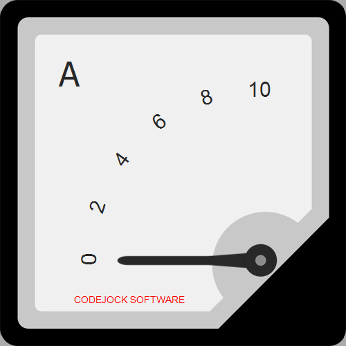
Meter Gauge Type
As mentioned before, the Meter gauge type is designed to represent numerical data within a certain range and dimensions. Its key properties include the displayed value, minimum and maximum possible values. Examples of Meter gauge types range from analogue or digital thermometers to speedometers, barometers, and more.
The Meter gauge type expects four required traits to be provided:
current: The global currently displayed value. It must be in range determined by theminandmaxtraits.min: The global minimum allowed displayed value.max: The global maximum allowed displayed value.dimensions: The array of traits object specific to each dimension.
When current, min and max are defined at the root level they defined a common default values for all dimensions that don't override those values. Once defined in a particular dimension they override the default common value. The dimensions array must be defined in the root traits object only.
For example, it is required to create a odometer gauge to represent the speed value in both metric and imperial unints on different scales, i.e. it has to have 2 scales with 2 pointers. This kind of Meter gauge will need to have 2 dimensions. Each dimension will have a common min value equal to 0 as speed cannot go below it, but the max and current values will be different. Regardless of the actual gauge implementation and its appearance, at the core of such a gauge will be the followg in traits structure:
{
  min: 0, // common for kph/mph
  dimensions: [

    // Metric scale (kph)
    {
      max: 200,
      current: 0
    },

    // Imperial scale (mph)
    {
      max: 124,
      current: 0
    }
  ]
}
All other traits are specific to each particular gauge implementation that are described below.
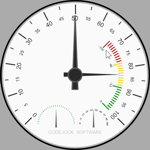
The Scale Meter gauge style
The Scale Meter gauge is designed to show round or arc scales with pointers, and provides the following features:
- There can be up to 5 scales
- Each scale's center position and dimensions can be configured
- Each scale has one pointer, a number of ticks, up to 2 optional icons, up to 2 optional labels (hints)
- A scale can be directed either clockwise or counter clockwise
- The start angle and a span of each can be configured
- The total number of ticks for each scale can be split in groups to have each tick group starting with a large tick
- Each small and large tick is an image object
- Each tick can have an associated label
- An individual tick appearance can be customized
- Each pointer is an image object
- Each scale icon if specified is an image object
- Each scale hint if specified is a font object
- A cap image can be displayed on top of all displayed scaled
The traits schema for the Scale Meter gauge:
{
  /* Common traits */
  ...

  /* Meter type traits */
  ...

  // Defines the cap image
  cap: { /* Image, View and Location traits */ },

  dimensions: [
    // Defines a particular scale
    {
      /* Optional Meter type traits to override Meter type traits at the top level */
      ...

      // Defines direction orientation
      clockwise: true | false,

      // Defines scale span and angle
      angle: {
        // Defines where the scale starts
        start: /* A numeric degree value in range 0..360  */,

        // Defines how long the scale spans
        span: /* A numeric degree value in range 0..360 */
      },

      // Defines scale pointer image
      pointer: { /* Image, View and Location traits */ },

      // Defines the scale itself
      scale: {
        // Defines scale ticks
        ticks: {
          // Defines the total number of ticks
          count: /* A numeric number */,

          // Defines how many groups the ticks are split in
          split: /* A numeric number */,

          // Defines a small tick image
          small: { /* Image, View and Location traits */ },

          // Defines a large tick image
          large: { /* Image, View and Location traits */ }

          // An optional definition of individual tick apperance.
          // Each array element corresponds to a tick with with the same index.
          // Only not null elements get processed.
          custom: [
            { /* Image, View and Location traits */ },
            ...
          ]
        },

        // Defines tick labels
        labels: {
          // Defines label format for large ticks
          large: {
            /* Font, View and Location traits */

            format: /* An sprintf-like format string where the only placeholder will receive the current value */
          },

          // Defines label format for small ticks
          small: {
            /* Font, View and Location traits */

            format: /* An sprintf-like format string where the only placeholder will receive the current value */
          }
        }
      },

      // Defines the first optional hint label
      hint1: {
        /* Font, View and Location traits */

        format: /* Label text */
      },

      // Defines the second optional hint label
      hint2: {
        /* Font, View and Location traits */

        format: /* Label text */
      },

      // Defines the first optional scale icon
      icon1: { /* Image, View and Location traits */ },

      // Defines the second optional scale icon
      icon2: { /* Image, View and Location traits */ }
    },
    ...
  ]
}
The following below example shows a built in Circular Quarter Top-Left gauge traits:
function(ctx) {
  var rt = ctx.libs.runtime;
  var gaugeMin = 0;
  var gaugeMax = 10;
  var gaugePos = 0;
  var gaugeWidth = 1000;
  var gaugeHeight = 1000;
  var gaugeType = 0; // Meter

  return {
    backgroundColor: '#ababab',
    transparent: true,
    min: gaugeMin,
    max: gaugeMax,
    current: gaugePos,
    background: rt.resource('background.svg'),
    cap: {
      src: rt.resource('cap.svg'),
      cx:  .25,
      cy:  .25,
      rx: -.58,
      ry: -.58
    },
    dimensions: [
      // Dim 0
      {
        clockwise: true,
        angle: {
          start: 0,
          span: 90
        },
        pointer: {
           src: rt.resource('pointer.svg'),
           x: .7,
           y: .71,
          cx: .2,
          cy: 1.5,
          rx: .068,
          ry: 1.5,
          crx: 0,
          cry: 1.2
        },
        scale: {
          ticks: {
            count: 51,
            split: 10,
            small: {
              src: rt.resource('tick.small.svg'),
               x: .7,
               y: .7,
              cx: .01,
              cy: .05,
              rx: .001,
              ry: 1.2
            },
            large: {
              src: rt.resource('tick.large.svg'),
               x: .7,
               y: .7,
              cx: .02,
              cy: .13,
              rx: .001,
              ry: 1.2
            }
          },
          labels: {
            large: {
               x: .7,
               y: .7,
              cx:  10,
              cy: .2,
              rx:  5,
              ry:  1.375,
              foreground: '#3d5a80',
              background: null,
              fontSize: 60,
              fontFamily: 'Arial',
              format: '%i'
            }
          }
        },
        hint1 : {
          format: 'CODEJOCK SOFTWARE',
          x: .26,
          y: .9,
          cx:  2,
          cy: .2,
          foreground: '#c0c0c0',
          background: null,
          fontSize: 30,
          fontFamily: 'Arial'
        }
      }
    ]
  }
}
The Digital Meter gauge style
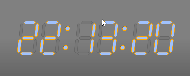
The Digital Meter gauge is designed to show numeric data on a digital-like screen. It provides the following features:
- It can have up to 5 indepdenent screens
- Each screen can have up to 20 digits
- Each screen can have its skew configured
- Each screen can have up to 2 icons and up to 2 labels
- Height, margins, digit thickness and position of each screen are configurable
- Thousands groupping can be enabled for each screen
- Active and inactive digit parts appearance are configurable
- Optional digit background and overlay images can be speicified
The traits schema for the Digital Meter gauge:
{
  /* Common traits */
  ...

  /* Meter type traits */
  ...

  // Optionally defines a common screen height to be used by all screens by default
  height: /* A numeric value in gauge coordinate system */,

  // Optionally defines a common digits margins to be used by all screens by default
  margins: {
    // Defines a horizontal margin value for a digit parts
    x: /* A numeric value */,

    // Defines a vertical margin value for a digit parts
    y: /* A numeric value */
  },

  // Optionally defines a common digit parts thickness for all screens to be used by default
  thickness: /* A numeric value */,

  // Optionally defines a maximum number of digits per screen for all screens to be used by default
  maxDigits: /* A numeric value in range 1..20 */

  // Optionally enable thousand groupping for all screens to be used by default
  groupThousands: true | false,

  // Optionally defines a skew angle for all screens to be used by default
  skew: // A numeric value

  // Optionally defines visual appearance of active digits parts for all screens to be used by default
  active: {
    // Defines an element fill color
    fill: /* A string value of an RGB color in XAML format */,

    // Defines an element stroke color
    stroke: /* A string value of an RGB color in XAML format */,

    // Defines an element stroke size
    strokeSize: /* A numeric value */
  },

  // Optionally defines visual appearance of inactive digits parts for all screens to be used by default
  inactive: {
    // Defines an element fill color
    fill: /* A string value of an RGB color in XAML format */,

    // Defines an element stroke color
    stroke: /* A string value of an RGB color in XAML format */,

    // Defines an element stroke size
    strokeSize: /* A numeric value */
  },

  // Optionally defines a digit background image for all screens to be used by default
  digitBackground: /* Image, View and Location traits */,

  // Optionally defines a digit overlay image for all screens to be used by default
  digitOverlay: /* Image, View and Location traits */,

  // Define gauge specific optional icons (not used by the screens)
  icon1: /* Image, View and Location traits */,
  icon2: /* Image, View and Location traits */,

  // Define gauge specific optional labels (not used by the screens)
  label1: {
    /* Font, View and Location traits */
    ...,

    format: /* Label text */
  },
  label2: {
    /* Font, View and Location traits */
    ...,

    format: /* Label text */
  },

  // Defines up to 5 digital screens
  dimensions: [
    {
      /* Optional Meter type traits to override Meter type traits at the top level */
      ...

      // Defines screen position in gauge coordinates
      position: {
        x: /* Numeric value */,
        y: /* Numeric value */
      },

      // Define screen specific optional icons
      icon1: /* Image, View and Location traits */,
      icon2: /* Image, View and Location traits */,

      // Define screen specific optional labels
      label1: {
        /* Font, View and Location traits */
        ...,

        format: /* Label text */
      },
      label2: {
        /* Font, View and Location traits */
        ...,

        format: /* Label text */
      },

      // Top level traits can be overriden for this particular screen:
      height: ...,
      margins: ...,
      thickness: ...,
      maxDigits: ...,
      groupThousands: ...,
      skew: ...,
      active: ...,
      inactive: ...,
      digitBackground: ...,
      digitOverlay: ...
    },

    ...
  ]
}
The following below example shows the built in Clock-HHMM gauge traits with explanation comments (reduced source):
function(ctx) {
  // Getting the Gauge Runtime library reference.
  var rt = ctx.libs.runtime;

  // Computing basic measurements.
  var clockHeight = .3;
  var dcx = clockHeight / 2;
  var pointSize = clockHeight / 8;

  // Defining a point template object for preventing code duplicates.
  var templates = {
    point: {
      src: rt.resource('point.svg'),
      cx: pointSize,
      cy: pointSize
    }
  };

  // Building the result traits object.
  return {

    // Defining gauge actions.
    actions: (function() {
      return {
        init: ...,
        setTime: ...,
        runClock: ...,
        stopClock: ...,
        setHourFormat: ...,
        showLeadingZeros: ...
      };
    })(),

    viewboxStretch: 'None',
    current: 0,
    background: rt.resource('background.svg'),
    height: clockHeight,
    margins: { x: 7, y: 7 },
    thickness: 10,
    maxDigits: 2,
    groupThousands: true,
    skew: -5,
    active: {
        fill: '#a0c0ff',
        stroke: 'Orange',
        strokeSize: 2
    },
    inactive: {
        fill: '#777777',
        stroke: '#666666',
        strokeSize: 2
    },
    dimensions: [
      // Dim 0: Hours
      {
        position: { x: -dcx * 3, y: -dcx },
        min: 0,
        max: 23
      },
      // Dim 1: Minutes
      {
        icon1: rt.extend(templates.point, {
          x: -pointSize / 2,
          y: -dcx + dcx / 2
        }),
        icon2: rt.extend(templates.point, {
          x: -pointSize / 2,
          y: dcx - dcx / 2
        }),
        position: { x: dcx / 2, y: -dcx },
        min: 0,
        max: 59
      }
    ]
  }
}
State Gauge Type
The State gauge type can be used to represent a finite number of possible states, and unlike the passive Meter type, the State type provides interaction with a user and allows changing states using a mouse or a keyboard. This ability makes opens a lots of oportunities for implementing gauge based state driven visual controls.

The State type requires these required triats to be provided:
stateCount: The required number of possible states.state: The required current active state in range [0 ..stateCount)states: The required array of image or animation objects where the index of each element corresponds to a state index.
The Image State gauge style

The Image style assumes that each state can be represented via one image. Changing a state causes a previosly active state image to be hidden if hideInactive traits is set to true, and an image associated with the next state to be shown. Image showing and hiding can be animated. State changing can be triggered in the code or as a result of user input.
The following traits can be used for controlling the Image gauge:
hideInactive: An optional boolean value that causes images of inactive states to be hidden if its value istrue, or kept shown if it's value isfalse.toggleByMouse: An optional boolean value that allows toggling to the next state by clicking a gauge with a right mouse button.toggleBySpaceBar: An optional boolean value that allows toggling to the next state by clicking a space bar on a keyboard.
By default this style changes states from 0 to stateCount - 1 and then starts over at 0. If another state changing logic is required then then nextState action must be defined in triats as follows:
{
  actions: {
    nextState: function(gauge) {
      var oldState = gauge.traits.state;
      var newState =  ...; // TODO: Compute the next state based on oldState value.
      return newState;
    }
  }
}
The following below is an example of a On/Off gauge with a brief explanation of its basic blocks:
function(ctx) {
  // Getting the Gauge Runtime library reference.
  var rt = ctx.libs.runtime;

  // Defining a transition template object for preventing code duplicates.
  var transitionTemplate = {
    effect: 'easeInSine',
    time: 100,
    res: 25
  };

  // Defining a state template object with common properties specified for preventing code duplicates.
  var stateTemplate = {
    show: {
      transition: transitionTemplate,
      start: {
        y: -.7,
        opacity: 0
      },
      stop: {
        opacity: 1,
        y: -1
      }
    },
    hide: {
      transition: transitionTemplate,
      start: {
        y: -1,
        opacity: 1
      },
      stop: {
        opacity: 0,
        y: -1.3
      }
    }
  };

  // Building the 'states' array from the cloned state template objects.
  var states = [
    rt.clone(stateTemplate),
    rt.clone(stateTemplate)
  ];

  // Specifying image source for each state.
  states[0].show.start.src = rt.resource('on.svg');
  states[1].show.start.src = rt.resource('off.svg');

  // Defining the result traits.
  return {
    transparent: true,
    backgroundColor: '#808080',

    state: 0,
    hideInactive: true,
    toggleByMouse: true,
    toggleBySpaceBar: true,

    states: states
  };
}


User Comments
No comments yet, sign in to comment.