Features Tour
Visual Studio 2015 Themes Support
Command Bars provides your application with Visual Studio 2015 style theme support that gives your application the closest, most exact Visual Studio 2015 style themes of any 3rd party tool available today. The Visual Studio 2015 theme is already built in, so you don't have to spend any extra time on this.
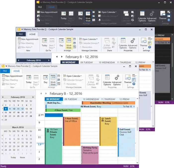
Visual Studio 2015 Status Colors
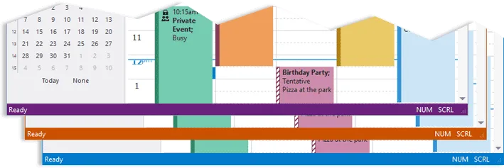
The Visual Studio 2015 state theme setting allows you to define custom colors for your application status bar and border to indicate the current state of your application. You can define colors that indicate Open, Closed, Debug or any state you require.
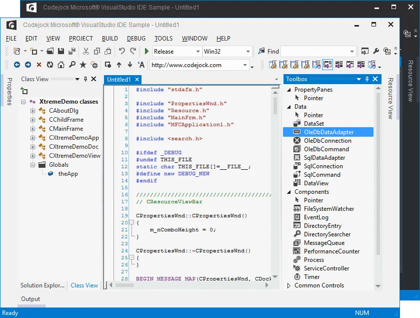
Visual Studio 2012 Theme Support
Command Bars provides your application with full Visual Studio 2012 light theme support that gives your application the closest, most exact Visual Studio 2012 style themes of any 3rd party tool available today. Visual Studio 2012 is already built in, so you don't have to spend any extra time on this.
Visual Studio 2010 Theme Support
Command Bars provides your application with full Visual Studio 2010 theme support that gives your application the closest, most exact Visual Studio 2010 style themes of any 3rd party tool available today. Visual Studio 2010 is already built in, so you don't have to spend any extra time on this.
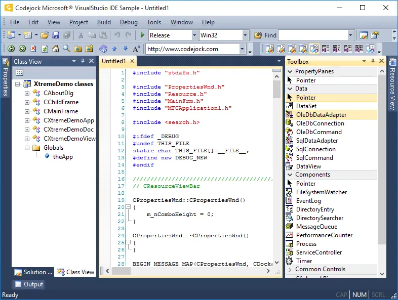
Visual Studio 2008 Theme Support
Command Bars provides your application with full Visual Studio 2008 theme support that gives your application the closest, most exact Visual Studio 2008 style themes of any 3rd party tool available today. Visual Studio 2008 is already built in, so you don't have to spend any extra time on this.
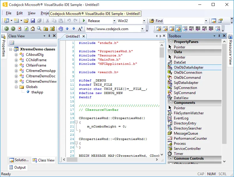
Visual Studio 2005 Theme Support
Command Bars provides your application with full Visual Studio 2005 theme support that gives your application the closest, most exact Visual Studio 2005 style themes of any 3rd party tool available today. Visual Studio 2005 is already built in, so you don't have to spend any extra time on this.
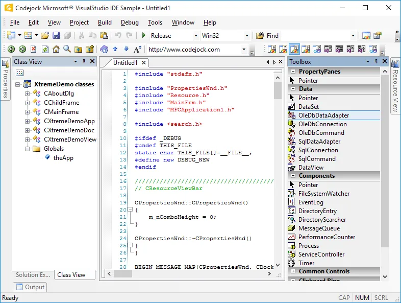
Visual Studio 2003 Theme Support
Command Bars provides your application with full Visual Studio 2003 theme support that gives your application the closest, most exact Visual Studio 2003 style themes of any 3rd party tool available today. Visual Studio 2003 is already built in, so you don't have to spend any extra time on this.
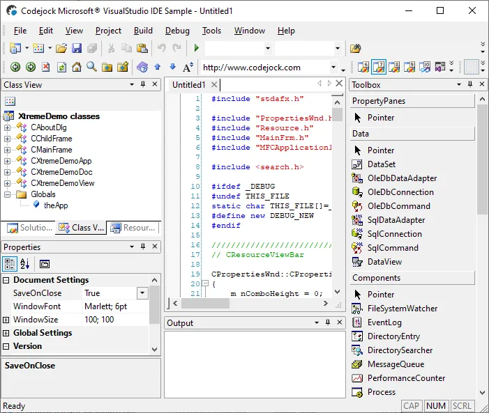
Office 2016
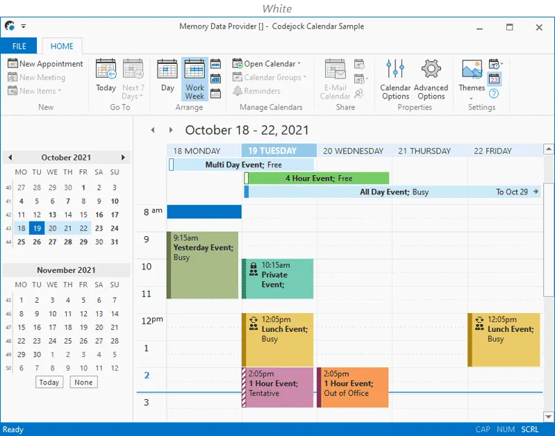
The built-in Office 2016 theme for Command Bars provides you with a ready to use Office 2016 like experience that comes with a choice of the preferred Office application accent color combined with any of the four available base colors.
Office 2013
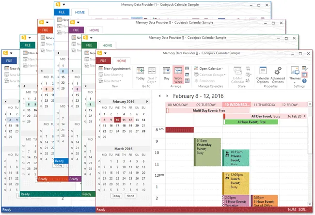
The Office 2013 Style includes several different themes. The themes included are the Access, Excel, One Note, Outlook, Power Point, Publisher and Word styles.
Office 2013 Gray
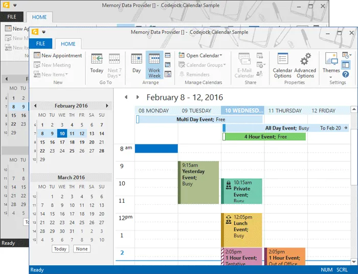
The Office 2013 Gray Styles include two different themes. The themes included are light and dark gray themes.
Office 2013 Background Images
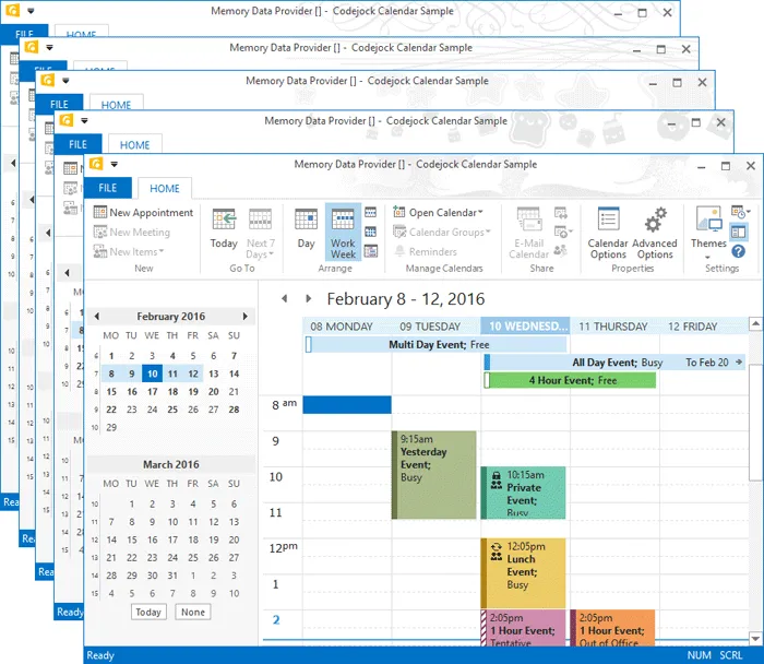
The Office 2013 Background Images Style allows you to select from various pre-included images to customize and decorate your title bar. The backgrounds available are Calligraphy, Circles and Stripes, Circuit, Clouds, Doodle Circles, Doodle Diamonds, Geometry, Lunch Box, School Supplies, Spring, Stars, Straws, Tree Rings and Under Water.
Office 2010 Theme Support
Command Bars provides your application with full Office 2010 theme support that gives your application the closest, most exact Office 2010 style themes of any 3rd party tool available today. Office 2010 is already built in, so you don't have to spend any extra time on this.
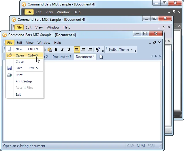
Office 2007 Theme Support
Command Bars provides your application with Office 2007 style theme support. Office 2007 style is already built in, so you don't have to spend any extra time on this.
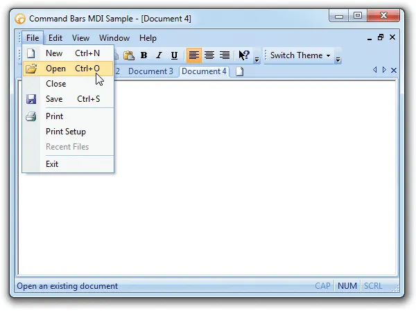
Office 2003 Theme Support
Command Bars provides your application with full Office 2003 theme support that gives your application the closest, most exact Office 2003 style themes of any 3rd party tool available today. Office 2003 is already built in, so you don't have to spend any extra time on this.
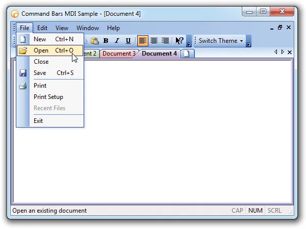
Office 2000 Theme Support
Command Bars provides your application with full Office 2000 theme support that gives your application the closest, most exact Office 2000 style themes of any 3rd party tool available today. Office 2000 is already built in, so you don't have to spend any extra time on this.
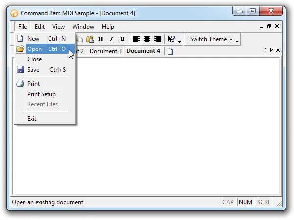
Office XP Theme Support
Command Bars provides your application with full Office XP theme support that gives your application the closest, most exact Office XP style themes of any 3rd party tool available today. Office XP is already built in, so you don't have to spend any extra time on this.
Ribbon Theme Support
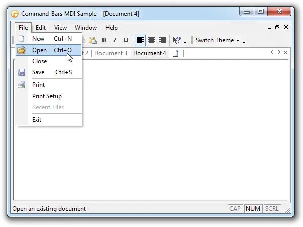
Command Bars provides your application with Office style Ribbon theme support. This theme uses the Ribbon colors in your menus and toolbars. The Office Ribbon style is already built in, so you don't have to spend any extra time on this.
Office Colorization Manager
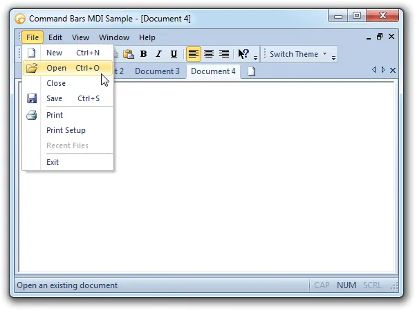
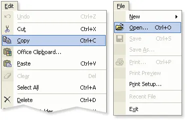
Command Bars provides your application with the closest, most exact Office style colorization of any3rd party tool available today. Regardless of what Windows theme or color scheme you have chosen, Commands Bars will match the same colors used by Office for the particular Windows color setting. We challenge you to compare our products to our competition's products. You will quickly see that, when compared to Office, our competition doesn't even come close!
Left to right: Microsoft® Officexp, Command Bars sample using Officexp theme - Windows XP Blue Theme.
Modern Backstages
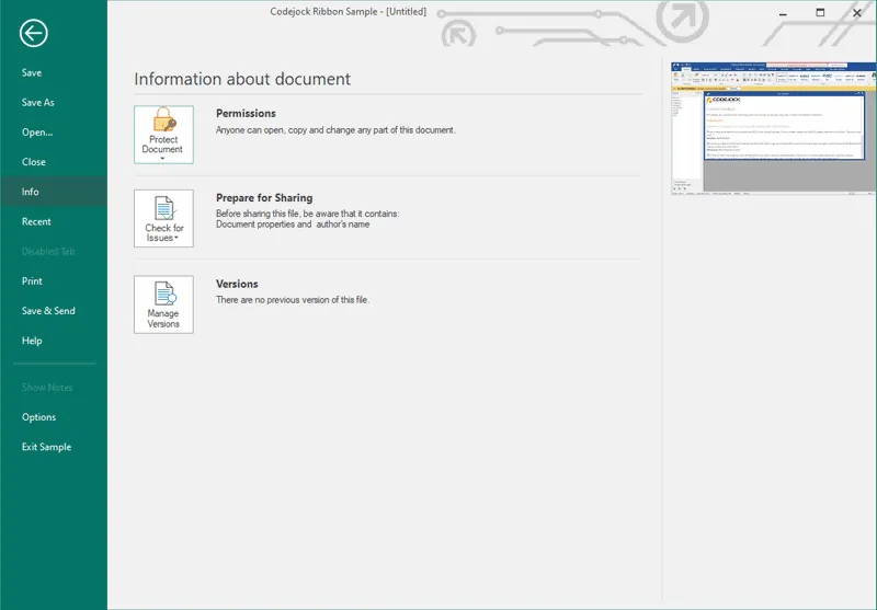
Backstages provide a way to add useful tools to your views and documents without overcomplicating and cluttering the user interface. They are easy to access and have plenty of space for whatever content or tools you want them to contain.
Windows 10
Make your Command Bars and window titles fully consistent with your Windows 10 UI by taking advantage of the built-in Windows 10 theme with customizable accent color.
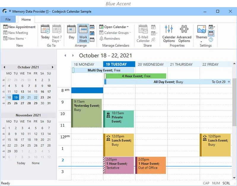
Windows 7 Blue Theme Support
Command Bars provides your application with full Windows 7 Blue theme support that gives your application the closest, most exact Windows 7 Blue style themes of any 3rd party tool available today. Windows 7 Blue is already built in, so you don't have to spend any extra time on this.
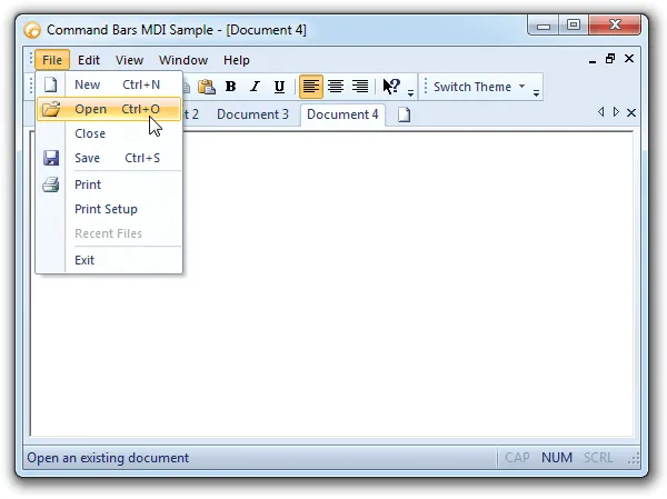
Windows XP Theme Support
Command Bars provides your application with full Windows XP theme support that gives your application the closest, most exact Windows XP style themes of any 3rd party tool available today. Windows XP is already built in, so you don't have to spend any extra time on this.
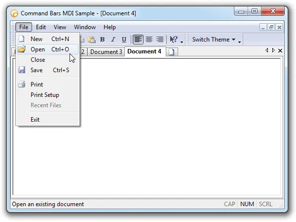
Custom CommandBar Colors
The Command Bars provides support for a custom appearance. This allows you to create your own custom colors or choose from several pre-defined themes.
Custom Color Support
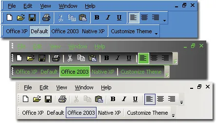
Frame Shadow
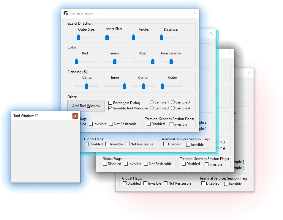
Using a right shadow under a window makes it easier for a user to visually focus on your application as well as it makes it unique looking. Some Command Bars themes have already enabled shadow that matches the theme style, however it’s highly configurable so you can create a true unique shadow for your application.
Dialog Frame Theme
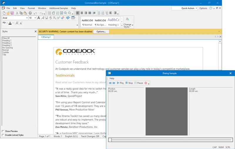
Command Bars are capable to apply theme not only to the frame window caption and the borders, but also for the regular dialogs, which makes it possible to have one consistent theme across all windows used in an application.
Vector Icons
Vector icons allow using one icon image for any possible screen resolutions and DPI settings, and such an icon will always be drawn as a crisp image without any loss of quality. And all Command Bars and Ribbons controls will scale properly and adjust themself for any DPI scaling enabled.
![]()
![]()
![]()
Office Style Ribbon Bar Control
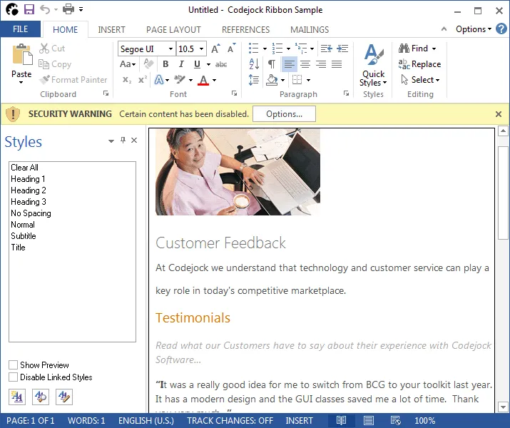
Codejock Software's Ribbon Bar provides Windows developers with the latest Microsoft Office 2013 style Ribbon Bar component. No longer will users need to fumble through confusing and boring menus. Ribbon Bar includes enhanced navigation capabilities by grouping menu and toolbar commands into logical blocks that are arranged in tabular format.
Ribbon Groups
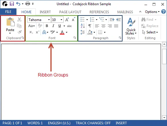
Groups are used to logically organize items in a Ribbon Bar. Group captions make it easy to identify what the items in a group are related to. Just about any type of item can be added to groups in the toolbar.
Group Option Button
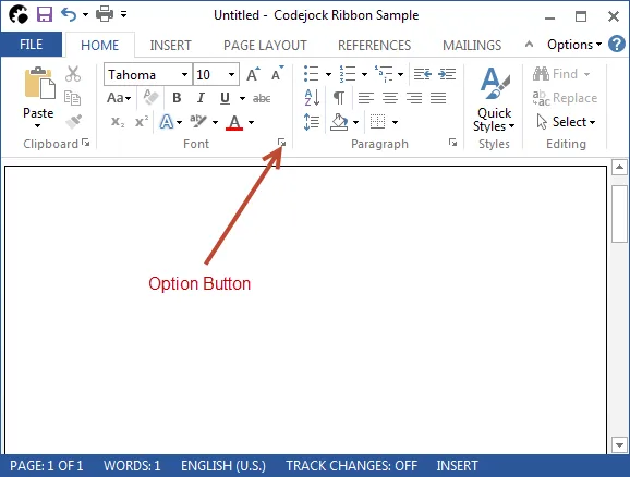
Option buttons can be added to a ribbon group's caption. Typically, when an option button is pressed a dialog should be displayed that is related to the controls in the group, but you can perform any action you wish such as displaying a popup menu.
Office Style Smart Layout
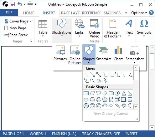
Advanced smart layout abilities ensure that the Ribbon Bar makes the most efficient use of the available space. Smart layout allows each item to have multiple image sizes. The smart layout will display the largest images when enough room is available and automatically display the smaller icons when space is tight. When space is abundant, large images with item captions are displayed, if space is limited, then only small icons with no captions are displayed. Items are always only a few clicks away, groups with insufficient space are displayed as a popup button which displays the entire group as a popup. Ribbon Bar is always adapting to its environment to provide a perfect fit.
Right-To-Left (RTL) Ribbon Support
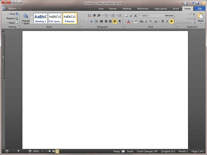
The Ribbon Bar can be displayed from Right-To-Left (RTL), making the Ribbon accessible to all users, regardless of language. In addition to RTL languages, the Ribbon Bar provides support for up to 32 different languages.
Gallery Control
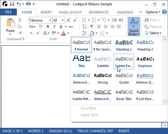
The Office style gallery control can be used in the toolbar, ribbon group, or popup menu. The gallery control displays a collection of picture or text items that can be scrolled and displayed in your popup menu, standard toolbar, or ribbon group. For example, a gallery can be used to create an Office style font or size popup drop-down menu and popup color selector.
Variable Font Size
Both the RibbonBar and CommandBars can support a wide variety of font sizes with the option to automatically resize the icons to be consistent with the font size. If the size of the font is changed to extra large all the components of the RibbonBar will be adjusted to fit the new font size including properly sized images.
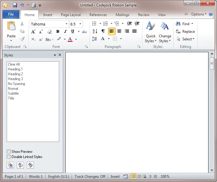
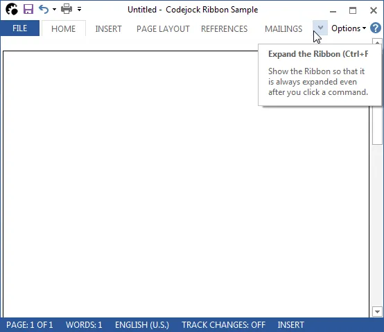
Expandable RibbonBar
Using the Office Style Ribbon Bar you can be expanded or collapsed to save workspace area.
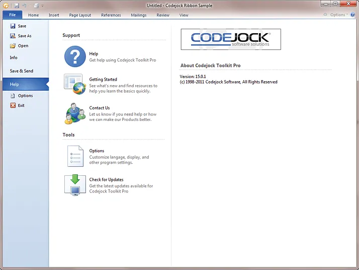
Backstage View
The backstage view is is displayed by the ribbon when the system tab is pressed. This is the new Office style menu and is used for displaying tasks that the user can perform on the document (i.e. printing and saving). The backstage view consists of 3 main sections, the "Tabs Pane" which contains commands and tabs, the "Control Pane" which contains controls related to the tabs in the Tabs Pane, and the "Optional Control Pane" which contains controls related to controls in the Controls Pane.
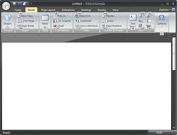
Screen Tips
Accessing commands in the RibbonBar and Commandbars can now be done using ScreenTips. ScreenTips allow every feature in the RibbonBar and Commandbars to become accessible using the keyboard. Every command will be assigned a letter that becomes visible when the Alt key is pressed that allows you to activate that command when pressed.
System Button Menu
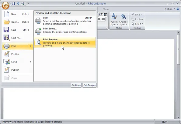
Using the Office style System Button you can group together all the functionality of your application into a single easy-to-use entry point.
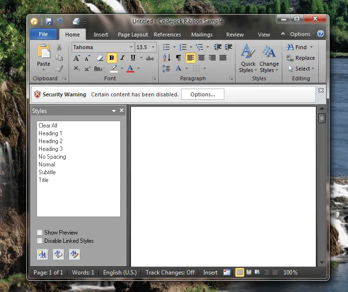
Glass Effect
Applications using the RibbonBar or Command Bars on Windows Vista or Windows 7 can use the Aero style glass effects. You can see right through the glass-like interface. On the Aero glass theme the RibbonBar's Quick Access Toolbar is drawn completely on the glass window frame.
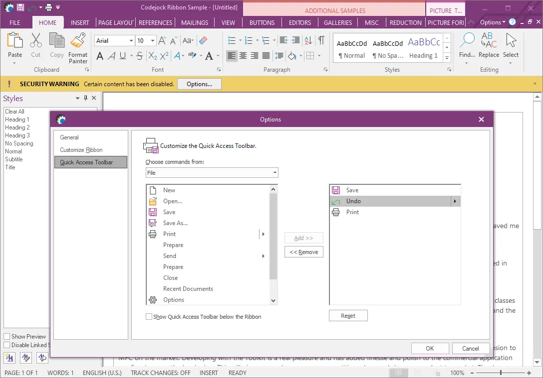
Ribbon Customization
Just like toolbars and menus, the ribbon bar provides flexible customization options that allow users to adjust the application so it suits their needs best.
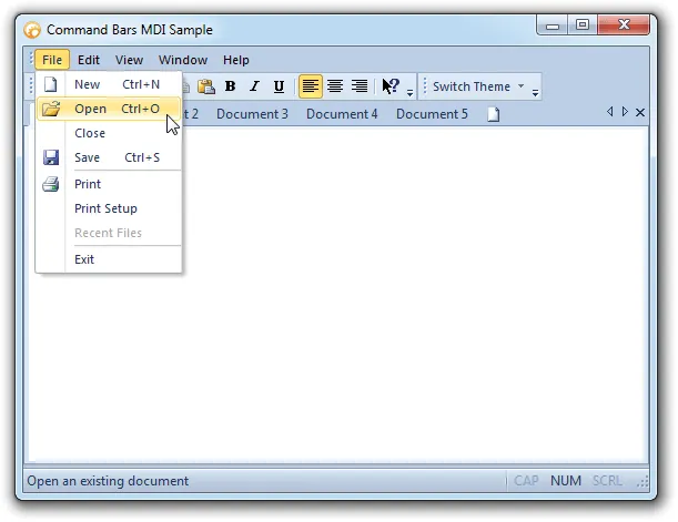
Shortcuts
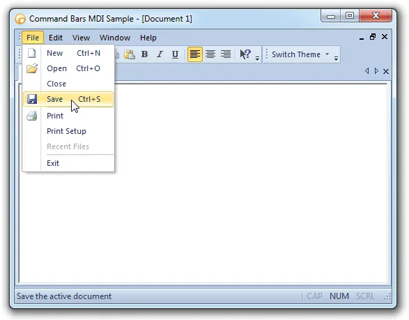
Command Bars allows you to define keyboard shortcuts for each Command Bar control. You can create a shortcut from any combination of keys on the keyboard. Command Bars will automatically place the key combination of the shortcut in the menu next to the caption of the control.
Shortcut Key Tips
Command Bars allows users to either turn accelerator tips on or turn them off. With the accelerator tips on, the accelerator key/ shortcut key combination will appear over your toolbar button next to the tool tip as you scroll over them with the mouse. If the accelerator tips are off, the accelerator key/ shortcut key combination will not be displayed in the tool tip.
Accelerator/Shortcut tips enabled

Accelerator/Shortcut tips disabled

User Defined Accelerators\Shortcuts
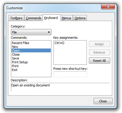
Command Bars allows users to create their own custom accelerators/shortcut keys for each control in your application at run-time. This provides users a way of increasing productivity by having all their control a key stroke away.
Alpha Icon Support
Command Bars includes alpha icons support that allows you to use smooth and semi-transparent icons, thus able to blend into the application for a more exact Windows XP look and feel. Command Bar's ImageManager control allows you to easily add alpha icons to your toolbars and menus.

Add, Edit, Copy, Delete and Modify Command Bar Images
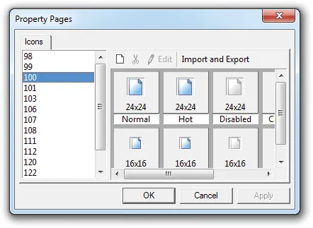
The Command Bars ActiveX Image Manager control gives you greater control over toolbar and menu image customization by allowing you to add, edit, copy, delete, and modify images during design time to give you total control over your Command Bar images.
The Image Manager control is similar to the Microsoft ImageList control, however, the Image Manager is a much more powerful tool. One of the most noticeable improvements is the Image Manager supports 32-bit Alpha Icons. When an image is added to the Image Manager, a "disabled" image and a "hot" image are automatically created for you. You can then individually edit the normal, disabled, and hot images. Another nice feature is that you can add multiple image sizes for each Command Bar control, for example, you can add 16x16 and 32x32 icons and simply set the LargeIcons property to true to automatically use the larger set of icons. You can use the SetIconSize Method to switch between image sizes and the Image Manager will automatically load the appropriate size images.
Hot, Disabled, and Normal Icons
Command Bars allows you to easily add a separate icon that is displayed when your menu bar and toolbar controls are in a "normal", "hot", and "disabled" state. When the mouse pointer is moved over a control, the "hot" icon will be displayed, and if the control is disabled, the "disabled" icon will be used. Command Bars will automatically create a "hot" and "disabled" icon for you, all you have to do is provide the "normal" icon. You can also add your own custom "hot" and "disabled" icons. When using the ImageManager control, you can add all three image states using the icon editor user interface at design time.
Normal

Hot

Disabled

Faded Menu and Toolbar Icons
Command Bars shows icons in menus and toolbars as faded until the mouse runs over them, highlighting the icons and showing their true colors and brilliance.
Disabled Icons
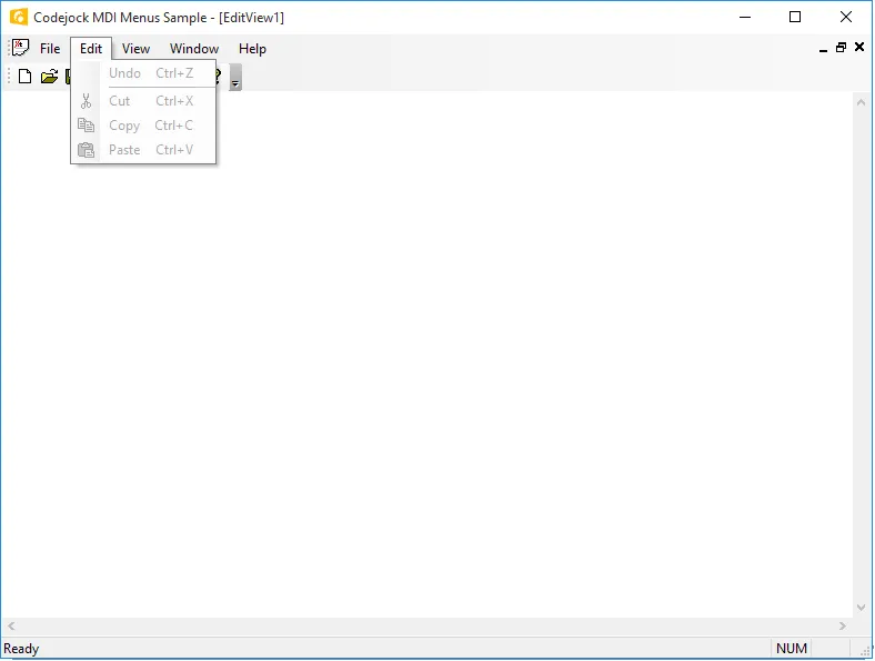
Command Bars offers disabled menu and toolbar icons so that users can easily distinguish between the commands that can be used at the moment and those that cannot. Disabled menu icons automatically take on a grayed look and are not highlighted on mouseover.
Icon Shadows
Command Bars creates a shadow behind menu and toolbar icons on mouseover to give the icons the appearance of possessing a 3 dimensional look.
Save and Load Command Bar Layout to System Registry
Command Bars allows you to easily save and load your Command Bar layout to and from the system registry. Only two lines of code are required to load and save your Command Bar layout. Command Bars will save all of your Command Bar customizations.
Save and Load Command Bar Layout to String
Command Bars allows you to easily save and load your Command Bar layout to and from a String. You have more control over what Command Bar customizations are saved/ loaded when saving/loading the layout to/from a string. When saving to a string you have the option of saving the customization settings from the Keyboard and Options pages of the Customize dialog, you can save only the layout of the Command Bar that have changed, and you can chose not to save the Command Bar layout. When loading the Command Bar layout from a string you have the option to restore the controls layout, options layout (Keyboard and Options pages of the Customize dialog), and whether to prompt the user before restoring the layout.
Some applications have multi user access. It can be useful to store a layout for each user in a personal file instead of the registry.
Add, Edit, Copy, Delete and Modify Command Bar Images
The Command Bars ActiveX Image Manager control gives you greater control over toolbar and menu image customization by allowing you to add, edit, copy, delete, and modify images during design time to give you total control over your Command Bar images.
The Image Manager control is similar to the Microsoft ImageList control, however, the Image Manager is a much more powerful tool. One of the most noticeable improvements is the Image Manager supports 32-bit Alpha Icons. When an image is added to the Image Manager, a "disabled" image and a "hot" image are automatically created for you. You can then individually edit the normal, disabled, and hot images. Another nice feature is that you can add multiple image sizes for each Command Bar control, for example, you can add 16x16 and 32x32 icons and simply set the LargeIcons property to true to automatically use the larger set of icons. You can use the SetIconSize Method to switch between image sizes and the Image Manager will automatically load the appropriate size images.

Custom Status Bar
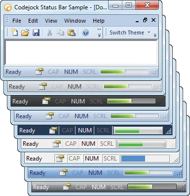
Command Bars comes with a built-in custom status bar. You have the ability to add panes to the custom status bar, and can access each individual pane to change the message that is displayed. The custom status bar will automatically use the current Command Bar theme. The custom status bar can be used to display other useful information such as Caps Lock, Scroll Lock, and Num Lock just by assigning the correct indicator to the status bar pane.
Commandbar Actions
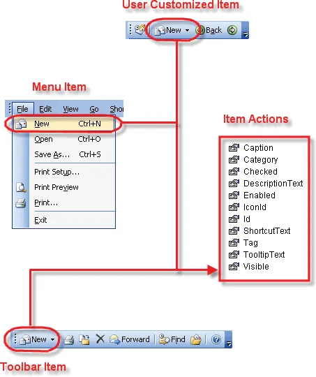
Commandbar actions eliminate the need to use the update notification\event to update\change the state and properties of an item that appears multiple places in your menus and toolbars. This also makes it easy to localize all the control with a single line of code.
In the diagram below, the "Menu Item," "Toolbar Item" and "User Customized Item (user created toolbar)" all share the same "Item Action." When you modify the properties of the action it will update all occurrences of the item.
Loading a Command Bar from a File
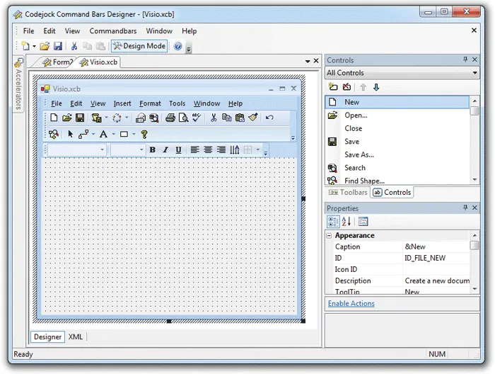
The Command Bars Designer Studio allows you to visually create your command bar or ribbon. The command bar is saved to a file and only one line of code is needed to load the file in your application. With the Designer Studio, you can easily add/edit/delete accelerators, controls, icons, and toolbars.
Multi-Language Support
Command Bars allows you to easily support multiple languages via a single line of code. Command Bars supports up to 32 different languages, including Right-To-Left (RTL) support.
Supported Languages:
 Arabic (Saudi Arabia)
 Czech
Czech Finnish
 Hebrew
 Swedish
 Thai
Thai Portuguese (Portugal)
 Chinese (PRC)
 Danish
 French (France)
 Hungarian
 Ukrainian
 Dutch
Dutch Romanian
 Chinese (Taiwan)
 English (US)
 German (Germany)
 Italian (Italy)
 Slovenian
 Spanish
 Croatian
 Estonian
 Greek
Greek Japanese
 Slovakian
 Russian
 South Korean
 Latvian
 Lithuanian
 Norwegian
 Polish
 Portuguese (Brazil)
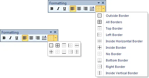
Popup Toolbars
Command Bars allows you to display a normal popup menu as a popup toolbar.
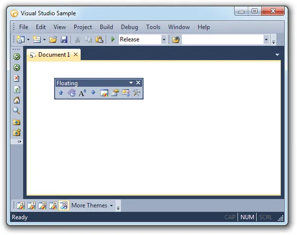
Dockable Toolbars
Command Bars allows you to drag-n-drop your toolbars and dock them to any border of your application or you can have a floating toolbar.
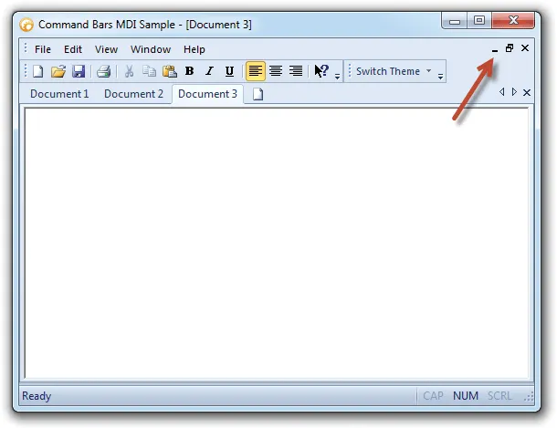
Command Bar MDI Buttons
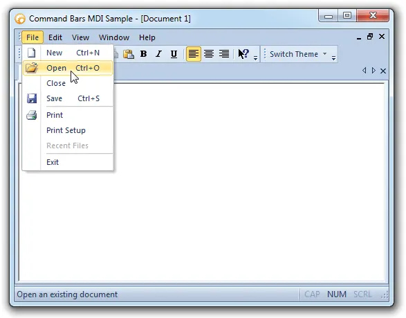
Command Bars allows you to easily add/remove MDI buttons to/from your command bar. This allows you to control how your MDI Child windows will be resized.
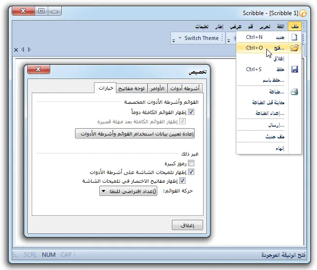
Microsoft® Office Style Toolbars
Command Bars gives your Windows application toolbars a professional modern appearance similar to many popular Microsoft® products. You can choose from several pre defined themes.
Microsoft® Office 2003 Style Toolbars

Microsoft® OfficeXP Style Toolbars

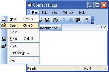
Control Popup Alignment
Command Bars allows you to easily change the direction a popup control will be displayed. You can make the popup be displayed to the left or right, which is the default behavior.
Control popup that is displayed to the left
Luna Colors
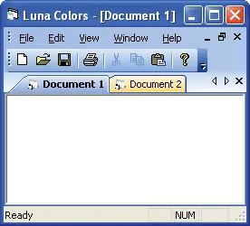
Command Bars allows you to enable/disable Luna colors in your command bar.
Office 2003 theme with Luna colors disabled
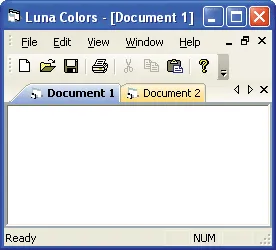
Office 2003 theme with Luna colors enabled
Tab Workspace Luna Colors
Command Bars allows you to enable/disable Luna colors in the tab workspace.
Tab workspace with Luna colors disabled
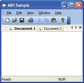
Tab workspace with Luna colors enabled
Command Bar Button Styles
Command Bars allows you to easily change the button style of your command bar controls. You can allow Command Bars to choose the most suitable button style or you can pick your own style. Depending on the type of command bar control, you can display only the caption, the caption and icon, or just the icon.
Button Caption

Button Caption and Icon

Button Icons

Command Bar Standard Button Control
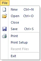
Command Bars allows you to easily add a Control Button control to your command bar. The Control Buttons are automatically themed to match the currently set Command Bar theme.
Control Buttons in a toolbar
![]()
Control Buttons in the menu bar
Command Bar Split Button Popup Control
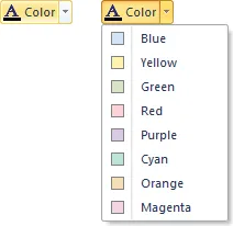
Command Bars allows you to easily add a Split Button Popup control to your command bar. The Split Button Popup control allows you to add a group of controls that will be displayed when the arrow button is clicked. Once a control is selected from the drop-down list, you can simply click on the button half of the Split Button Popup to execute the code for the selected control. The Split Button Popup control can also be used to display a tear-off popup or tear-off toolbar. The Split Button Popup is automatically themed to match the currently set Command Bar theme.
Split Button Popup in "hot" and "selected" state
Command Bar Button Popup Control
Command Bars allows you to easily add a Control Button Popup control to your command bar. The Control Button Popup is automatically themed to match the currently set Command Bar theme.
Office 2010 Themed Popup
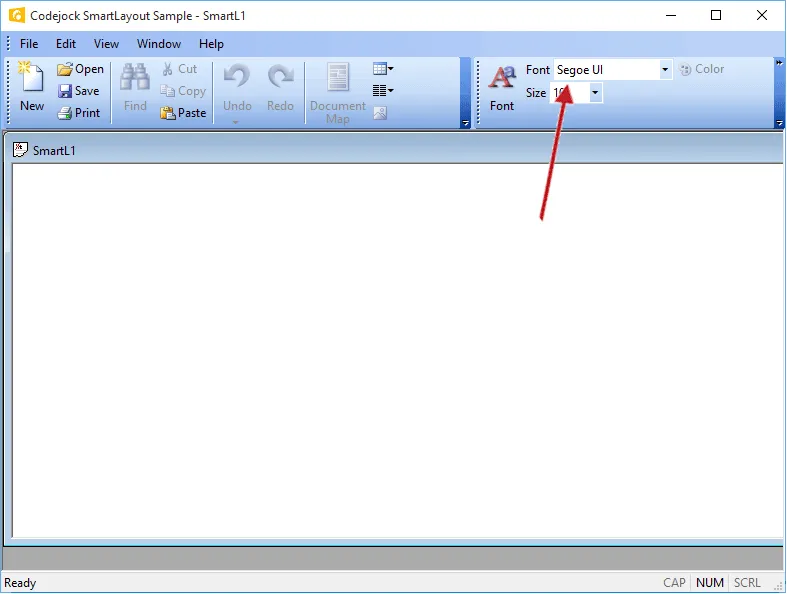
Command Bar Combobox Control
Command Bars allows you to easily add a Combobox control to your command bar. The Combobox control is automatically themed to match the currently set Command Bar theme.
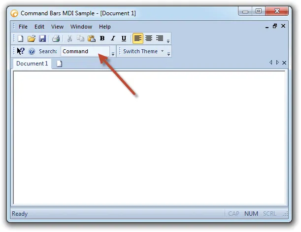
Command Bar Edit Control
Command Bars allows you to easily add an Edit box control to your command bar. The Edit box control is automatically themed to match the currently set Command Bar theme.
Toggle Buttons
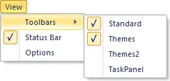
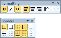
Command Bars offers toggle buttons that users can easily see when commands in your menu and toolbar are "on" or "off". When a toggle button is clicked, you only need to update the "checked" property of the control. Controls in you menu bar will have a check mark next to them and toolbar controls will appear in a "selected" state.
MenuBar Toggle Buttons
ToolBar Toggle Buttons
Drag and Drop CommandBar Items
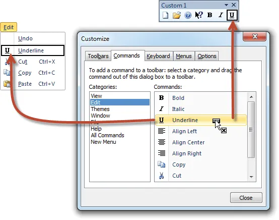
Command Bars gives your application the functionality of drag and drop, which allows users to drag any command from a toolbar or menu and drop it into another. Just open the customize dialog and click on the command you want to move, drop it in the place you want it and continue working!
Edit, Copy and Delete Commands
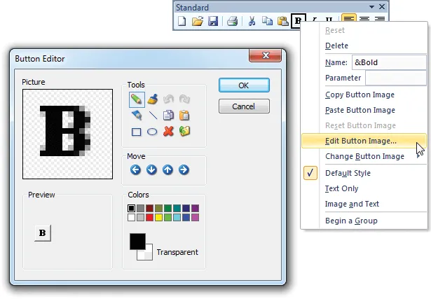
Command Bars gives you greater control over toolbar and menu customization by allowing you to edit, copy, delete, and modify commands during runtime to give you total control over your application workspace. Command Bar allows you to specify which Command Bar can be customized, this way the user can only customize the Command Bar you allow them to customize.
Command Bars supports Command Icon Editing...
Dynamically Add and Remove
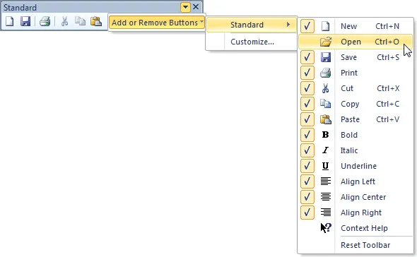
Command Bars provides your application with the ability to add and remove toolbar commands dynamically, ensuring that users have all of the toolbar commands needed, and none that are not wanted. This gives your application the highest functionality with no confusion over the purpose over commands.
Toolbar Customization
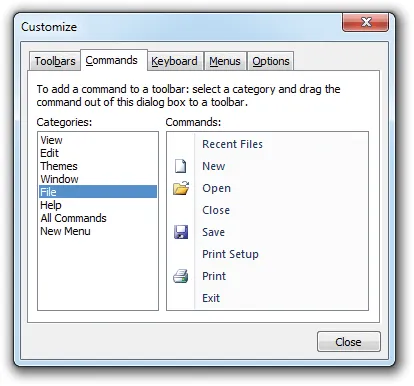
The ‘Toolbar Customization’ feature provides a clean and professional way to customize your workspace. You can easily create new toolbars or modify existing ones with just a few mouse clicks so you can quickly and easily organize your workspace.

User Defined Toolbars
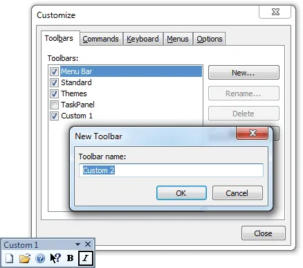
Command Bars allows users to create their own custom toolbars in your application at run-time. This provides users a way of customizing the look and feel of the application to fit their personal needs.
User Defined Command Bar Options
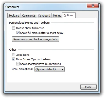
Command Bars allows users to specify which command bar options they want to use. Users can specify how the menus are displayed, if large icons are used, menu animation, and accelerator tips in your application at run-time. This allows users to obtain a custom look and feel that best suits them.
Toggle Large or Small Icons
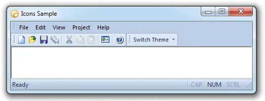
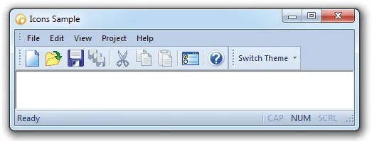
With Command Bars you always have the choice of selecting either small or large toolbar icons. You can easily set the size of the icons that will be used for small and large icons. Switching between the two can be accomplished with only a few mouse clicks, giving users the satisfaction of controlling the look of the application. With this feature there is no need to worry about running out of space for more icons in using the small icons, and there is no need for squinting to determine which icon to use in using the large icons.
Small Icons
Large Icons
Show Text Below Toolbar Icons
Command Bars allows you to show text below your toolbar icons. You can set this option for each individual toolbar or for all toolbars.
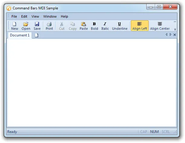
Toggle Tool Tips
Command Bars allows users to either turn tool tips on or turn them off. With the tool tips on, helpful cues will appear over your toolbar button as you scroll over them with the mouse. If the tool tips are off, no such cues will appear on mouseover.

Hide and Show Toolbars
You can use Command Bars to allow users to customize their application setup by showing and hiding toolbars. The user has the choice of which toolbars to show and which to hide, with the option of resetting to revert to the default appearance. When you right click on any command bar, a context menu is automatically displayed listing all of your command bars giving you the option to hide/un-hide or customize them.
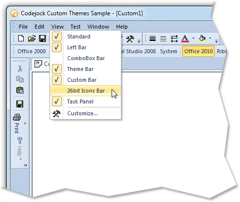
Closeable Toolbars
Command Bars allows you to specify whether a specific command bar can be closed. If a command bar is not closeable, you will not be able to close or hide the command bar. You can use this to make sure that important controls are always displayed.
Command Bars supports persistent Toolbars
![]()
Command Bars supports Closeable Toolbars
![]()
Command Bar Grippers
Command Bars allows you to easily add/remove grippers to/from your Command Bar. Grippers are a graphical way to indicate to the user that the command bar can be "gripped" and moved or docked to another location.
Menu bar and Toolbar with grippers removed, other toolbars can be moved
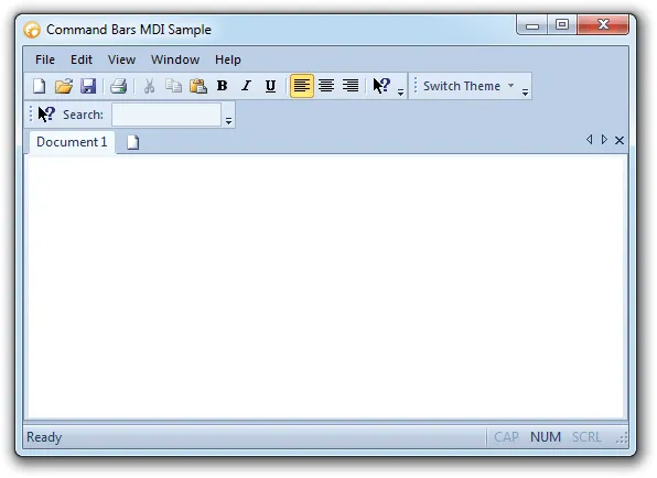
Tabular Toolbars
Tabular toolbars eliminate the need for numerous toolbars crowded around an application. Menu items can now be elegantly displayed in a toolbar. The contents of a toolbar can be accessed simply by clicking on its tab. Tabbed toolbars are not only easy to use, but they increase the usable view area.
A Tabbed ToolBar contains all the functionality of standard toolbars. Many toolbars, called categories can be "tabbed" together. Switching between toolbar categories is similar to a TabControl, you can now access all of your toolbar categories simply by clicking on its tab. Normal toolbars can still be used outside of the TabbedToolbar if needed. The TabbedToolbar will also dock just like a normal toolbar.

Transparent Toolbars
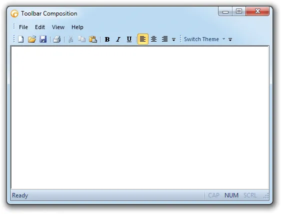
Commandbars supports Windows 7 style "composition"/transparent toolbars.
Intelligent Menus
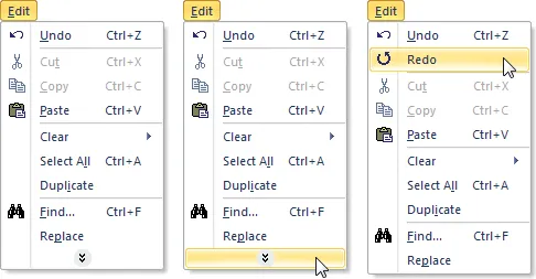
Command Bars provide you with a simple means of creating your own intelligent menus. You can define a set of commands that stay hidden until the user presses or hovers over the chevron- style button to completely expand the menus.
Menu Animations
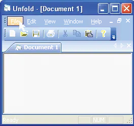
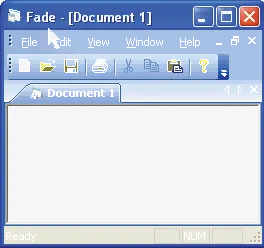
Command Bars allows you to configure how your menus will be displayed using animation effects. You can easily choose from one of several predefined effects that include Random, Unfold, Slide, Fade and None.
"Unfold" style menu animation
"Fade" style menu animation
Tear-Off Menus and Toolbars
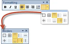
Command Bars can give your application a professional look with tear-off menus and toolbars that allow users to easily tear menus and toolbars off and float them in separate windows, providing a workspace that is easy to manipulate to anyone's preferences.
Tear-off popup
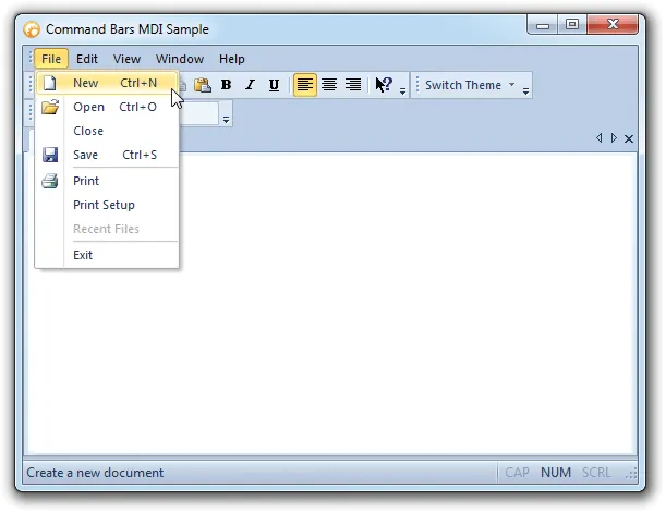
Popup Menus
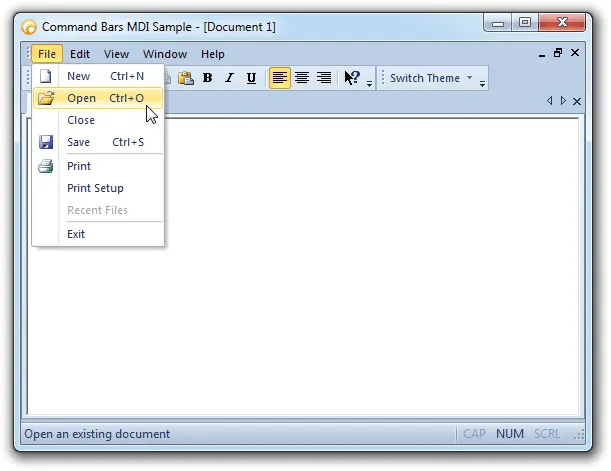
Command Bars allows you to easily add a Control Popup control to your command bar. The Control Popup is automatically themed to match the currently set Command Bar theme.
The menu bar contains themed popup controls
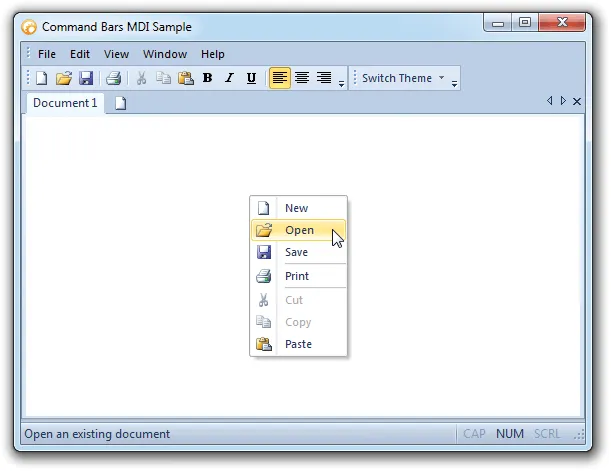
Popup Context Menus
Command Bars allows you to show popup context menus anywhere on the screen. You can display any existing popup menu or command bar as popup menus, or you can create a temporary popup menu that is created and destroyed each time the popup menu is opened and closed. You can easily show a different popup when you right-click on different components of your application.
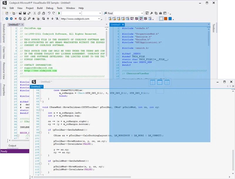
MDI Tear-Offs
(Only available with Toolkit Pro for Visual C++)
MDI tear-offs make it simple to work with a number of documents simultaneously while having all documents visible. It is an invaluable feature for applications that can be used in multi-monitor environments as it is possible to fill all monitors with the detached windows of one application.
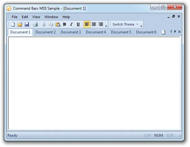
MDI Tabbed Interface
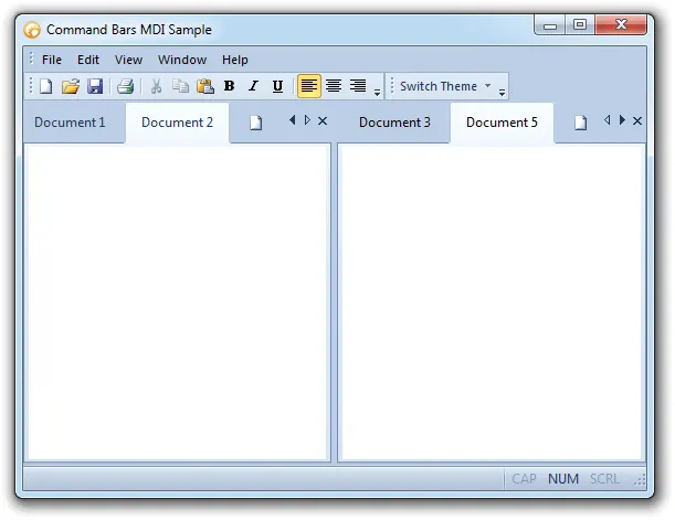
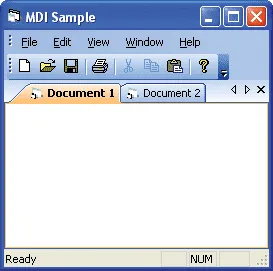
Command Bars gives your Windows application a professional modern appearance with MDI tabs that are similar to many popular Microsoft® products. An MDI tabbed interface can be included in your application with a single line of code. You can easily turn on and off this feature via code. Command Bars will automatically use themed tabs that match the currently set Command Bar theme. For your convenience, you can choose from several pre defined themes or create your own custom look.
.NET Style Tabbed Workspace Groups
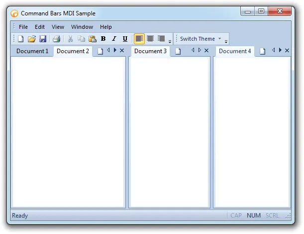
Command Bars allows you to easily create .NET style tabbed workspace groupings. You have the ability to group tabs vertically or horizontally within the tab workspace. Tabs can easily be moved from one group to another by a drag-and-drop or via code. You can easily add functionality for the user to create a new horizontal/vertical group and move a tab to the previous/next group simply by adding a control in your Command Bar.
Themed MDI Client Backcolor
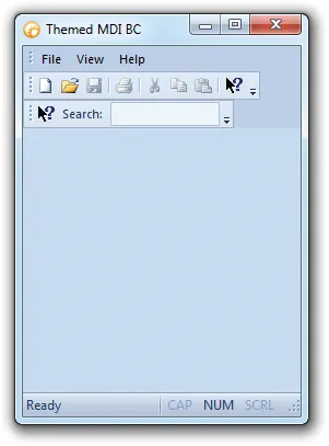
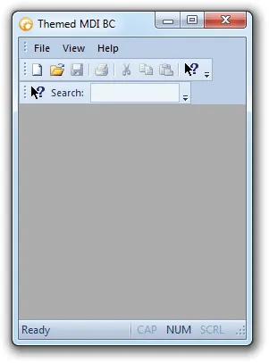
Command Bars will automatically use a themed MDI Client backcolor that matches the currently set Command Bar theme. You can easily enable/disable themed backcolor. If enabled, the backcolor of the MDIClient is calculated from current theme, if disabled the Form::BackColor property will be used.
MDI Client with themed backcolor
MDI Client without themed backcolor
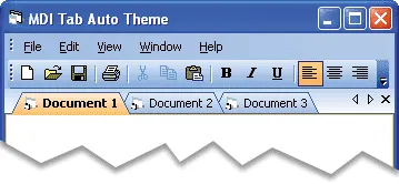
MDI Tabs Auto Theme
Command Bars will automatically use themed tabs that match the currently set Command Bar theme. You can turn on/off the Auto Theme feature. This will allow you to change the theme of your tab workspace so that is different from the Command Bar theme.
Command Bars automatically uses themed tabs that match the current Command Bar theme
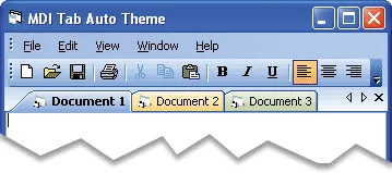
Command Bars allows you to mix themes
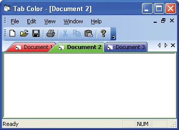
Tab Color
Command Bars allows you to easily change the color of each individual tab in the tab workspace.
You can change the color of each individual tab
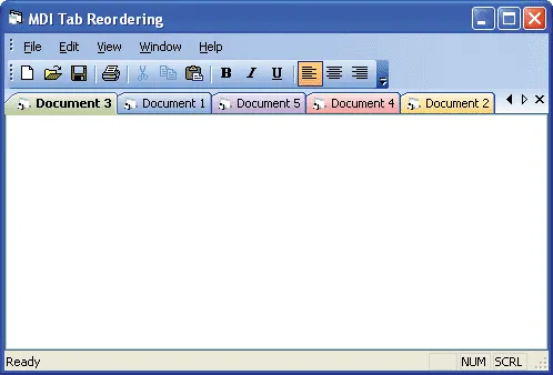
Tab Reordering
Command Bars allows you to reorder your tabs simply by dragging the tab to the desired location. You have the ability to turn tab reordering on or off.
Tab Buttons
Command Bars allows you to hide the tab workspace buttons. You can hide the close button, the arrows, or both at the same time.
All buttons visible
![]()
Close button hidden
![]()
Arrow buttons hidden
![]()
All buttons hidden
![]()
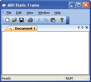
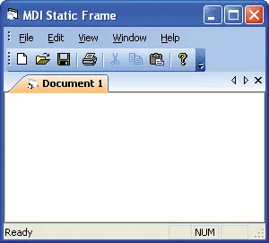
Static Frame
Command Bars allows you to add a static frame around the entire TabControl. You can easily add or remove the static frame via code.
Static frame
No Frame
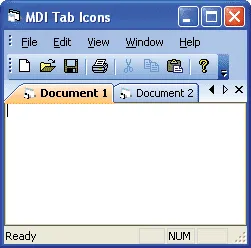
Show Tab Icons
Command Bars allows you to easily show/hide icons in your tab buttons.
Tab icons hidden
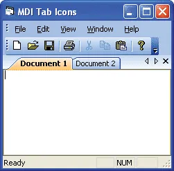
Tab icons visible
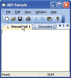
Hot Tracking
Command Bars allows you to easily enable/disable Hot Tracking. When you move the mouse cursor over your tabs, they will become "Hot" when Hot Tracking is enabled. This allows you to easily see which tab the mouse cursor is over.
Hot Tracking Support
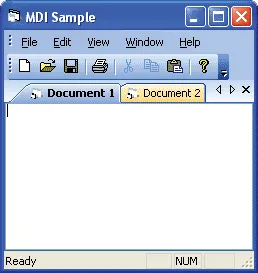
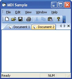
Bold Selected Tabs
Command Bars allows you to easily enable/disable Bold Selected tabs. When you click on a tab, the currently selected tab caption is displayed in bold type, making it easy to see which tab is selected.
Bold selected tabs enabled
Bold selected tabs disabled
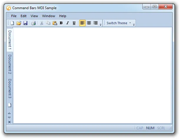
Tab Position
Command Bars allows you to position the tabs on the top, left, bottom, or right with a single line of code. You can change the position of the tabs at any time in your program. The picture below has the tabs positioned to the left.
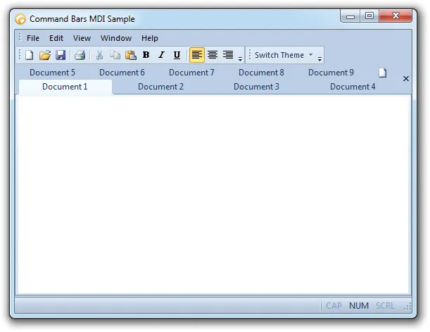
Tab Layout
Command Bars allows you to change the layout of your tabs with a single line of code. The tabs can be in a compressed, fixed, auto size, size to fit layout, multi-row, or rotated. You can change the layout of the tabs at any time in your program. The picture below show multi-row tabs.
Rotated Tab Layout
Command Bars allows you to use rotated tabs in the tab workspace.
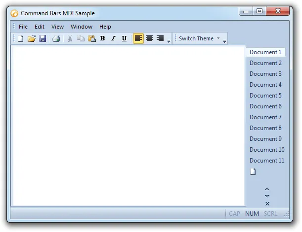
Tab Appearance Styles
Command Bars allows you to easily change the appearance of your tabs. You can choose from several built in appearances such as Excel, MS Office, Flat, Visio, Visual Studio and many more!
Tabs using the Excel appearance with Office 2010 coloring
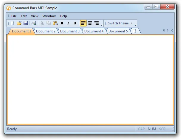
Tab Color Styles
Command Bars allows you to fully customize the appearance of your tabs by applying color styles. For your convenience, you can choose from several built in color styles such as Office 2010, Windows XP, Visual Studio 2010 and many more!
Tabs using the Visual Studio 2010 coloring and Office 2010 appearance
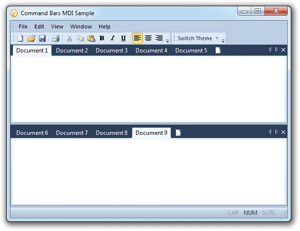
Tab Borders
Command Bars allows you to manipulate the frame/border that surrounds the tab's client area. You can have a full border that surrounds the entire pane client area, a single line border that runs along the top of the tab panel, or you can completely remove the border.
Full Frame/Border
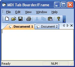
Single Line Frame/Border

Tab Margins
Command Bars allows you to manipulate the margins of the components that make up the tabs. You can change the button, header, client, and control margins of the tabs. The button margin is the area in the tab button surrounding the tab caption, the header margin is the area surrounding the tab buttons, the client margin is the area surrounding the client (area inside the tabs), and the control margin is the area surrounding all of the tabs and tab client area.
