Command Bars and Ribbon Component
for Visual C++ MFC v24.3.0
Command Bars for Visual C++ MFC provides Windows developers with comprehensive, fully customizable menus, toolbars, ribbon and MDI tab windows to give your application a professional and modern interface.
Command Bars is included in Toolkit Pro for Visual C++ MFC
Key Features
Codejock Command Bars for Visual C++ MFC provides several options to choose from including Office Style Ribbon, Visual Studio and Office Theme Support, Tabbed and Transparent Toolbars, MDI Tab and Gallery Controls, Accelerators / Hot Keys, Load / Save State, full Customization and much more!
Command Bars is included with the Toolkit Pro for Visual C++ MFC evaluation.
Modern Office Themes
Create a polished, modern Office-inspired interface with built-in themes, accent colors, backstage views, background accents, and clean application style command bar layouts.
Give your application a modern Office-inspired command bar interface with built-in theme support, selectable accent colors, and multiple base color options for a polished, current UI.
Add modern backstage views that provide space for document tools, settings, and related commands without cluttering the main interface or overwhelming the user.
Customize the title bar with built-in Office style background images, giving your application a more personalized and visually distinctive command bar presentation.
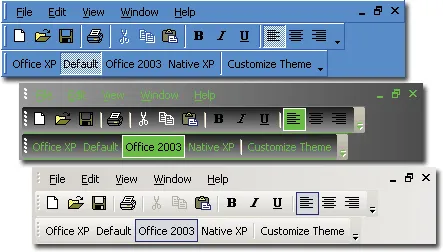
Office Application Style includes several different themes. It helps teams deliver familiar Windows navigation while keeping menus, ribbons, and toolbar interactions easy to customize.
Use neutral Office gray style variations to give command bars a clean, balanced appearance with light and dark gray options for a more understated interface.
Give your application an Office v14.0-inspired interface with built-in styling for menus, toolbars, command bars, and ribbon-era UI elements. It improves clarity for everyday users.
Apply Office style ribbon colors across menus and toolbars, giving your application a coordinated ribbon-inspired appearance without custom theme work.
Apply Office v12.0 style command bar themes to create a polished ribbon-era interface with familiar colors, controls, and Office-inspired visual styling.
Support classic Office v11.0 style interfaces with built-in command bar themes for applications that need a familiar pre-ribbon Office appearance. It improves clarity for everyday users.
Support classic Office v10.0-style command bars with built-in styling for traditional menus, toolbars, and Office-inspired controls. It improves clarity for everyday users.
Match Office v10.0 style colors to the active Windows theme or color scheme, helping command bars and menus blend naturally with the user’s desktop environment.
Support older Office v9.0-style command bars with built-in styling for applications that need a familiar classic Office interface. It adds useful detail for production desktop applications.
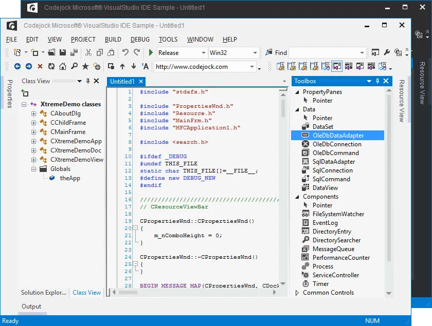
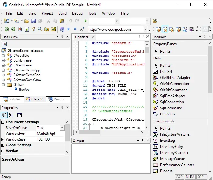
Visual Studio Themes
Give your application a familiar Visual Studio style interface with built-in themes that match multiple Visual Studio generations, including status color support.
Apply the Modern Visual Studio Themes style to give Command Bars a polished look that fits familiar desktop UI themes. It adds useful detail for production desktop applications.
Use Visual Studio-style status colors to highlight application state through the status bar and window border. It adds useful detail for production desktop applications.
Apply the Light and Dark Themes style to give Command Bars a polished look that fits familiar desktop UI themes. It adds useful detail for production desktop applications.
Give your application a Visual Studio Blue-style interface with built-in command bar styling for a familiar, development-focused user experience. It improves clarity for everyday users.
Match the classic Visual Studio v9.0 IDE appearance with built-in command bar styling for applications that need a familiar developer-focused interface.
Apply a classic Visual Studio v8.0 IDE-style theme with built-in styling for menus, toolbars, and related command controls. It adds useful detail for production desktop applications.
Support older Visual Studio v7.1-style interfaces with built-in classic IDE theme support for applications that need a familiar development environment look.
Windows Themes
Match the Windows desktop experience with built-in command bar themes for modern Windows interfaces, along with classic Windows 7 and Windows XP-inspired styles.
Match modern Windows desktop styling with built-in command bar and window title theming, including support for modern Windows style layouts and customizable accent colors.
Apply a familiar Windows Blue-inspired command bar style for applications that need to align with established Windows desktop environments. It improves clarity for everyday users.
Support classic Windows XP-inspired command bars with built-in styling for applications that need a familiar legacy Windows desktop appearance. It improves clarity for everyday users.
Additional Theme Support
Extend your interface with custom colors, frame shadows, themed dialog frames, and vector icon support for sharper, more flexible command bar styling.
Use scalable vector icons across command bars and ribbons for crisp rendering at different screen resolutions and DPI settings without maintaining multiple bitmap sizes.
Extend command bar theming to dialog frames so application windows, borders, captions, and dialogs maintain a consistent visual style. It improves clarity for everyday users.
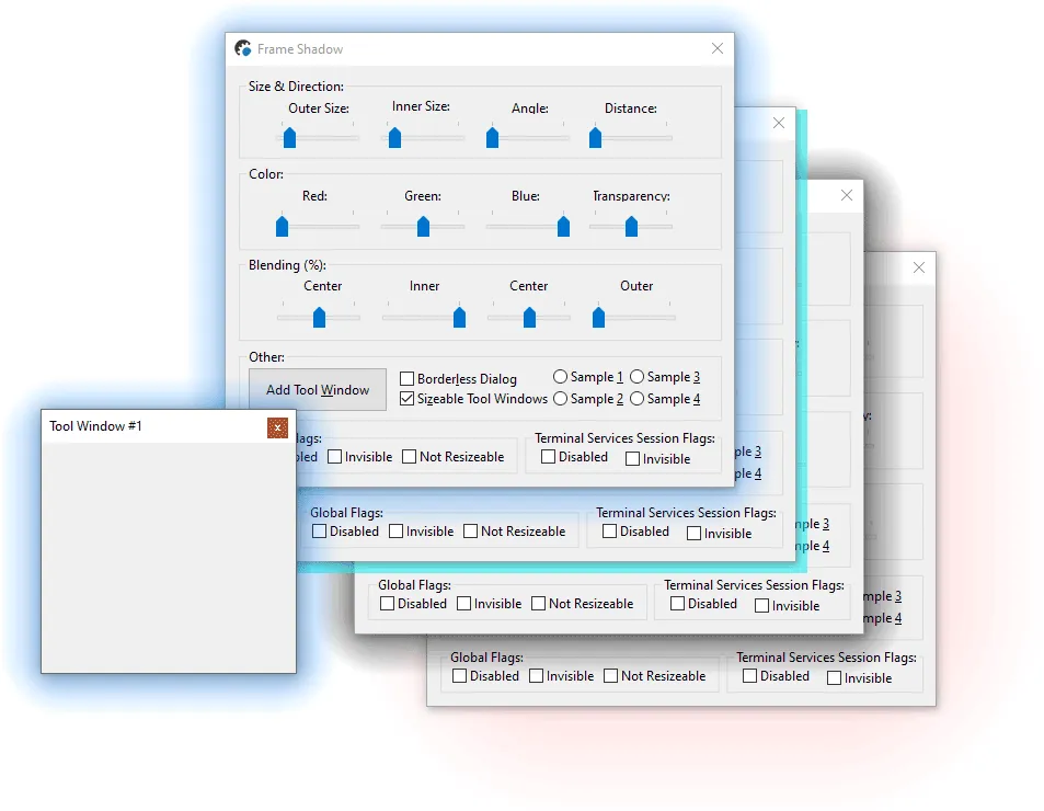
Add themed frame shadows that help windows stand out, improve visual focus, and give supported command bar themes a more polished desktop appearance. It improves clarity for everyday users.
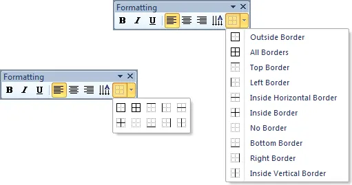
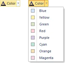
Customize command bar colors to match your application branding or choose from predefined appearance options for a more tailored interface. It improves clarity for everyday users.
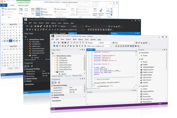
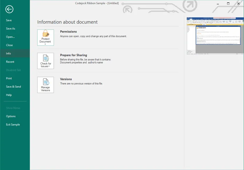
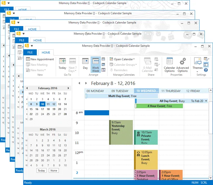
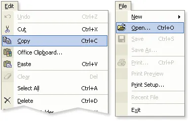
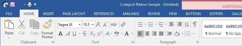
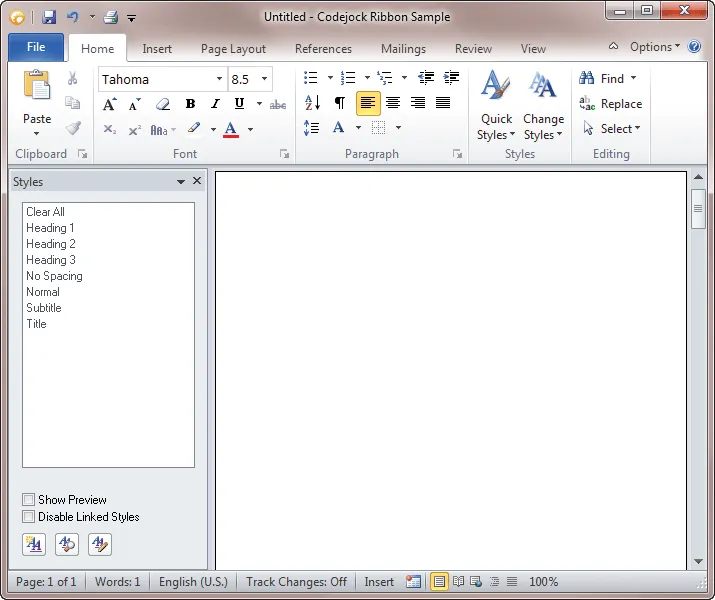
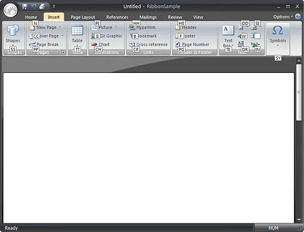
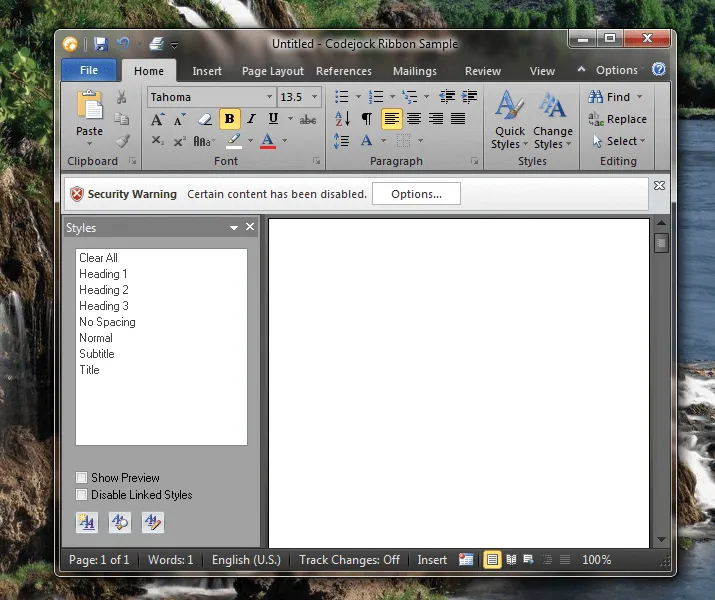
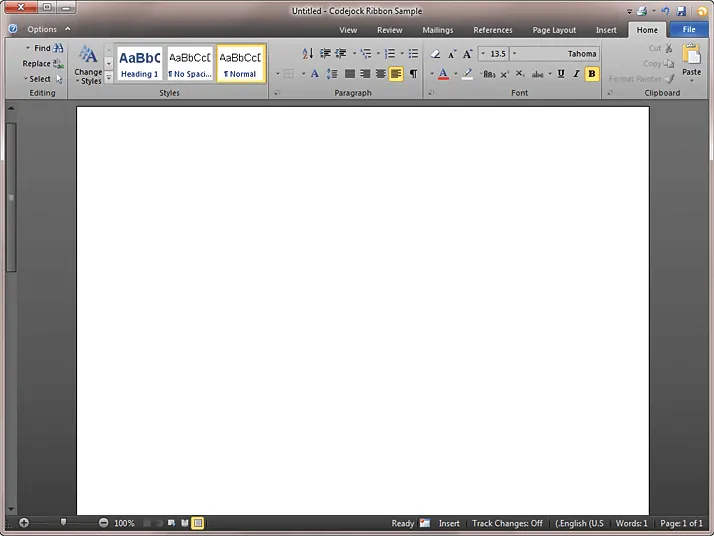
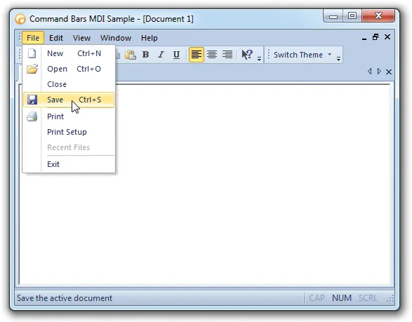
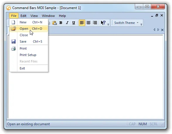
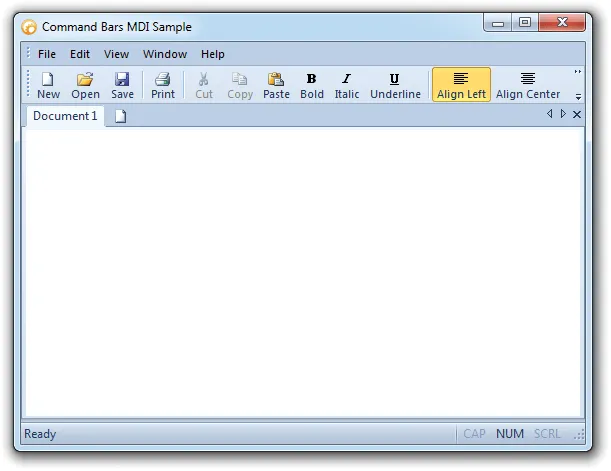
Office Style Ribbon
Create full Office style ribbon interfaces with ribbon groups, gallery controls, smart layout, screen tips, backstage views, Aero effects, and customization support.
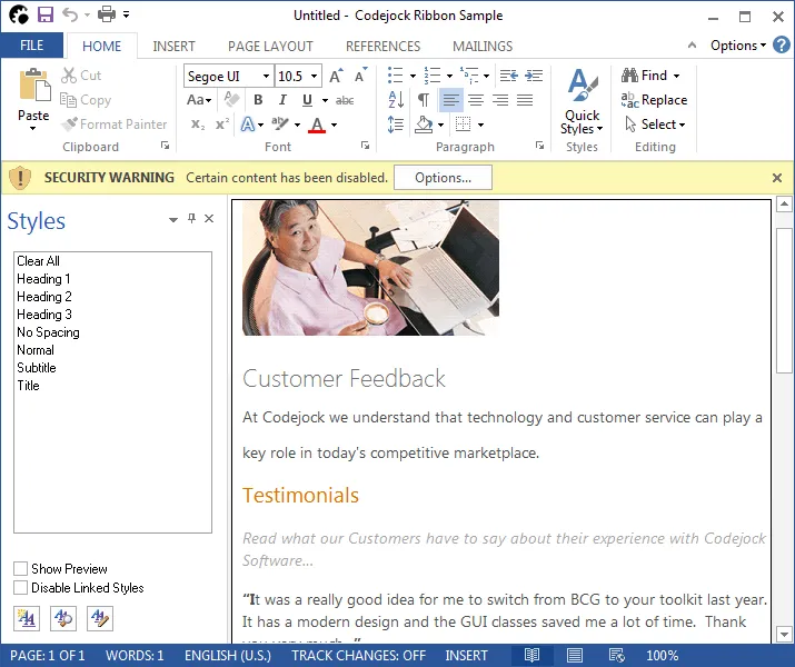
Create Office-style ribbon interfaces with command groups, enhanced layout behavior, and familiar ribbon controls that help organize application features more effectively.
Just like toolbars and menus, the ribbon bar provides flexible customization options that allow users to adjust the application so it suits their needs best.
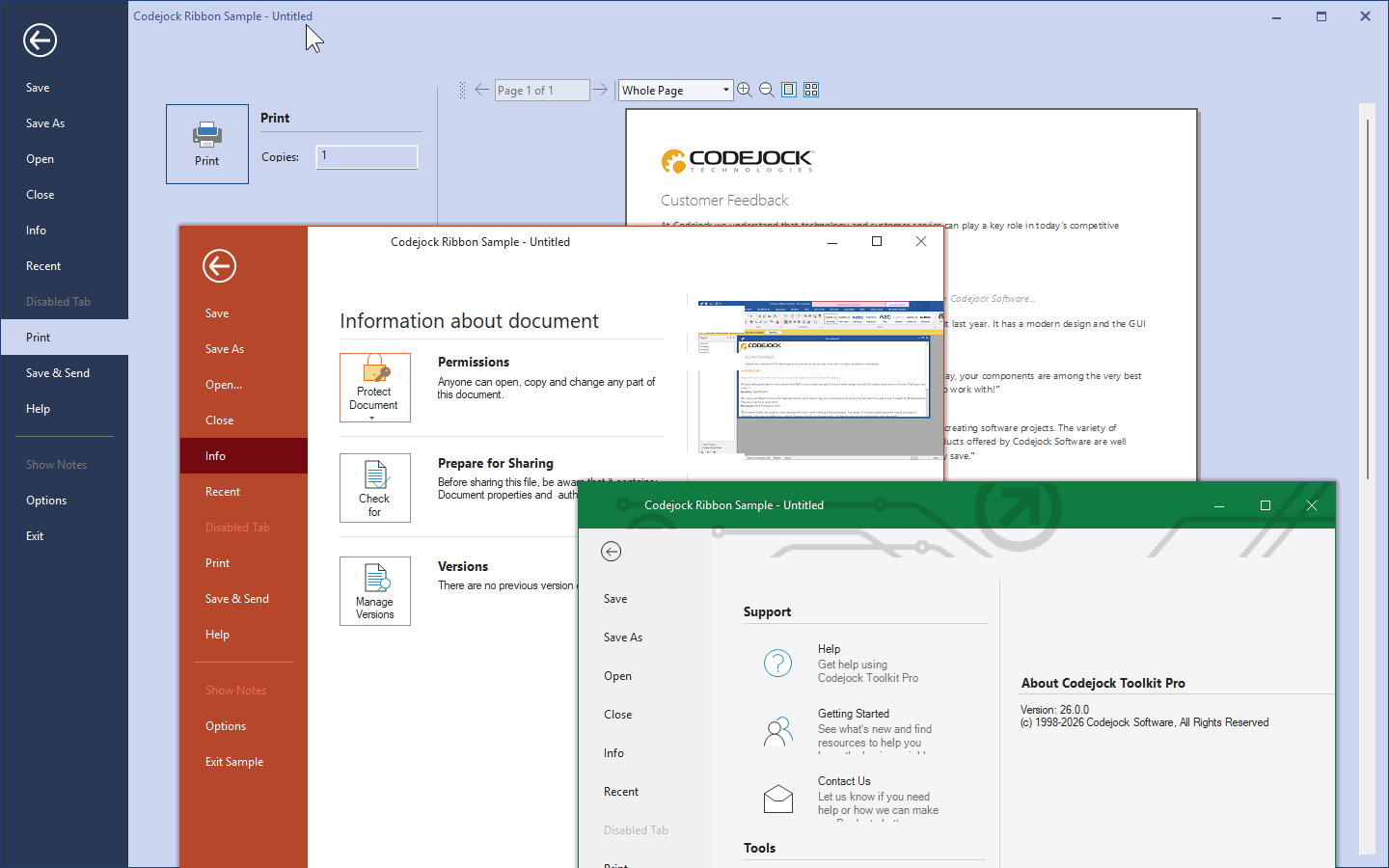
Provide an Office-style backstage area for document-level tasks such as printing, saving, and settings, giving users a dedicated space for application-wide commands.
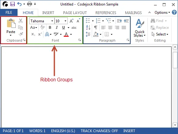
Organize ribbon commands into logical groups with captions that make related tools easier to identify, browse, and use within the ribbon interface. It improves clarity for everyday users.
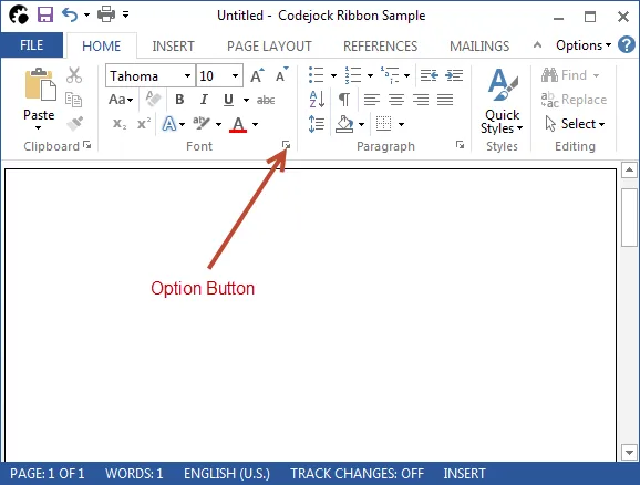
Add option buttons to ribbon group captions to open related dialogs or trigger custom actions tied to the controls within that group. It improves clarity for everyday users.
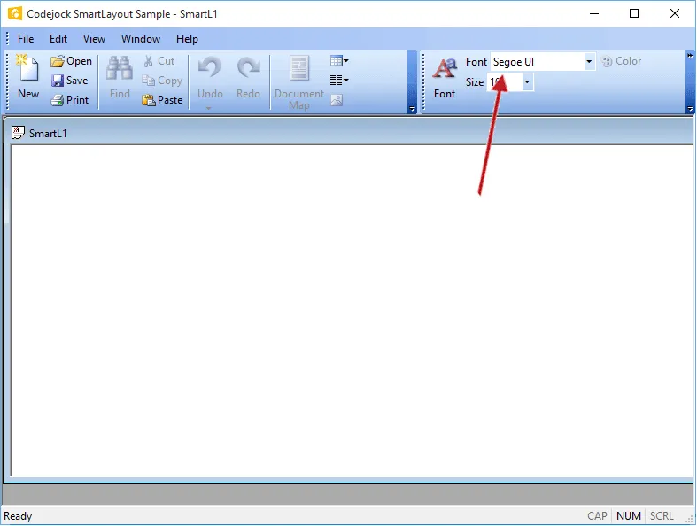
Use smart ribbon layout behavior to make efficient use of available space, automatically adjusting command presentation and image sizes as the ribbon changes width.
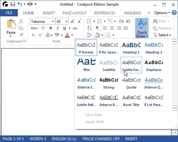
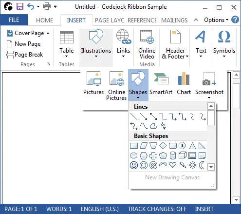
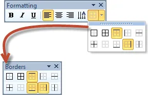
Display visual or text-based choices in a toolbar, ribbon group, or popup menu using an Office-style gallery control with scrollable item collections.
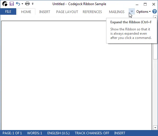
Allow the Office-style Ribbon Bar to collapse when users need more workspace and expand again when command access is required. It adds useful detail for production desktop applications.
Support a wide range of font sizes in Ribbon Bar and Command Bars, with optional icon resizing to keep controls visually balanced as text size changes.
Improve command discovery with ScreenTips that provide keyboard access guidance and help users understand available ribbon and command bar actions. It improves clarity for everyday users.
Apply Aero-style glass effects on supported Windows versions, giving Ribbon Bar and Command Bars a translucent interface that integrates with the desktop theme.
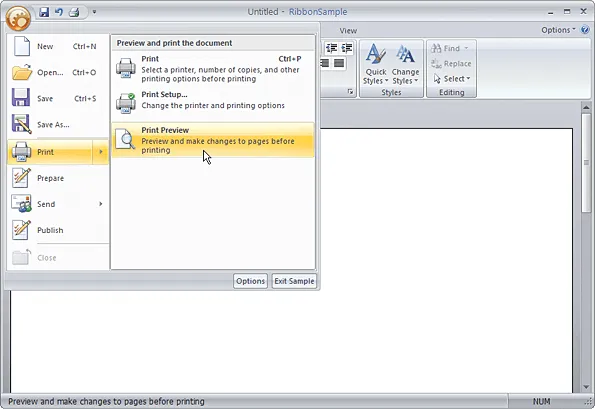
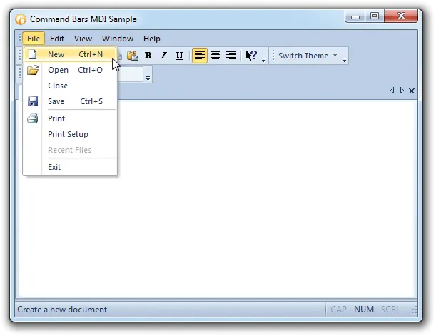
Group core application commands into a single Office-style system button menu, creating a clear entry point for common file and application actions. It improves clarity for everyday users.
Display the Ribbon Bar in right-to-left layouts for RTL languages, with multi-language support to help applications serve a broader international user base.
Accelerators/Hot Keys
Improve command access with shortcut keys, key tips, and user-defined accelerators that help users navigate menus and toolbars faster from the keyboard.
Assign keyboard shortcuts to command bar controls and automatically display shortcut combinations beside menu commands for faster access. It improves clarity for everyday users.
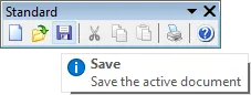
Show accelerator tips beside toolbar buttons so users can discover and use keyboard shortcuts while navigating commands more efficiently. It improves clarity for everyday users.
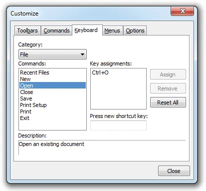
Let users create custom shortcut keys for application commands at runtime, improving productivity by allowing each user to tailor command access to their workflow.
Image Attributes
Customize command images with alpha icon support, visual image management, normal, hover, faded, and disabled states, plus subtle shadows for polished menus and toolbars.
Display faded menu and toolbar icons until the user hovers over them, creating a subtle visual effect that highlights active commands on mouseover. It improves clarity for everyday users.
Show disabled commands with grayed menu and toolbar icons so users can quickly identify which actions are currently unavailable. It adds useful detail for production desktop applications.
Add mouseover shadows behind menu and toolbar icons to give commands more depth and create a subtle three-dimensional highlight effect. It improves clarity for everyday users.
Use smooth 32-bit alpha icons in menus and toolbars for cleaner blending, semi-transparent edges, and a more polished command bar appearance. It improves clarity for everyday users.


Define normal, hover, and disabled icon states for menu and toolbar controls. It supports polished desktop command surfaces without forcing teams to build every interaction from scratch.
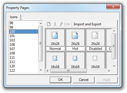
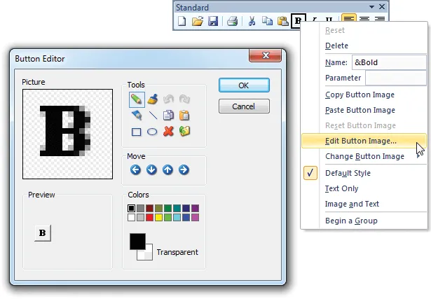
Add, edit, copy, delete, and manage command bar images at design time with Image Manager support for alpha icons, generated hover and disabled states, and multiple icon sizes.
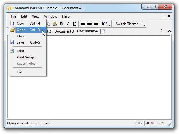
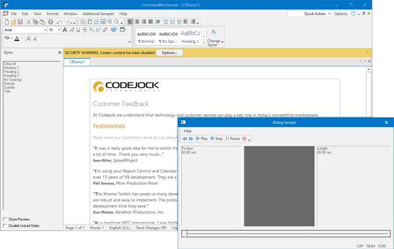
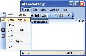
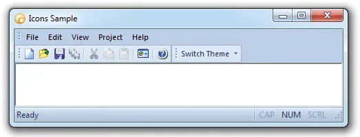
Toolbar and Status Bar Layout
Create flexible command bar layouts with custom commands, visual design tools, multi-language support, dockable toolbars, status bars, MDI buttons, and Office-style layouts.
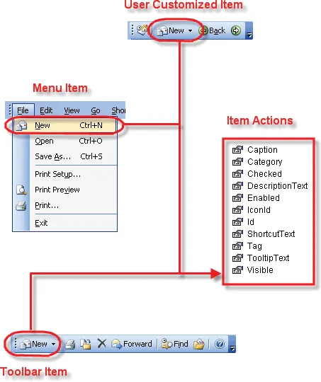
Commandbar actions eliminate the need to use the update notification\event to update\change the state and properties of an item that appears multiple places in your menus and toolbars.
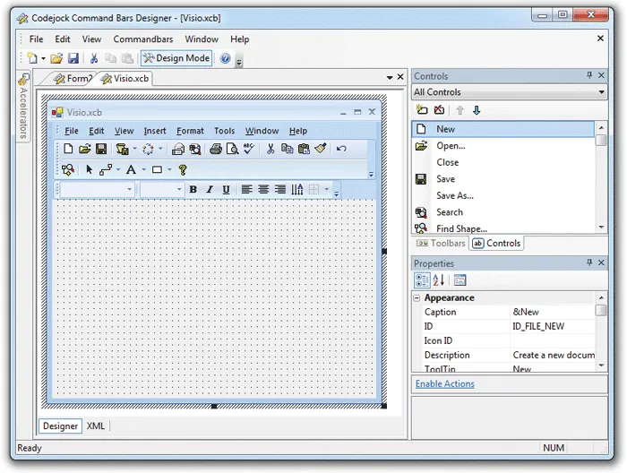
The Command Bars Designer Studio allows you to visually create your command bar or ribbon. It adds useful detail for production desktop applications. It improves clarity for everyday users.
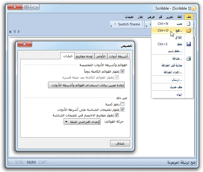
Command Bars allows you to easily support multiple languages via a single line of code. It adds useful detail for production desktop applications. It improves clarity for everyday users.
Command Bars allows you to display a normal popup menu as a popup toolbar. It supports polished desktop command surfaces without forcing teams to build every interaction from scratch.
Command Bars allows you to drag-n-drop your toolbars and dock them to any border of your application or you can have a floating toolbar. It improves clarity for everyday users.
Command Bars allows you to easily add/remove MDI buttons to/from your command bar. It improves the everyday user experience with practical behavior that is easy to understand and customize.
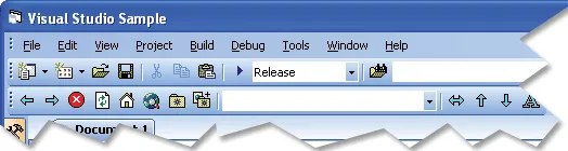
Command Bars gives your Windows application toolbars a professional modern appearance similar to many popular Microsoft products. It adds useful detail for production desktop applications.
Command Bars allows you to easily change the direction a popup control will be displayed. It adds useful detail for production desktop applications. It improves clarity for everyday users.
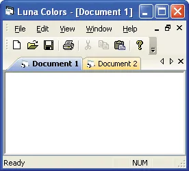
Command Bars allows you to enable/disable Luna colors in your command bar. It supports polished desktop command surfaces without forcing teams to build every interaction from scratch.
Command Bars allows you to enable/disable Luna colors in the tab workspace. It supports polished desktop command surfaces without forcing teams to build every interaction from scratch.
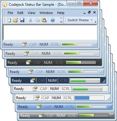
Add a themed status bar with customizable panes for messages, indicators, and application state. It adds useful detail for production desktop applications.
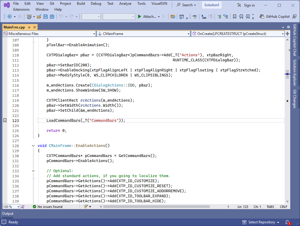
Save and restore command bar layouts using the system registry. It helps teams deliver familiar Windows navigation while keeping menus, ribbons, and toolbar interactions easy to customize.
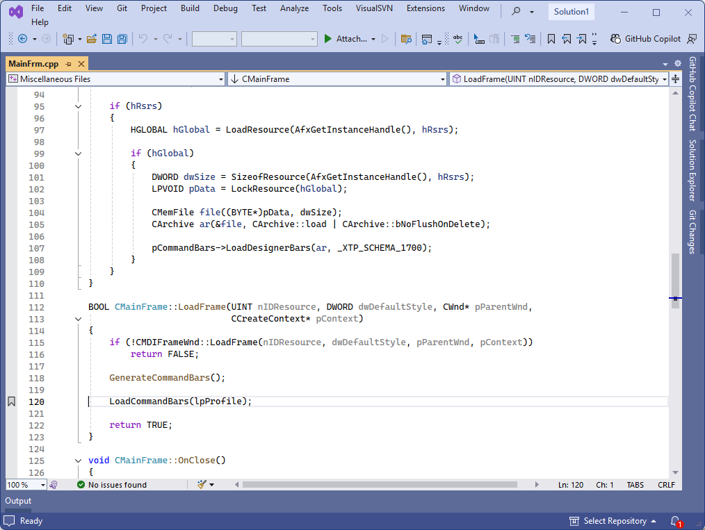
Save command bar layouts outside the registry using strings, XML, or other custom storage formats for per-user settings, shared profiles, or application-managed configuration.
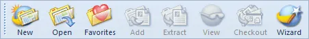
Toolbar Buttons
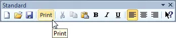
Add rich toolbar controls including standard buttons, split buttons, popup buttons, combo boxes, edit boxes, toggle buttons, and multiple button styles.
Customize command bar button presentation with caption-only, icon-only, or caption-and-icon styles. It adds useful detail for production desktop applications.
Add standard button controls to command bars, toolbars, and menus with built-in theming that automatically matches the active Command Bars visual style.
Add split button popup controls that combine a primary command with a drop-down list of related actions. It adds useful detail for production desktop applications.
Add themed popup button controls to command bars for menus, options, or grouped commands that open from a toolbar or command surface. It improves clarity for everyday users.
Add themed combo box controls directly to command bars so users can choose from predefined values without leaving the toolbar interface. It improves clarity for everyday users.
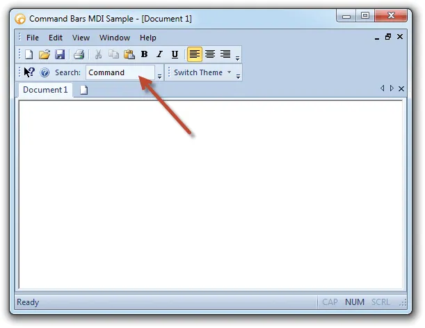
Add themed edit box controls to command bars for search fields, user input, command values, or other text-entry scenarios within the toolbar. It improves clarity for everyday users.
Use toggle buttons to show on/off command states in menus and toolbars. It gives users predictable access to commands while giving developers control over layout, states, and presentation.
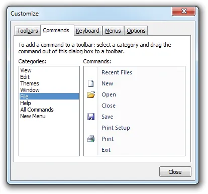
Dynamic Customization
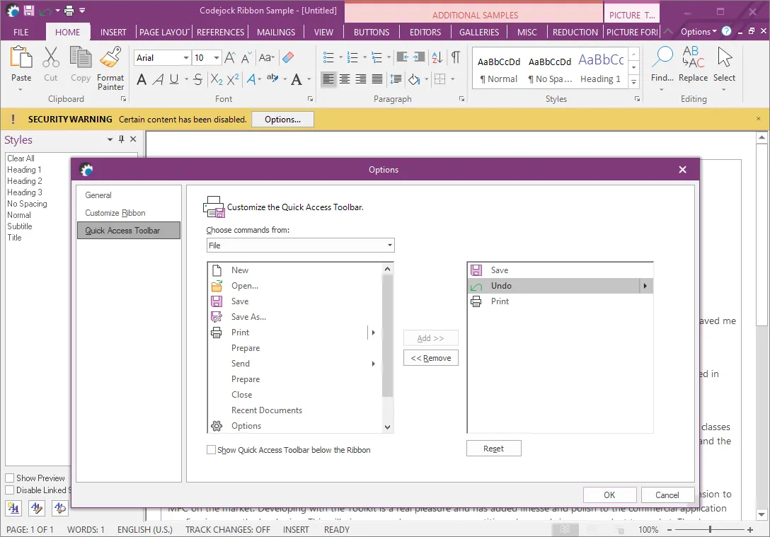
Let users customize commands at runtime with drag-and-drop editing, command modification, dynamic toolbar changes, user-defined toolbars, and configurable options.
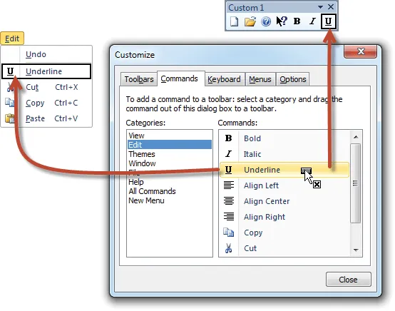
Let users rearrange command bar items by dragging commands between menus and toolbars from the customization dialog, making workspace changes quick and intuitive.
Give users runtime control over toolbar and menu commands with options to edit, copy, delete, and modify items while limiting customization to the command bars you allow.
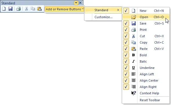
Add or remove toolbar commands dynamically so users see the commands they need without unnecessary clutter or confusion in the application workspace. It improves clarity for everyday users.
Create and modify toolbars with a clean customization interface that helps users organize commands and tailor the workspace to the way they work. It improves clarity for everyday users.
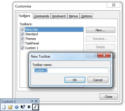
Allow users to create custom toolbars at runtime so they can personalize the application interface and keep frequently used commands within easy reach.
Command Bars allows users to specify which command bar options they want to use. It supports polished desktop command surfaces without forcing teams to build every interaction from scratch.
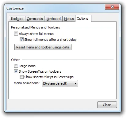
Toolbar Options
Control toolbar behavior with large or small icons, text below icons, tooltips, show and hide options, closeable toolbars, grippers, tabular layouts, and transparency.
Let users switch between large and small toolbar icons to balance workspace efficiency with readability. It adds useful detail for production desktop applications.
Display text below toolbar icons for clearer command identification. It gives users predictable access to commands while giving developers control over layout, states, and presentation.
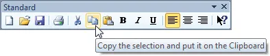
Show helpful tooltips when users hover over toolbar buttons, or disable them when a cleaner interface is preferred. It adds useful detail for production desktop applications.
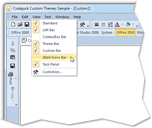
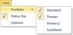
Allow users to show, hide, reset, or customize toolbars from a command bar context menu, giving them control over which tools appear in their workspace.
Control whether specific toolbars can be closed or hidden. It helps teams deliver familiar Windows navigation while keeping menus, ribbons, and toolbar interactions easy to customize.
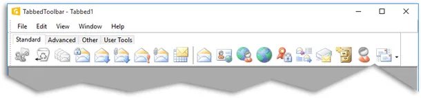
Group multiple toolbar categories into a tabbed toolbar interface, reducing clutter while keeping related commands easy to access from a compact tab layout.
Support Windows style composition effects with transparent toolbar rendering for applications that need a glass-like desktop appearance. It improves clarity for everyday users.
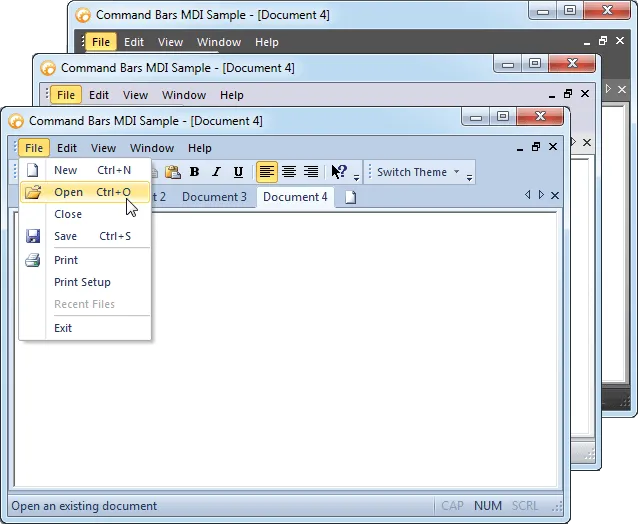
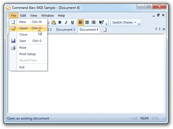
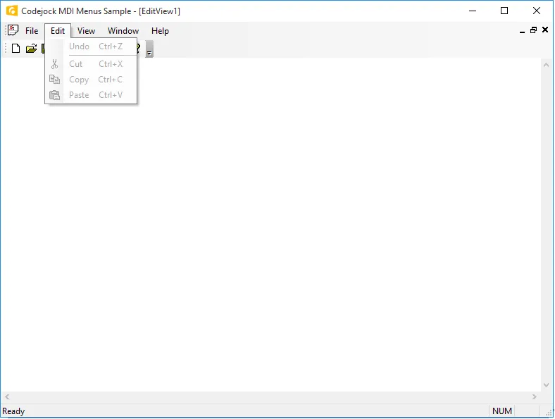
Menu Customization
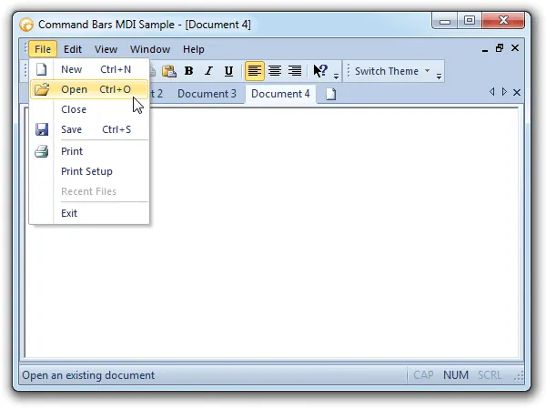
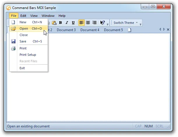
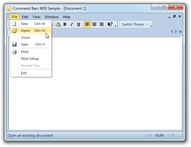
Build flexible menu experiences with intelligent menus, animations, tear-off menus and toolbars, popup menus, and context menus for application-specific commands.
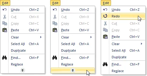
Create intelligent menus that keep less-used commands hidden until users expand the menu with a chevron button, helping reduce clutter while keeping advanced commands accessible.
Control how menus appear with built-in animation effects such as unfold, slide, fade, random, or none, giving your application a smoother and more polished menu experience.
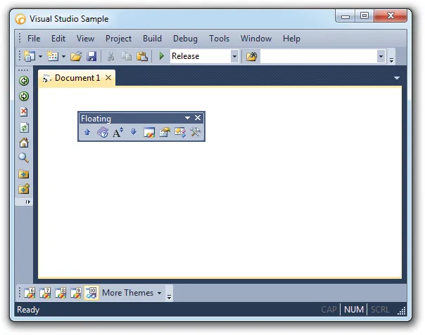
Allow users to tear off menus or toolbars and float them in separate windows, creating a more flexible workspace that can be arranged around individual preferences.
Add themed popup menu controls to command bars, giving users quick access to related commands while maintaining a consistent visual style across the application.
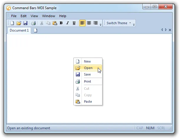
Display context menus anywhere in the application, using existing menus, command bars, or temporary popup menus that can change based on where the user right-clicks.
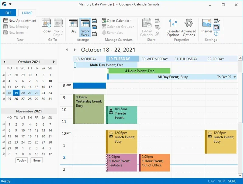
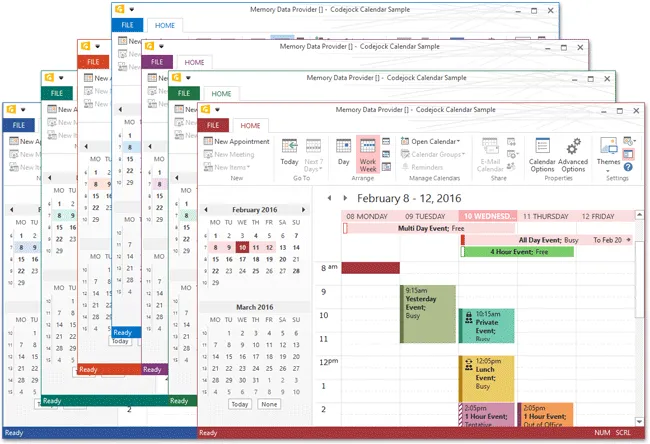
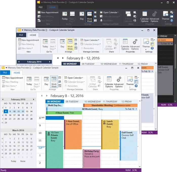
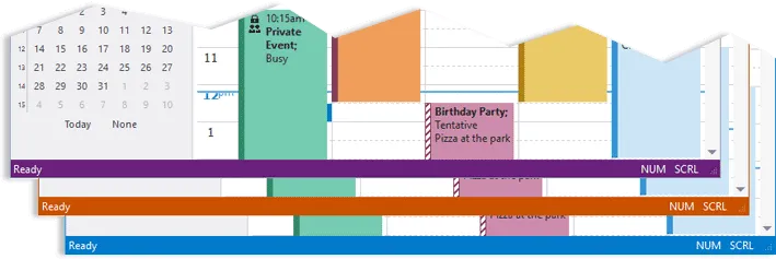
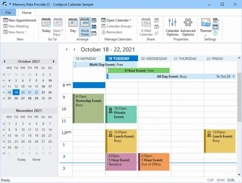
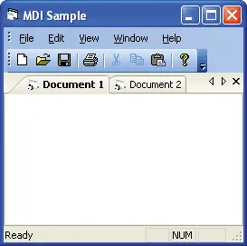
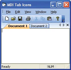
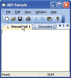
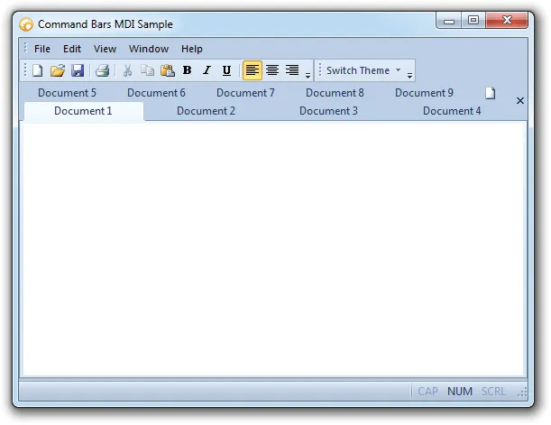
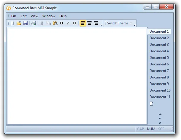
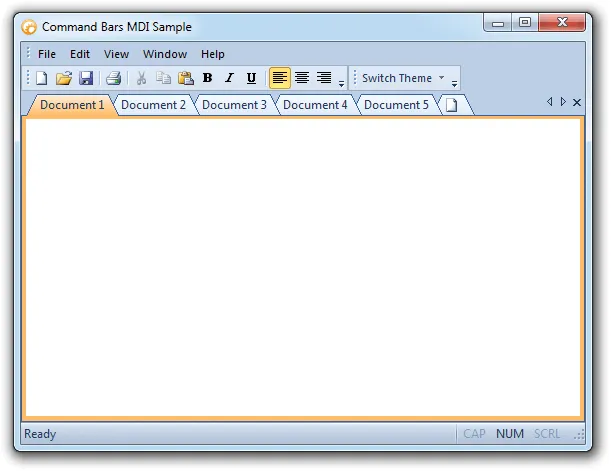
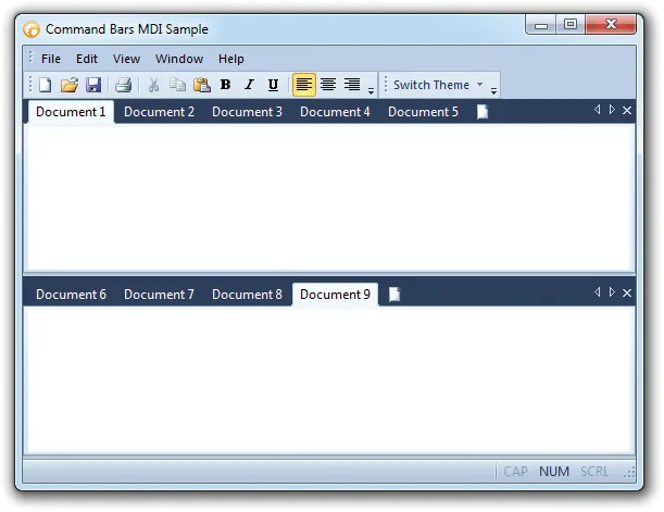
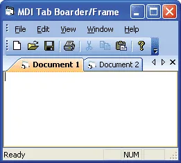
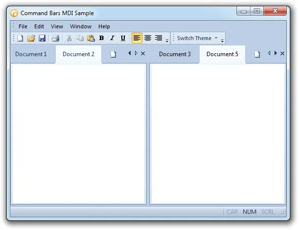
MDI Interface
Create advanced MDI interfaces with tear-offs, tabbed documents, tab groups, themed client backgrounds, auto-themed tabs, tab colors, reordering, and frame options.
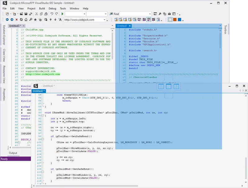
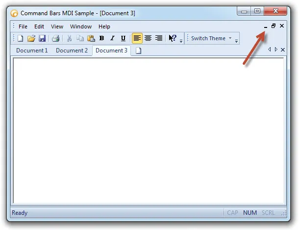
Detach MDI child windows so users can view and work with multiple documents at the same time, including across multi-monitor desktop environments. It improves clarity for everyday users.
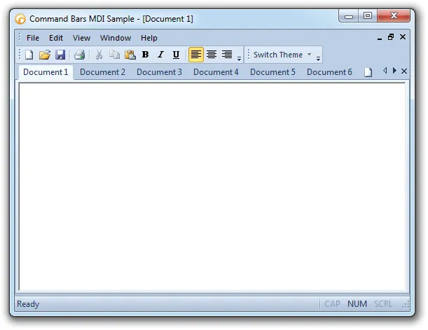
Add a professional tabbed MDI workspace with themed tabs that match the active Command Bars style. It adds useful detail for production desktop applications.
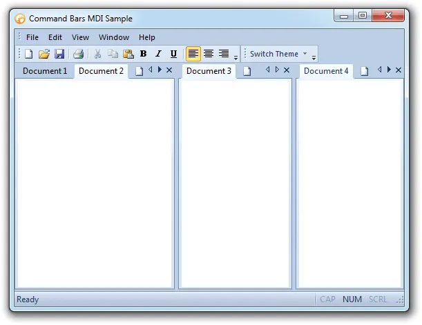
Create horizontal or vertical tab groups within the workspace. It helps teams deliver familiar Windows navigation while keeping menus, ribbons, and toolbar interactions easy to customize.
Apply a themed MDI client background that matches the active Command Bars style, or disable it to use the application form background color instead. It improves clarity for everyday users.
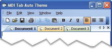
Automatically match MDI tab styling to the active Command Bars theme, or disable auto theming to use a different visual style for the tab workspace. It improves clarity for everyday users.
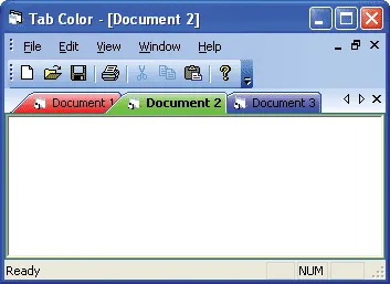
Assign custom colors to individual tabs in the workspace, making documents, categories, or important items easier to identify. It adds useful detail for production desktop applications.
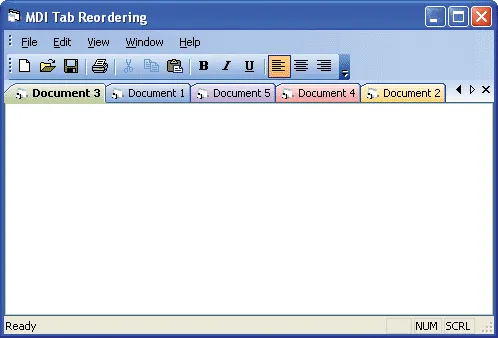
Allow users to reorder tabs by dragging them to a new position, with optional control over whether tab reordering is enabled. It adds useful detail for production desktop applications.
Control which tab workspace buttons are visible, including close buttons, navigation arrows, both, or neither, depending on your application layout. It improves clarity for everyday users.
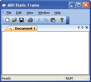
Add or remove a static frame around the tab control to give the workspace a more defined border and visual structure. It adds useful detail for production desktop applications.
Tab Customization
Customize tabbed interfaces with icons, hot tracking, selected tab emphasis, position, layout, rotation, appearance, colors, borders, and margin settings.
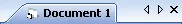
Show or hide icons in tab buttons to create a cleaner workspace or provide additional visual cues for each document, view, or tabbed item. It improves clarity for everyday users.
Highlight tabs as users move the mouse over them, making it easier to see which tab is currently under the pointer before selecting it. It improves clarity for everyday users.
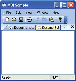
Display the selected tab caption in bold text so users can quickly identify the active document or workspace tab. It adds useful detail for production desktop applications.
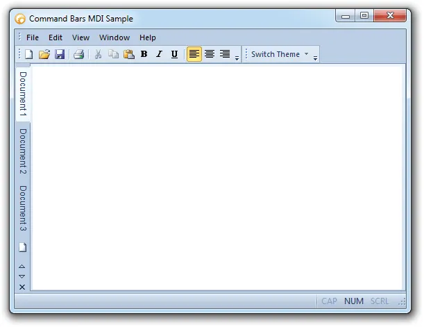
Place tabs on the top, bottom, left, or right side of the workspace, with the flexibility to change tab position through code. It adds useful detail for production desktop applications.
Choose from multiple tab layouts, including compressed, fixed, auto-size, size-to-fit, multi-row, and rotated arrangements for different workspace needs.
Display rotated tabs in the workspace to support side-positioned layouts or applications that need a more compact tab arrangement. It adds useful detail for production desktop applications.
Apply built-in tab appearance styles inspired by Excel, Office, Visual Studio, flat layouts, and other familiar interface designs. It adds useful detail for production desktop applications.
Customize tab colors with built-in color styles, including Office, Windows, and Visual Studio-inspired options for a more distinctive tabbed workspace.
Control the border around the tab client area with full frame, single-line, or borderless options to match the desired workspace appearance. It improves clarity for everyday users.
Adjust tab margins for buttons, headers, client areas, and the overall control to fine-tune spacing and layout throughout the tab workspace. It improves clarity for everyday users.
Broad compatibility across Visual Studio, Windows desktop, and Windows Server releases — from modern environments to legacy deployments.
Development environments
- Visual Studio 2022 (VC++ 17.0)
- Visual Studio 2019 (VC++ 16.0)
- Visual Studio 2017 (VC++ 15.0)
- Visual Studio 2015 (VC++ 14.0)
- Visual Studio 2013 (VC++ 12.0)
- Visual Studio 2012 (VC++ 11.0)
- Visual Studio 2010 (VC++ 10.0)
- Visual Studio 2008 (VC++ 9.0)
- Visual Studio 2005 (VC++ 8.0)
- Visual Studio .NET 2003 (VC++ 7.1)
- Visual Studio .NET 2002 (VC++ 7.0)
- Visual Studio 6.0 (VC++ 6.0)
Client operating systems
- Windows 11
- Windows 10
- Windows 8.1
- Windows 8
- Windows 7
- Windows Vista
- Windows XP
- Windows Me
- Windows 2000
- Windows 98 SE
- Windows 98
- Windows 95
Server environments
- Windows Server 2022
- Windows Server 2019
- Windows Server 2016
- Windows Server 2012 R2
- Windows Server 2012
- Windows Server 2008 R2
- Windows Server 2008
- Windows Server 2003 R2
- Windows Server 2003
- Windows 2000
- Windows NT 4.0
Baseline development and runtime support
- Compiler: Visual C++ 6.0
- Runtime: Windows 95 / NT 4.0