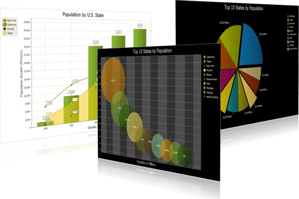
Chart Component for Data Visualization
for v24.3.0
Chart for is easy to use and can be added to your project with only a few lines of code. All charts are fully customizable allowing you to create virtually any charting style.
Chart is included in Toolkit Pro for
Key Features
Codejock Chart for provides several charting styles to choose from including Bar, Point, Line, Pie, Radar / Polar, Area, Financial, Gantt, Funnel / Pyramid, Graphing and Analysis with many features available.
Chart is included with the Toolkit Pro for evaluation.
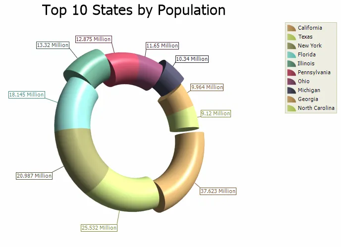
Pie Chart
Present proportional data with clear 2D, 3D, doughnut, and torus chart styles designed to make category comparisons easy to understand at a glance.
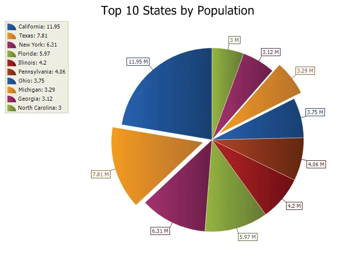
Display data as proportional slices of a pie, where each slice represents a percentage of the whole. It adds useful detail for production desktop applications.
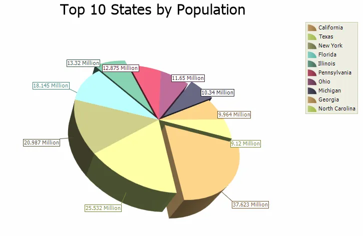
Present proportional data in a 3D pie layout with slices sized by value. It makes data easier to compare, explain, and explore while preserving flexible presentation options for developers.
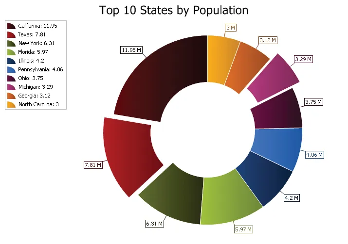
Display proportional data like a pie chart, but with a blank center that creates a cleaner doughnut-style appearance. It adds useful detail for production desktop applications.
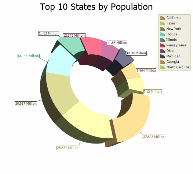
Show proportional data in a 3D doughnut layout with a blank center and value-based slices. It turns raw values into a clearer visual story for dashboards, reports, and analytical screens.
Display proportional data in a 3D torus style with configurable body thickness. It turns raw values into a clearer visual story for dashboards, reports, and analytical screens.
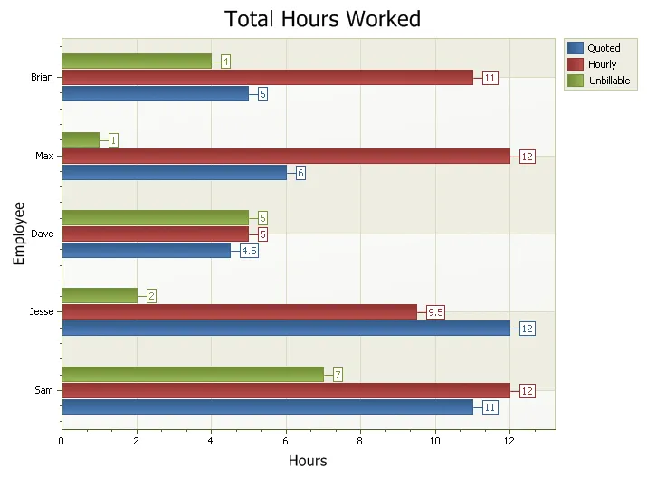
Bar Chart
Compare values across categories with flexible bar chart options, including range bars, stacked bars, 100% stacked bars, and rotated layouts.
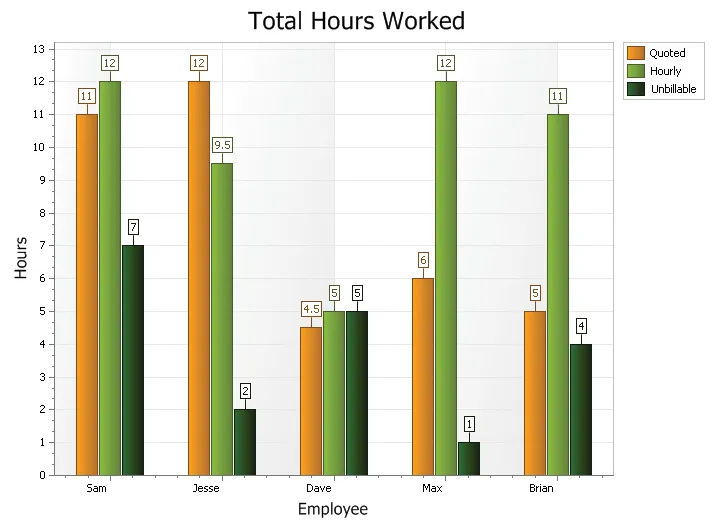
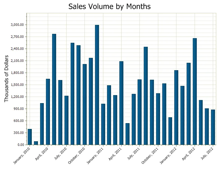
Compare discrete or continuous values using rectangular bars sized in proportion to the data they represent. It adds useful detail for production desktop applications.
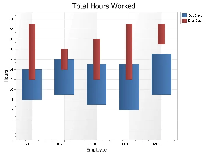
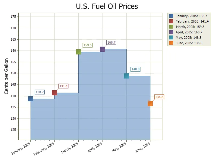
Display values or events with a defined beginning and end using range bars. It turns raw values into a clearer visual story for dashboards, reports, and analytical screens.
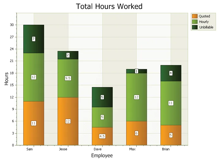
Compare parts of a whole by stacking related values within each bar. It helps developers present complex data clearly while keeping chart behavior customizable for real reporting workflows.
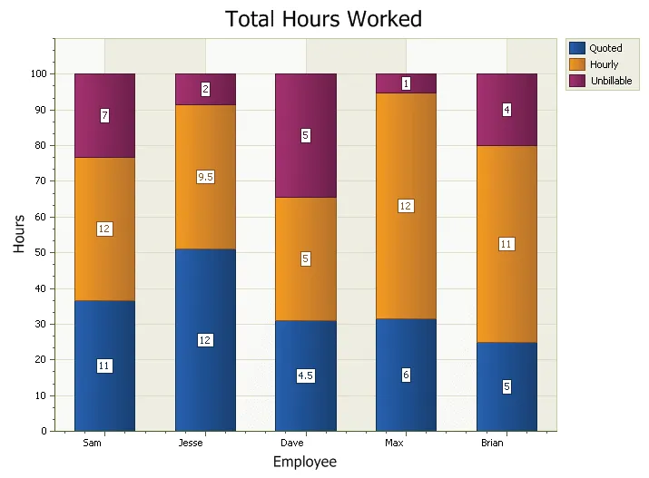
Display stacked bar values as proportional parts of a defined total, commonly 100%. It turns raw values into a clearer visual story for dashboards, reports, and analytical screens.
Rotate bar charts around the axis to better fit your layout or presentation style. It turns raw values into a clearer visual story for dashboards, reports, and analytical screens.
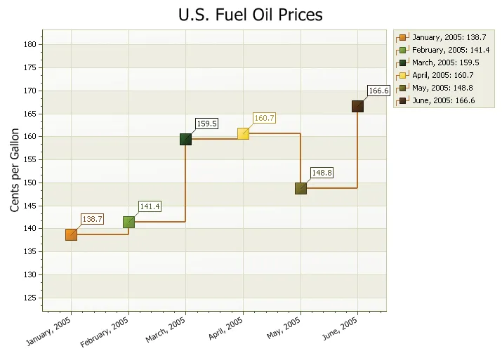
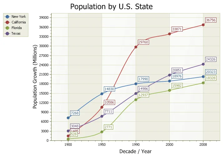
Line Chart
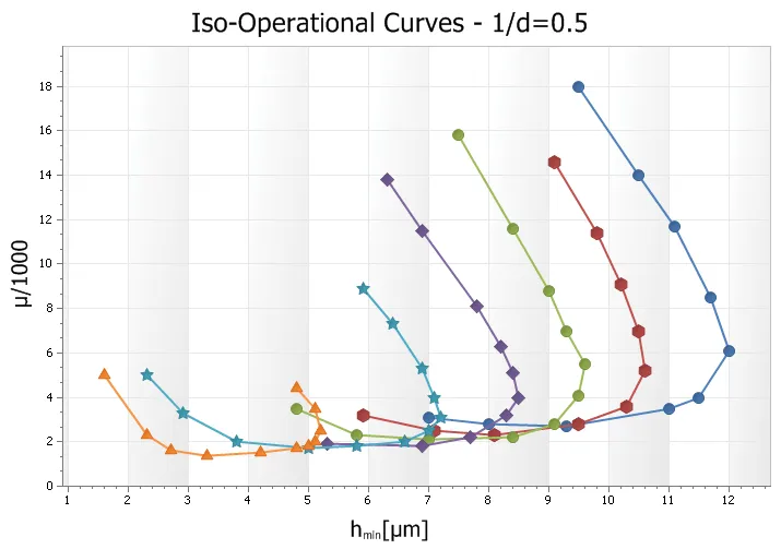
Visualize trends, changes, and continuous data with line chart styles that include scatter lines, fast lines, step lines, and smooth spline presentations.
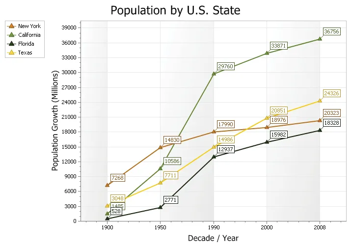
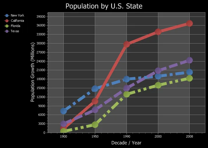
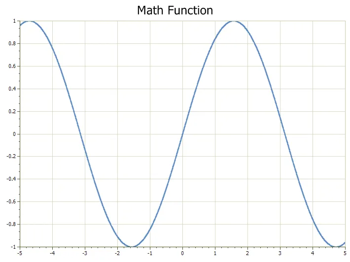
Show a series of data points connected by straight line segments. It helps developers present complex data clearly while keeping chart behavior customizable for real reporting workflows.
Plot data values in the exact order they are entered and connect the points with a line. It turns raw values into a clearer visual story for dashboards, reports, and analytical screens.
Improve rendering performance for large data sets with a fast line style designed to draw quickly. It adds useful detail for production desktop applications.
Display data using vertical and horizontal line segments instead of direct diagonal connections. It adds useful detail for production desktop applications.
Show data points connected by smooth, flowing spline segments. It helps developers present complex data clearly while keeping chart behavior customizable for real reporting workflows.
Funnel / Pyramid
Show staged processes, ranking, conversion paths, and proportional relationships with 2D and 3D funnel and pyramid chart styles.
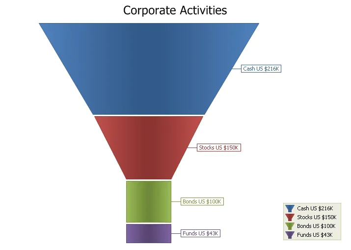
Display data in a funnel shape where each section is sized relative to the others. It turns raw values into a clearer visual story for dashboards, reports, and analytical screens.
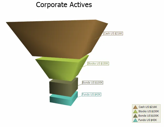
Present funnel data in a 3D layout with sections sized relative to each other. It turns raw values into a clearer visual story for dashboards, reports, and analytical screens.
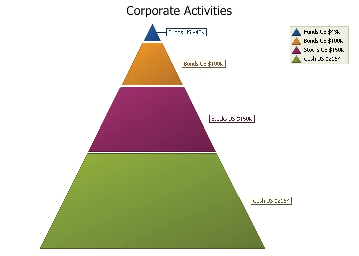
Display data in a pyramid shape with sections sized relative to each other. It turns raw values into a clearer visual story for dashboards, reports, and analytical screens.
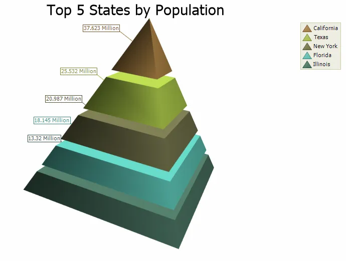
Present proportional data in a 3D pyramid layout with configurable base edges and optional rounded styling. It adds useful detail for production desktop applications.
Radar / Polar
Compare multivariable data in circular layouts using radar, polar, and spline-based chart types ideal for patterns, profiles, and category relationships.
Plot values around a circular radar layout using poles that radiate from the center. It turns raw values into a clearer visual story for dashboards, reports, and analytical screens.
Connect radar data points with lines around a circular layout, making it easy to compare multiple variables from a shared center point. It improves clarity for everyday users.
Fill the area enclosed by radar data points to emphasize the shape and magnitude of multiple variables. It adds useful detail for production desktop applications.
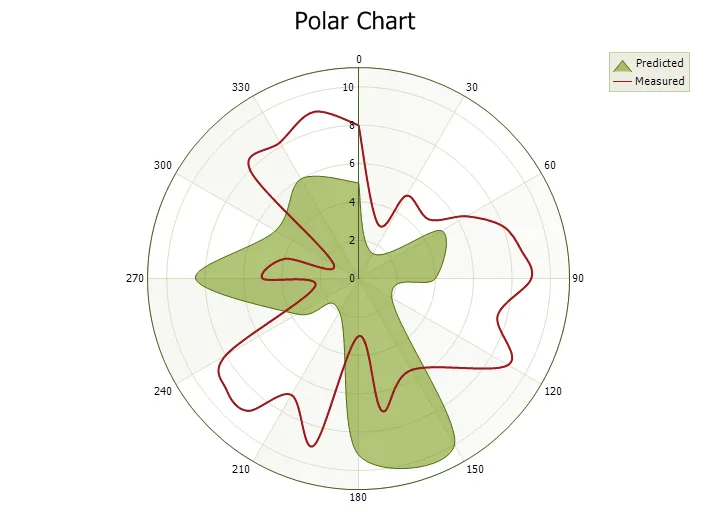
Plot data using polar coordinates where angle and distance define each point. It turns raw values into a clearer visual story for dashboards, reports, and analytical screens.
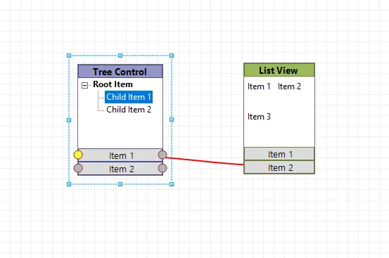
Flow Graph
Create connected visual diagrams with support for nodes, connection types, page transitions, and embedded controls for interactive flow-based presentations.
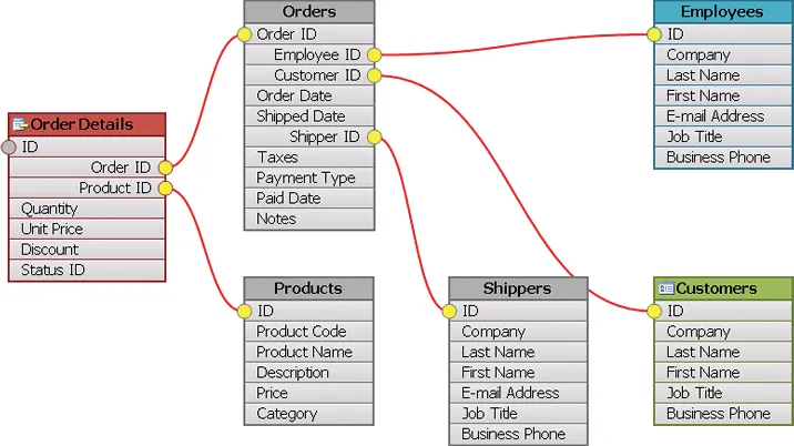
Display relationship graphs using nodes, connections, and connection points. It turns raw values into a clearer visual story for dashboards, reports, and analytical screens.
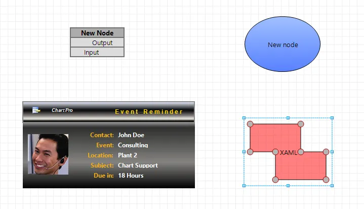
Build flow diagrams with a flexible mix of node types, including table nodes, picture nodes, geometry nodes, and custom XAML nodes. It adds useful detail for production desktop applications.
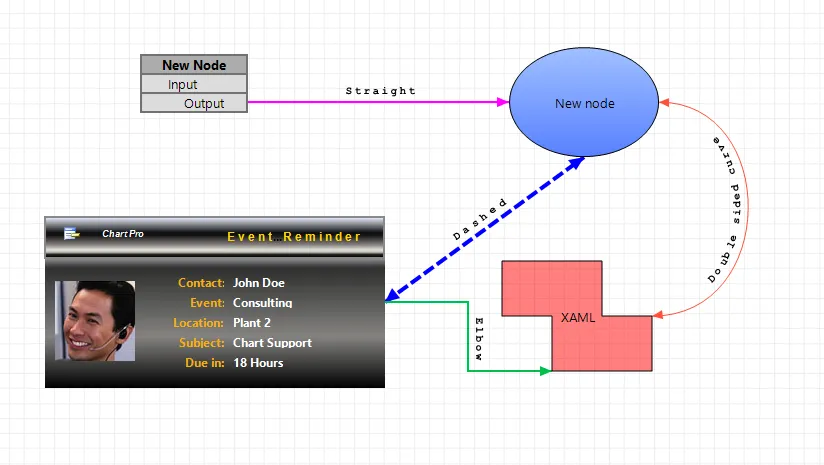
Connect shapes with multiple connection types to show logical relationships and direction between nodes. It adds useful detail for production desktop applications.
Move between Flow Graph pages using smooth transitions that combine scaling and fading effects. It adds useful detail for production desktop applications.
Embed controls or windows directly inside Flow Graph nodes to create richer interactive diagrams. It adds useful detail for production desktop applications.
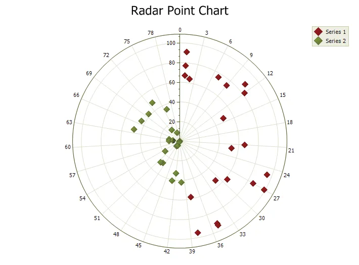
Point Chart
Plot individual values and data relationships with point and bubble charts that make scattered data, clusters, and value distribution easy to visualize.
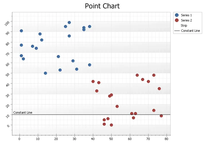
Plot individual data points on a Cartesian grid using x and y coordinates. It turns raw values into a clearer visual story for dashboards, reports, and analytical screens.
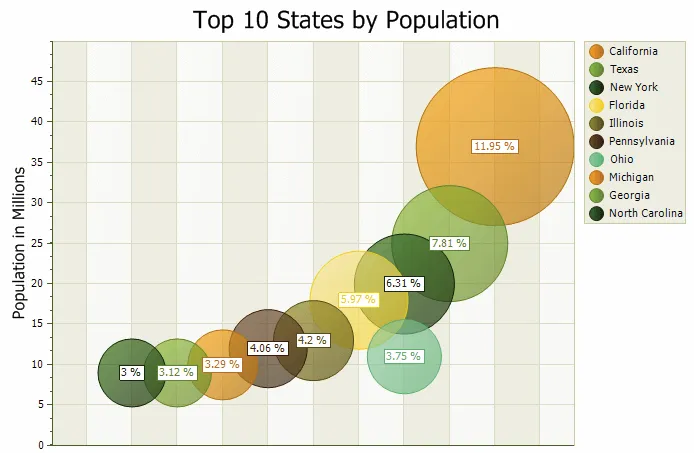
Display point chart data as bubbles on a Cartesian grid, with each bubble representing a plotted value. It adds useful detail for production desktop applications.
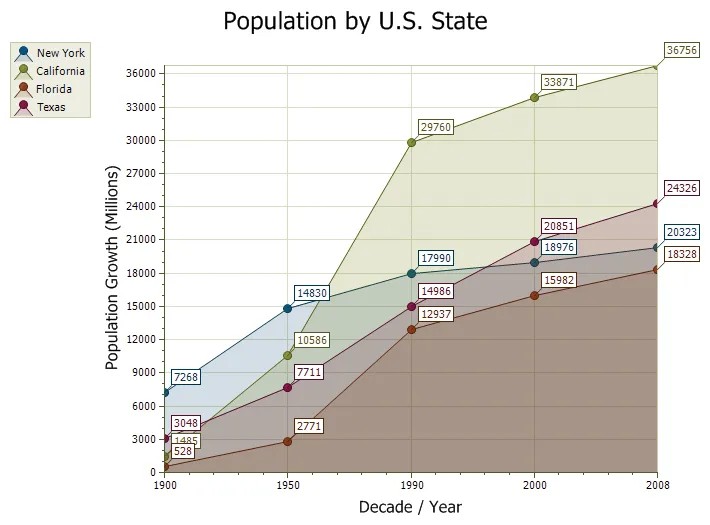
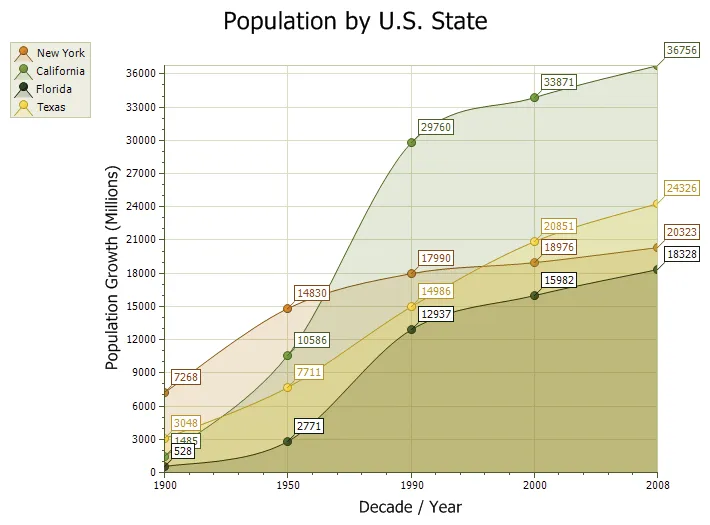
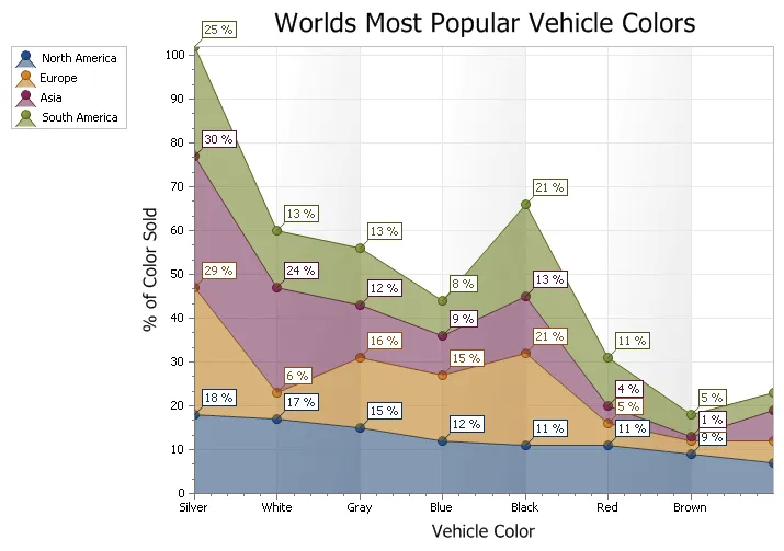
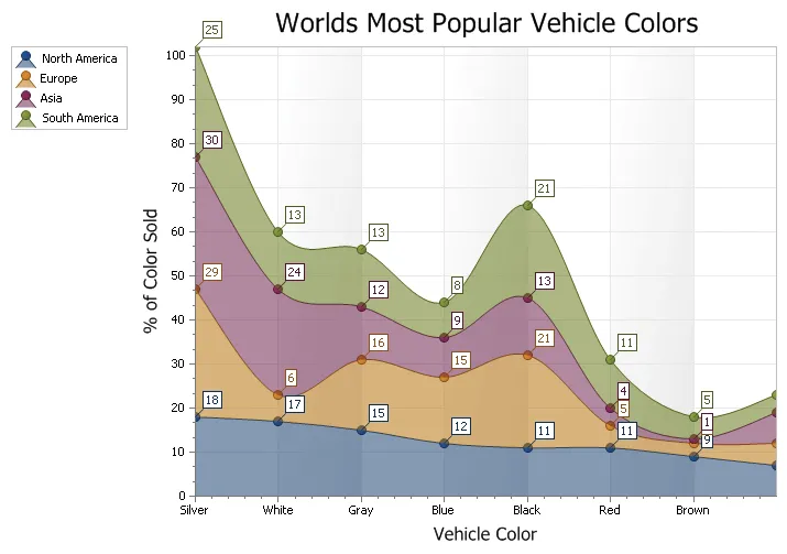
Area Chart
Highlight volume, trends, and cumulative values with area chart styles including spline, stacked, 100% stacked, range, and step area options.
Display data as filled areas beneath line segments, with each series shown in a different color. It adds useful detail for production desktop applications.
Show accumulated values with smooth spline curves and filled areas beneath each series. It turns raw values into a clearer visual story for dashboards, reports, and analytical screens.
Display multiple filled data series stacked on top of each other to show cumulative totals over time. It adds useful detail for production desktop applications.
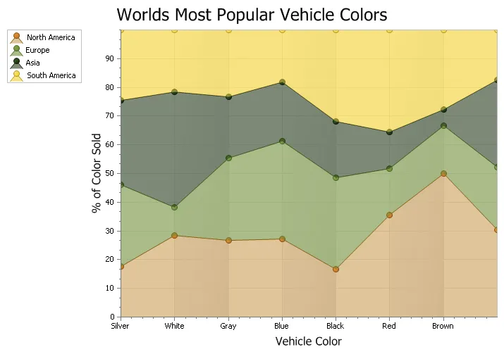
Show stacked area values as proportional parts of a 100% total for each category or point. It turns raw values into a clearer visual story for dashboards, reports, and analytical screens.
Display stacked area data with smooth spline curves for a more polished trend presentation. It turns raw values into a clearer visual story for dashboards, reports, and analytical screens.
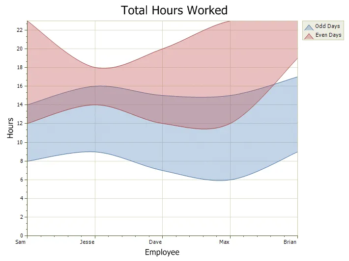
Display a filled area between minimum and maximum values for each point. It makes data easier to compare, explain, and explore while preserving flexible presentation options for developers.
Show area data using vertical and horizontal segments that form step-like changes between points. It adds useful detail for production desktop applications.
Financial
Display financial market data with high-low and candlestick chart types designed for pricing, trading, and time-based financial analysis.
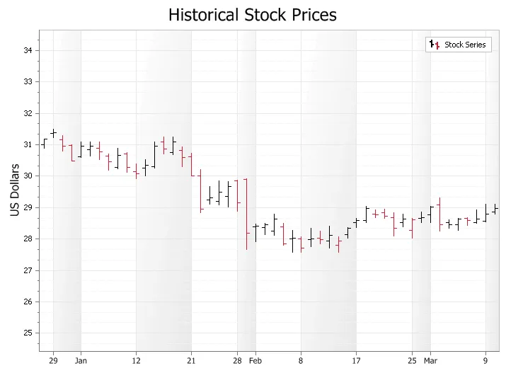
Display financial trends using high and low values, commonly for stock market pricing. It turns raw values into a clearer visual story for dashboards, reports, and analytical screens.
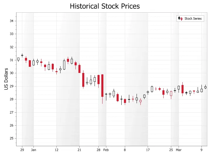
Display financial data with candlesticks that show high, low, open, and close values for each point. It adds useful detail for production desktop applications.
Analysis
Add analytical context to your charts with trend lines and error bars that help users interpret patterns, variance, and data confidence more effectively.
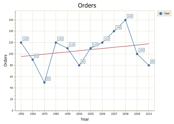
Add trend lines to show the general direction of a data set over time. It makes data easier to compare, explain, and explore while preserving flexible presentation options for developers.
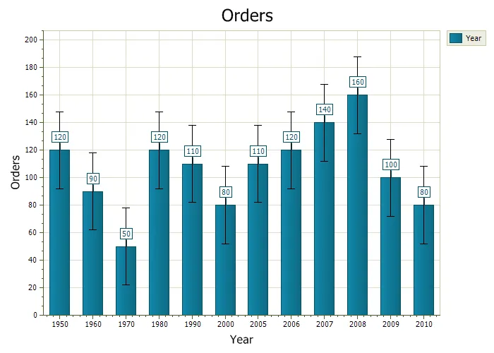
Use error bars to show uncertainty, variability, or possible error in reported values. It turns raw values into a clearer visual story for dashboards, reports, and analytical screens.
Gantt Chart
Visualize project schedules, task timelines, milestones, and progress using Gantt chart support designed for planning and timeline-based reporting.
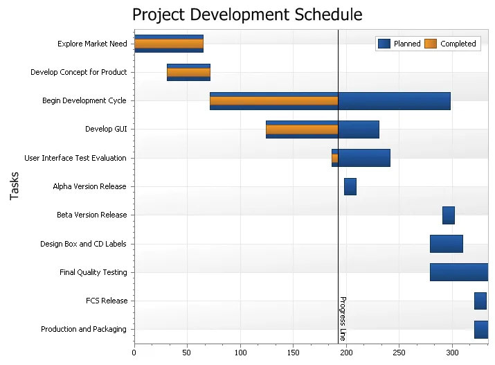
Display project tasks and schedules using a range bar layout over time. It makes data easier to compare, explain, and explore while preserving flexible presentation options for developers.
Features
Enhance chart presentations with secondary axes, zooming, scrolling, multiple diagrams, combined series, line styles, markup titles, scales, and 3D customization.
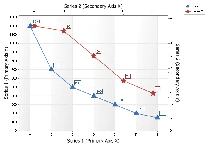
Plot data series with very different values or data types on secondary axes so they remain visible in one chart. It adds useful detail for production desktop applications.
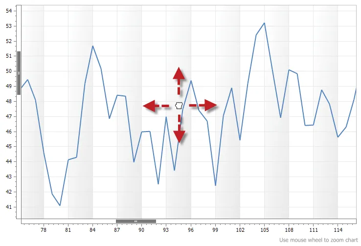
Allow users to zoom and scroll through charts to inspect large data sets more easily. It turns raw values into a clearer visual story for dashboards, reports, and analytical screens.
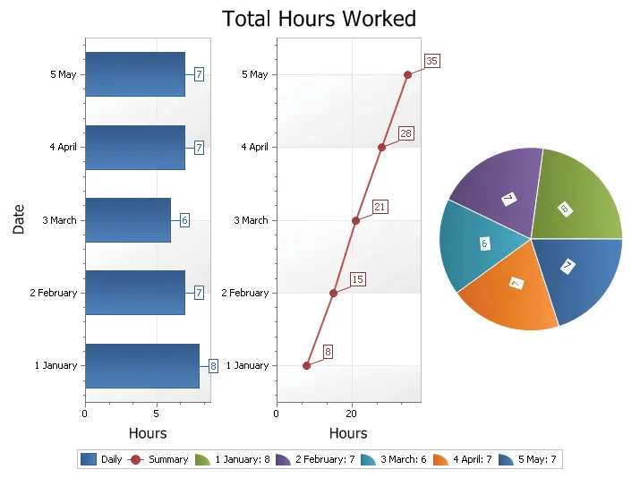
Display multiple chart diagrams in separate regions within the same view. It makes data easier to compare, explain, and explore while preserving flexible presentation options for developers.
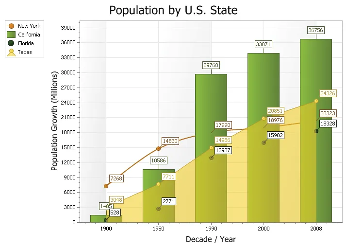
Combine two or more chart types in a single presentation to show different kinds of data together. It adds useful detail for production desktop applications.
Customize chart lines with supplied line styles, including dashed patterns and adjustable thickness. It adds useful detail for production desktop applications.
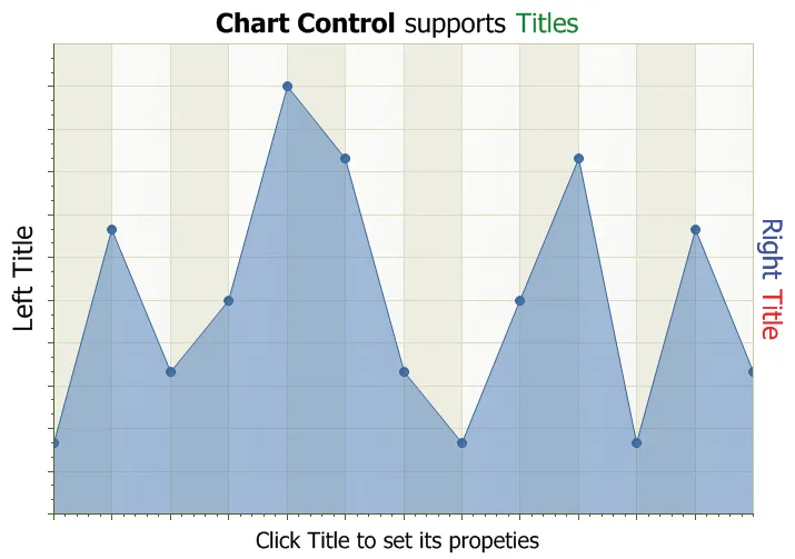
Add multiple chart titles docked to the top, bottom, left, or right, with support for stacked titles in the same location. It adds useful detail for production desktop applications.
Display date values along an axis using their text representation for clearer time-based charting. It adds useful detail for production desktop applications.
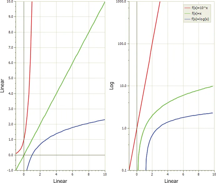
Use a logarithmic scale to display data that spans a very large range of values. It turns raw values into a clearer visual story for dashboards, reports, and analytical screens.
Improve chart performance with virtual points when a series contains a very large number of data points. It adds useful detail for production desktop applications.
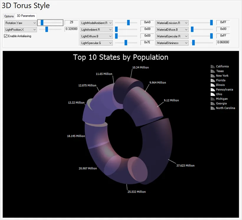
Customize 3D charts with manual or programmatic rotation and zooming, plus lighting, transparency, and material settings. It adds useful detail for production desktop applications.
Printing
Share chart results with built-in printing, image saving, and XML import/export support for reporting, documentation, and data exchange workflows.
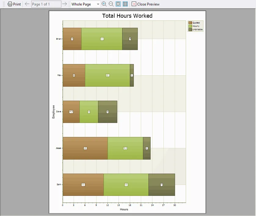
Print any chart, including Flow Graph charts, using your preferred printing method. It turns raw values into a clearer visual story for dashboards, reports, and analytical screens.
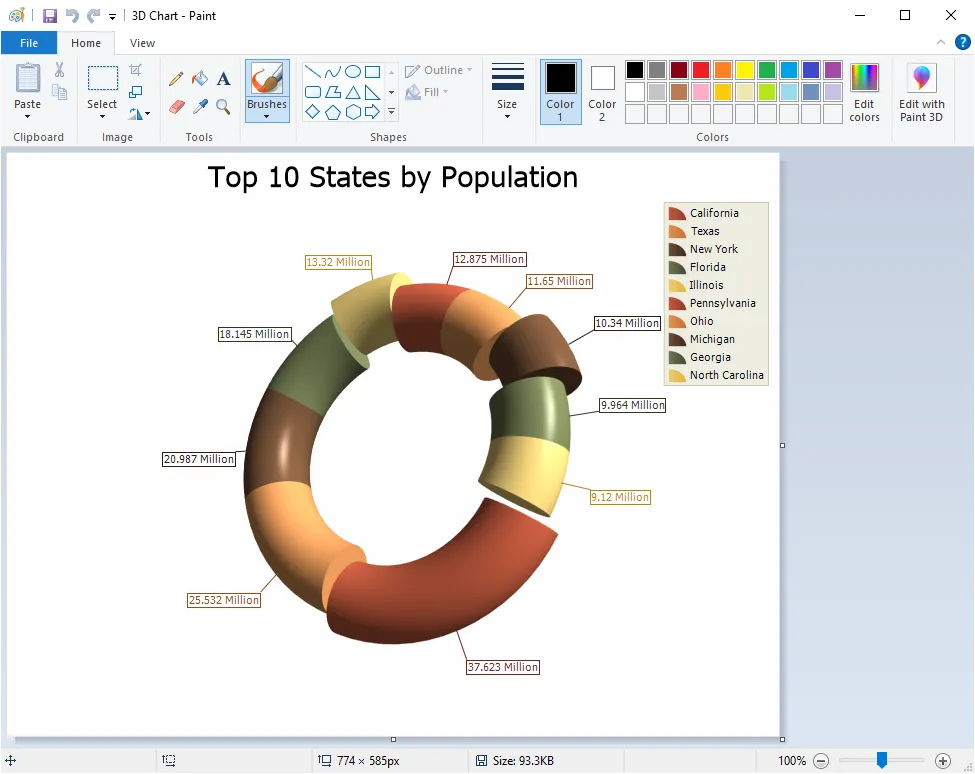
Save any chart, including Flow Graph charts, as an image file for reuse outside the application. It adds useful detail for production desktop applications.
Serialize and deserialize charts, including Flow Graph charts, using XML. It makes data easier to compare, explain, and explore while preserving flexible presentation options for developers.
Utilities
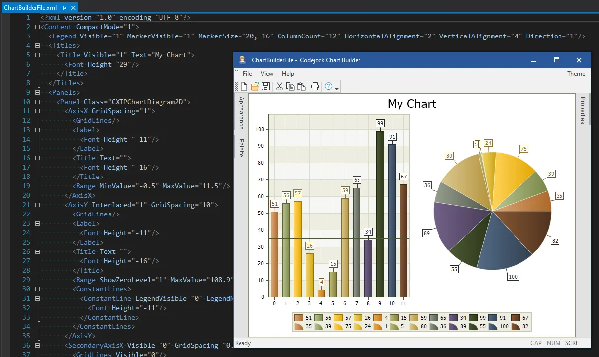
Speed chart creation and configuration with the Chart Builder Tool, making it easier to design, customize, and refine chart presentations.
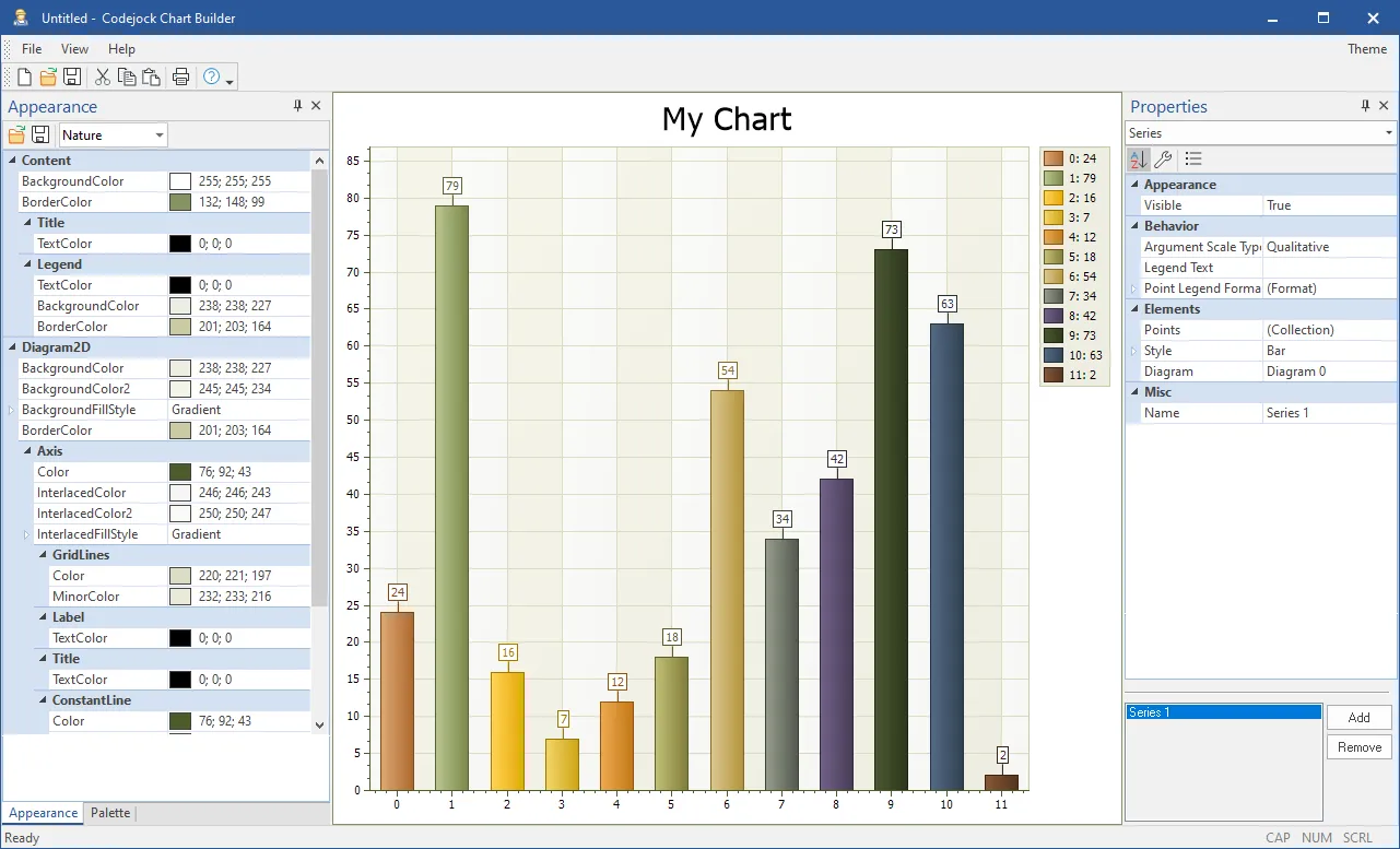
Build and customize charts with the supplied Chart Builder WYSIWYG editor. It turns raw values into a clearer visual story for dashboards, reports, and analytical screens.
Broad compatibility across Visual Studio, Windows desktop, and Windows Server releases — from modern environments to legacy deployments.
Development environments
- Visual Studio 2022
- Visual Studio 2019
- Visual Studio 2017
- Visual Studio 2015
- Visual Studio 2013
- Microsoft Access
- Visual Studio 2012
- Visual Studio 2010
- Visual Studio 2008
- Visual Studio 2005
- Visual Studio .NET 2003
- Visual Studio .NET 2002
- Visual Basic 6.0
Client operating systems
- Windows 11
- Windows 10
- Windows 8.1
- Windows 8
- Windows 7
- Windows Vista
- Windows XP
- Windows Me
- Windows 2000
- Windows 98 SE
- Windows 98
- Windows 95
Server environments
- Windows Server 2022
- Windows Server 2019
- Windows Server 2016
- Windows Server 2012 R2
- Windows Server 2012
- Windows Server 2008 R2
- Windows Server 2008
- Windows Server 2003 R2
- Windows Server 2003
- Windows 2000
- Windows NT 4.0
Baseline development and runtime support
- Compiler: Visual Basic 6.0
- Runtime: Windows 95 / NT 4.0