Features Tour
Pie Chart
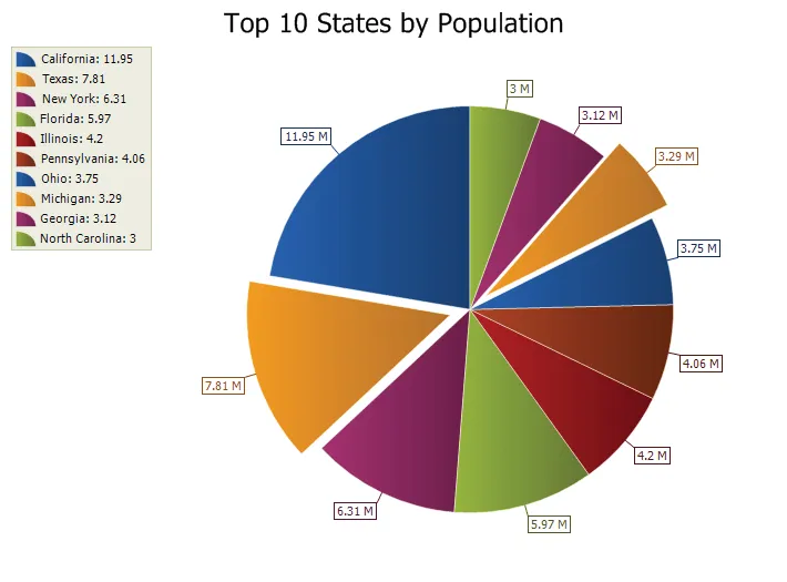
A pie chart displays a series of data as "slices" of a "pie". The data in the pie chart will be divided up into slices, each represents a percentage of the pie. The size of the slice will be proportional to the data it represents and each slice will be combined to represent some whole value.
3D Pie Chart
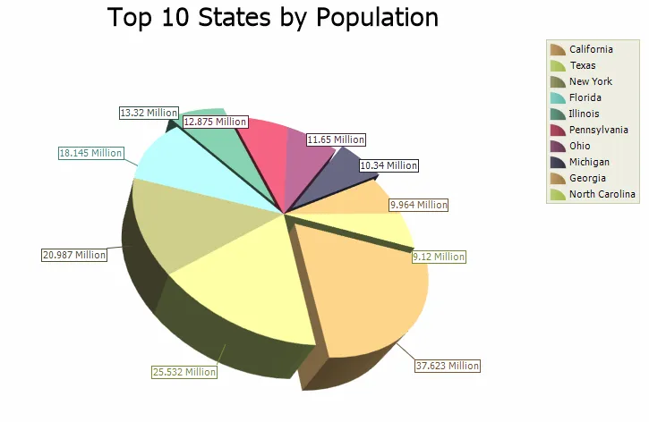
Just like a 2D Pie chart, the 3D Pie chart displays a series of data as "slices" of a "pie". The data in the pie chart will be divided up into slices, each represents a percentage of the pie. The size of the slice will be proportional to the data it represents and each slice will be combined to represent some whole value. The chart can be rotated and zoomed in and out, both manually and programmatically, and a number of additional lighting, transparency and material settings are available for making truly realistic charts.
Doughnut Chart
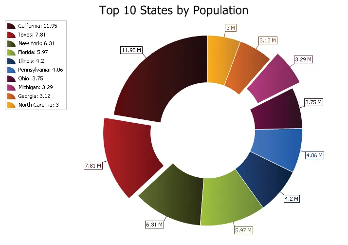
A Doughnut chart functions exactly the same as a pie chart, only there is a blank hole in the middle of the pie.
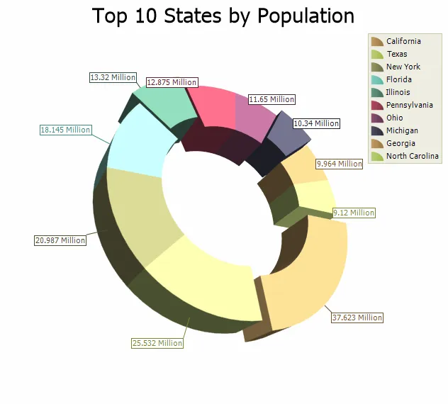
3D Doughnut Chart
A 3D Doughnut chart functions exactly the same as a 3D Pie chart, only there is a blank hole in the middle of the pie. The chart can be rotated and zoomed in and out, both manually and programmatically, and a number of additional lighting, transparency and material settings are available for making truly realistic charts.
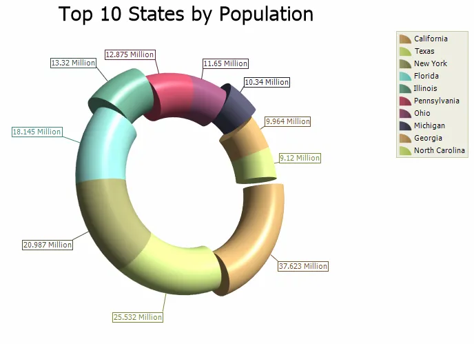
3D Torus Chart
A 3D Torus chart functions exactly the same as a 3D Pie chart. The thickness of the torus body is configurable. The chart can be rotated and zoomed in and out, both manually and programmatically, and a number of additional lighting, transparency and material settings are available for making truly realistic charts.
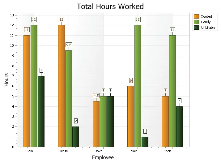
Standard Bar Chart
A bar chart displays data with rectangular "bars" with lengths relative to the data they symbolize. Generally a bar chart is used to display discontinuous data (data that has a discrete value), however it can also be used for continuous data. Examples of discontinuous data would be "car color" or "tire size", examples of continuous data would be "population" or "age".
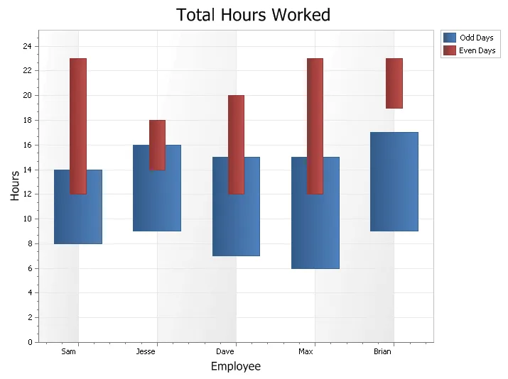
Range Bar Chart
A Range Bar is used to display data\events that have a finite beginning and end value. The range bar can be displayed both overlapped or side-by-side so the different ranges of data can easily be compared to each other.
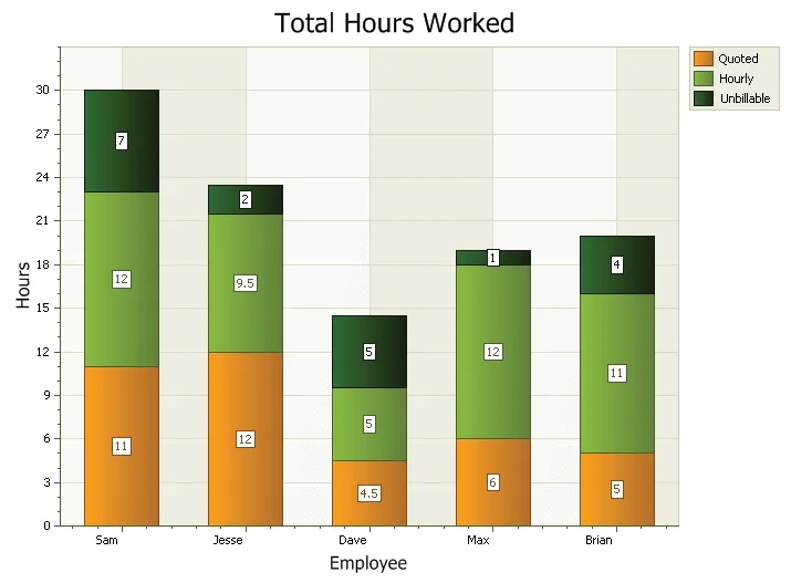
Stacked Bar Chart
A stacked bar chart is similar to a standard bar chart except the bars for a given argument will be stacked on top of each other. You can stack the bars vertically or horizontally. This type of chart is used to compare the relationship of parts to the whole. Each bar is used to represent a total. For example, you could show the number of males\females that prefer each of the 4 major sports (football, basketball, hockey, baseball) in a stacked bar chart. There would be 4 stacked bars, each divided into 2 categories (male\female).
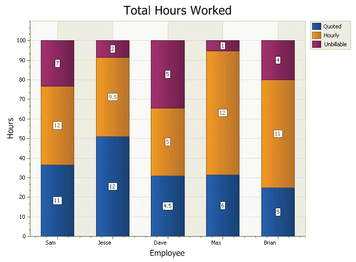
100% Stacked Bars Chart
A stacked bar chart is similar to a standard bar chart except the bars for a given argument will be stacked on top of each other. You can stack the bars vertically or horizontally. This type of chart is used to compare the relationship of parts to the whole. The StackHeight is used to make the bars 100%, but can be 80 for example. The chart will use the lowest value that a series has set and ignore all the larger values.
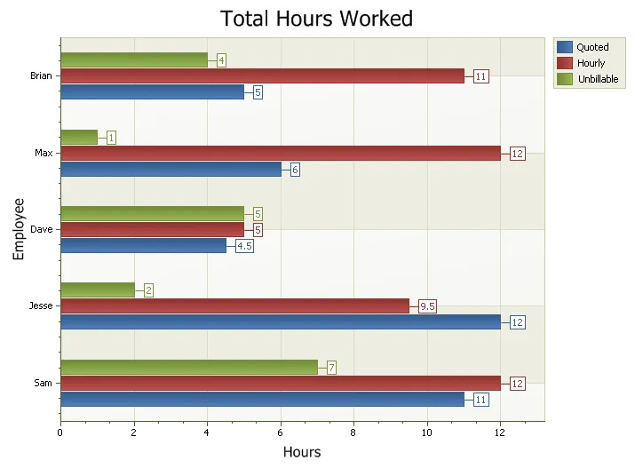
Rotated Bars Chart
A bar chart can be rotated about its axis.
Line Chart
A line chart is is used to show a series of data points connected by straight line segments. Charts of this type are generally used to illustrate trends in data over a period of time.
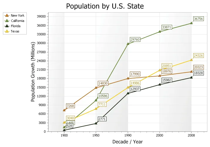
Scatter Line Chart
A Scatter chart is similar to a line chart, only the scatter chart will plot the data values in the exact order that they are entered and connect the plots with a line (unlike the line chart which will order the data based on the x and y axis). Scatter charts can be used for scientific data or can be used as a trend chart.
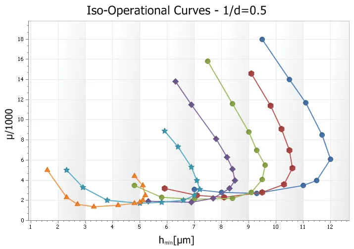
Fast Line Chart
Fast line is a variation of the normal line style that considerably improves performance by reducing the time it takes to draw the line. The increased speed comes at the cost of not displaying the plot points in the line and you can't display labels (among other things done behind the scenes). With fast line you can also turn off antialiasing. Common uses for a fast line might be a systems performance monitor that shows a chart in real time. Or possibly a chart that displays thousands of data points in a single view (might show a trend over 10,000 years in a single view).
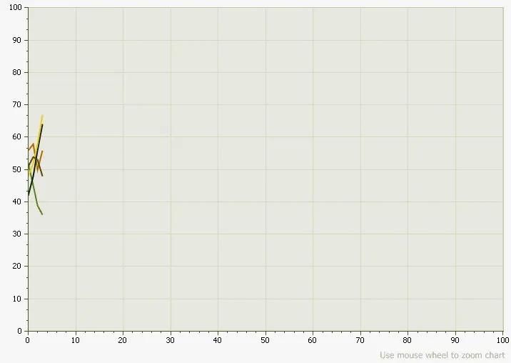
Step Line Chart
The Step Line chart is another form of a Line chart. Unlike the traditional Line chart, Step Line charts only use vertical and horizontal lines to connect the data points forming what looks like steps.
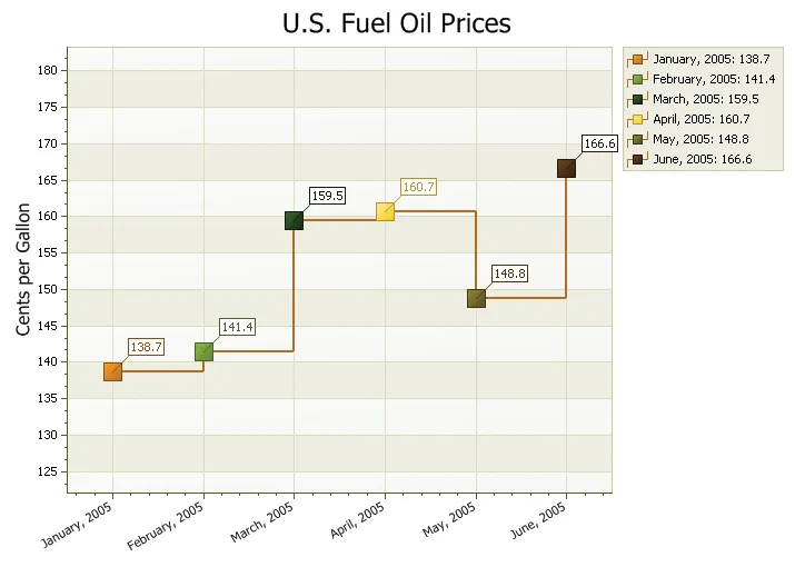
Spline Chart
A spline chart is used to show information as a series of data points connected by smooth flowing "spline" segments. The spline will draw a smooth flowing line through all data points in the data set. Charts of this type are generally used to illustrate trends in data over a period of time.
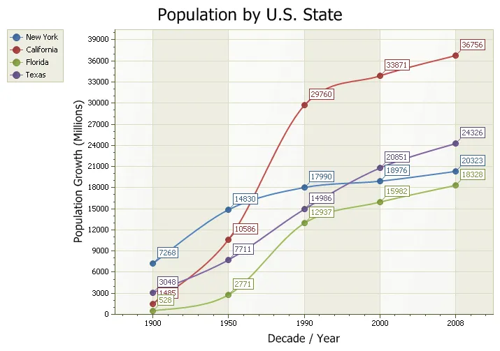
Funnel Chart
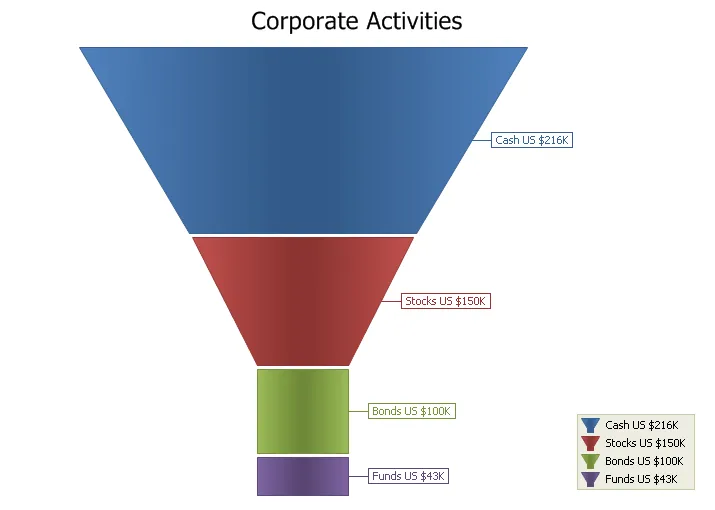
The Funnel chart displays a series of data in a funnel shape. The top portion of the funnel will typically contain the largest percentage of the data, while the bottom will "funnel" down to the smallest percentage, however the funnel will allow data to be added in any combination to suit your needs. The size of the funnel sections are all relative to each other and the order does not matter.
3D Funnel Chart
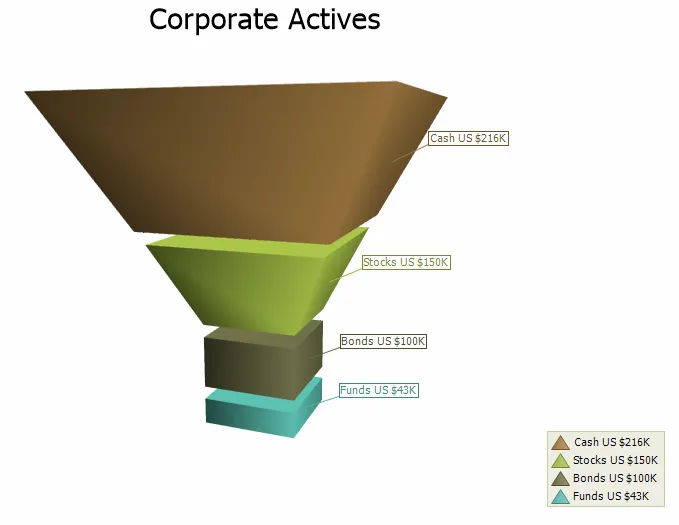
Just like the 2D Funnel, the 3D Funnel chart displays a series of data in a funnel shape. The top portion of the funnel will typically contain the largest percentage of the data, while the bottom will "funnel" down to the smallest percentage, however the funnel will allow data to be added in any combination to suit your needs. The size of the funnel sections are all relative to each other and the order does not matter. The number of funnel base edges is configurable, as well as it is possible to make it round. The chart can be rotated and zoomed in and out, both manually and programmatically, and a number of additional lighting, transparency and material settings are available for making truly realistic charts.
Pyramid Chart
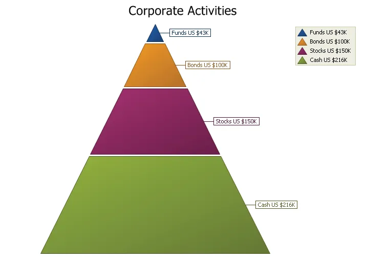
The Pyramid chart displays a series of data in a pyramid shape. The size of the pyramid sections are all relative to each other and the order does not matter. You can have a "top heavy" pyramid where the largest section is the top section or any other combination.
3D Pyramid Chart
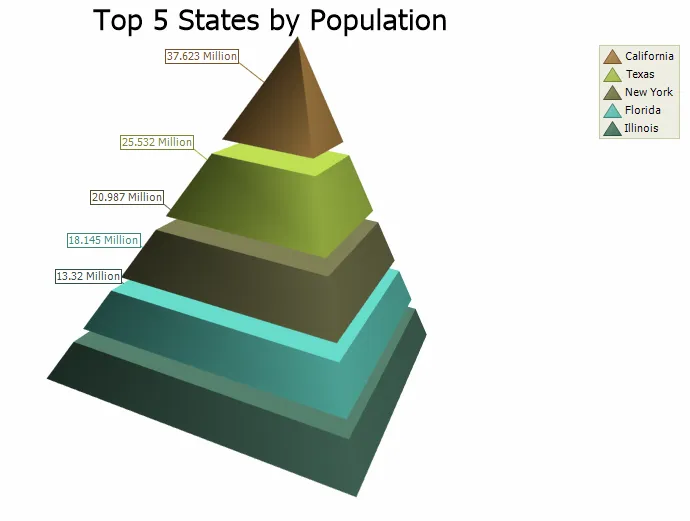
Just like the 2D Pyramid, the 3D Pyramid chart displays a series of data in a pyramid shape. The size of the pyramid sections are all relative to each other and the order does not matter. The number of pyramid base edges is configurable, as well as it is possible to make it round. The chart can be rotated and zoomed in and out, both manually and programmatically, and a number of additional lighting, transparency and material settings are available for making truly realistic charts.
Radar Point Chart
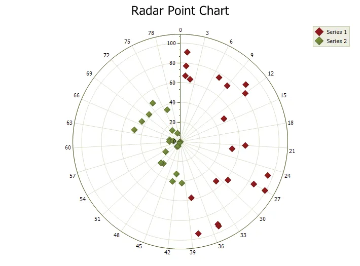
Radar charts are basically another form of a line chart, only it is represented as a radar. Data is drawn as a line around the center of the radar. Radar charts use "poles" to display data. Each data point gets displayed on one of these poles radiating from the center.
Radar Line Chart
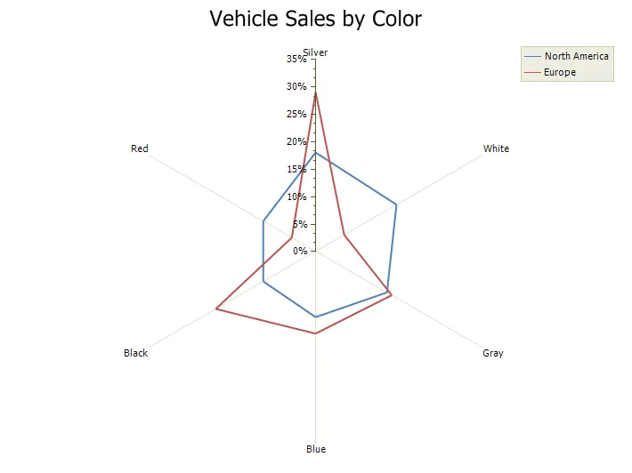
Radar charts are basically another form of a line chart, only it is represented as a radar. Data is drawn as a line around the center of the radar. Radar charts use "poles" to display data. Each data point gets displayed on one of these poles radiating from the center.
Radar Area Chart
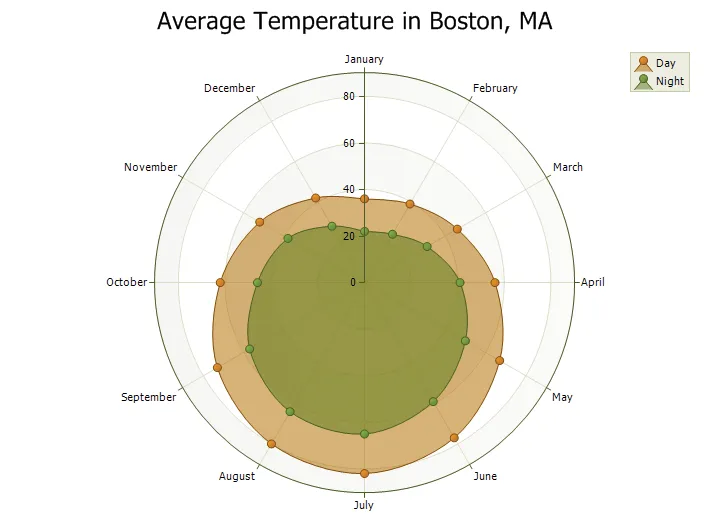
Radar charts are basically another form of a line chart, only it is represented as a radar. Data is drawn as a line around the center of the radar. Radar charts use "poles" to display data. Each data point gets displayed on one of these poles radiating from the center.
Polar Spline Chart
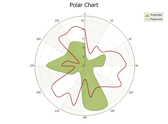
Polar charts use polar coordinates to plot data. The X-Axis is a circle and the values are normally fixed in degrees (0-360) or radians typical polar charts, but the chart will allow you to set any range desired. Data is plotted in terms of values and angles, where "x" is the angle/rotation and "y" is distance from the center of the circle.
Flow Graph Control
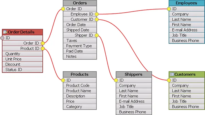
The Flow Graph control is also included with the chart, which is a graphing control used to display relationship graphs. This control can be thought of as a tool to visually display the relationships for a relational database. The control consists of "Nodes" that can be thought of as tables in a database. The Nodes contain "connections" (fields of a table). The connections can have many "connection points" that can be used to link the connections between different nodes (i.e. linking an invoice table to a customer table via a connection). Nodes and connection lines can be dragged around the graph allowing the user to fully customize the look of their relationship diagram. The control also supports undo\redo edit operations in the case you allow the nodes to be moved, renamed, connections added\removed, etc.
Flow Graph Node Types
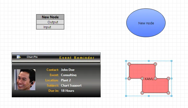
The Flow Graph control allows using and mixing various types of nodes, that include table nodes, picture nodes, geometry nodes and custom XAML nodes.
Flow Graph Connection Types
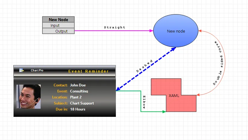
The Flow Graph allows connecting shapes using various connection types in order to depict the logical relationships and their direction between the connected nodes.
Flow Graph Page Transition
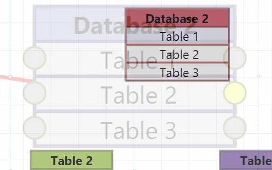
Transiting between pages in Flow Graph is accomplished by combining scaling and fading of one page through another.
Flow Graph Embedded controls
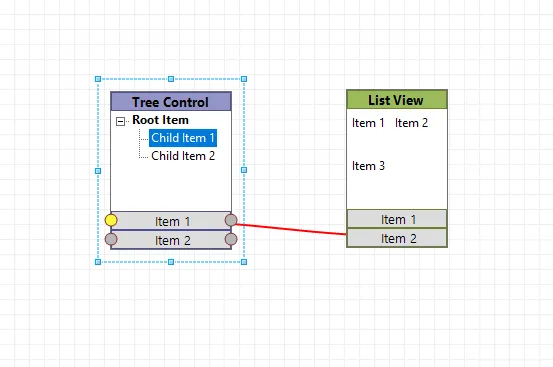
FlowGraph control allows embedding any control, or any window, into a node, thus making the nodes.
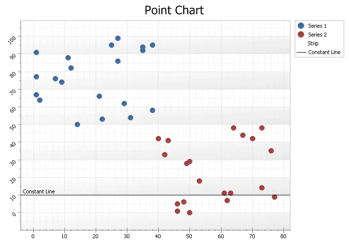
Standard Point Chart
A point chart displays data in a grid using Cartesian coordinates. Data is displayed along the x and y axis, where x and y can represent any type of data. A point chart is also referred to as a plot or scatter chart.
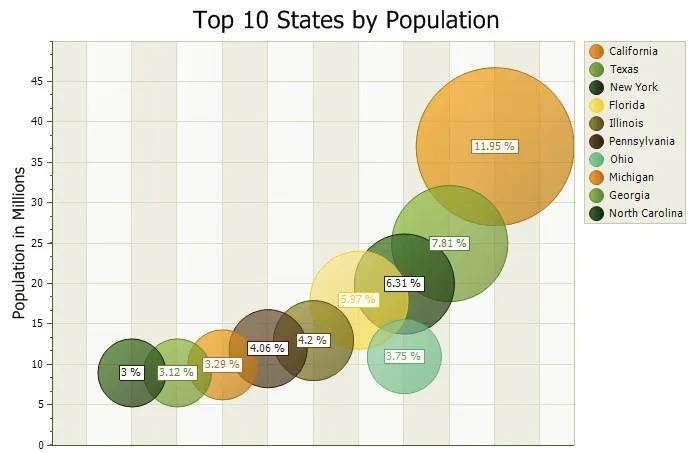
Bubble Chart
A bubble chart is just a variation of a point chart, only it displays bubbles of the data points. Data in displayed in a grid using Cartesian coordinates. Data is displayed along the x and y axis, where x and y can represent any type of data (as in the chart below, x - decades, y - population).
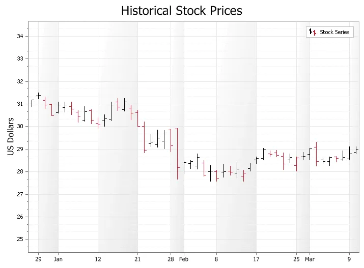
High Low Financial Chart
A High Low Financial Chart used to display trends for financial data, generally stock market prices. A Stock\Bar chart is similar to a Candlestick chart, but is considered harder to read for stock market analyse.
CandleStick Chart
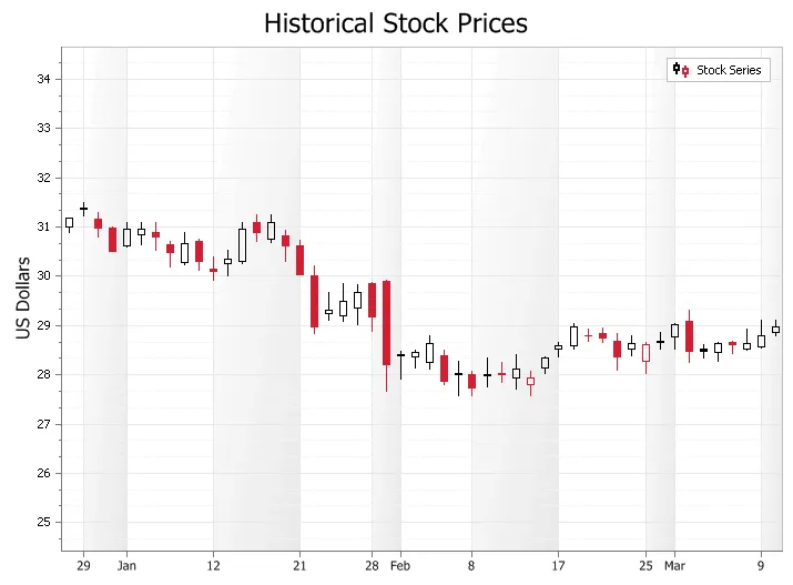
A Candlestick Chart is used to display trends for financial data, generally stock market prices. Candlestick charts are much easier to rear than a traditional bar chart to a stock market trader. The candle sticks make it fast and easy to compare the high and low, open and close of data. Each "candle stick" represents the high, low, open and close of data for a given value. The relationship between these candles is important in determining trends among stock prices.
Trend Lines
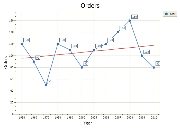
A Trend Line shows the the general direction that a set of data seem to be heading over a period of time.
Error Bars
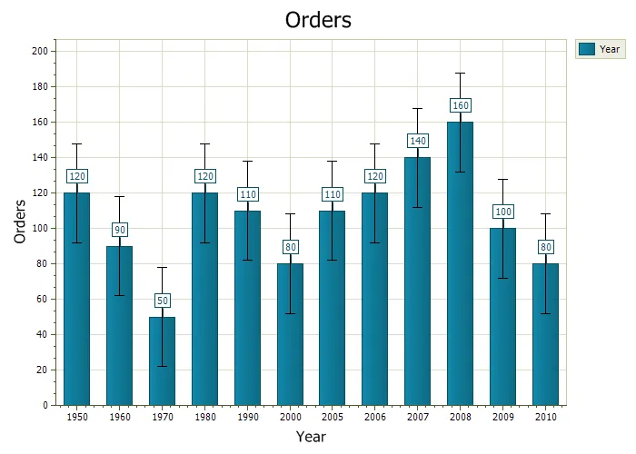
Error Bars use "bars" to display the uncertainty in a reported value, the bars show the variability of the data. These bars give you a general idea how accurate (or inaccurate) the data is.
Standard Area Chart
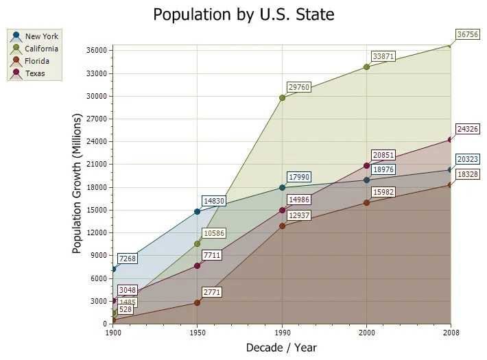
An area chart is very similar to a line chart. Data is displayed using different colors in the "area" below the line. Each series of points is represented with a different color. Area charts are commonly used to display accumulated values over a period of time.
Spline Area Chart
A Spline Area chart is very similar to a spline chart. Data is displayed using different colors in the "area" below the line. Each series of points is represented with a different color. Area charts are commonly used to display accumulated values over a period of time.
Stacked Area Chart
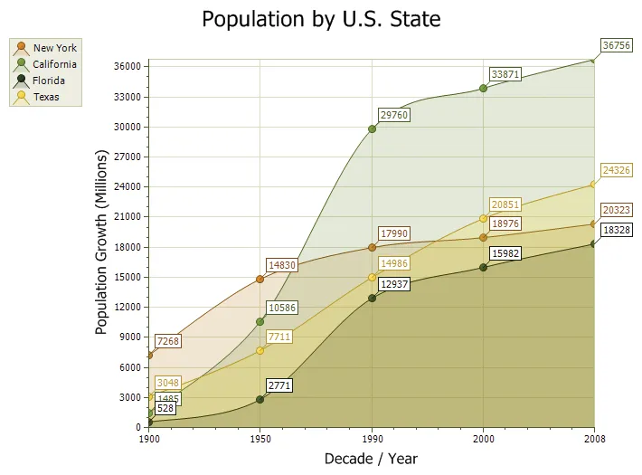
A Stacked Area chart is very similar to an area chart. Data is displayed using different colors in the "area" below the line. Each series of points is represented with a different color. Area charts are commonly used to display accumulated values over a period of time.
100% Stacked Area Chart
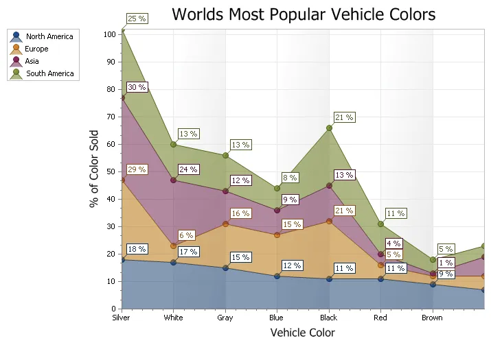
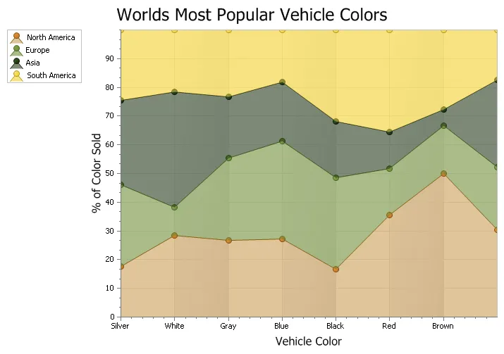
A 100% Stacked Area chart is very similar to an area chart, only the data is stacked on top of each other and the data values for each item will total 100%. Data is displayed using different colors in the "area" below the line. Each series of points is represented with a different color. Area charts are commonly used to display accumulated values over a period of time.
Stacked Spline Area Chart
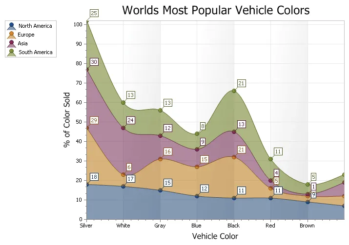
A Stacked Spline Area chart is very similar to a spline chart. Data is displayed using different colors in the "area" below the line. Each series of points is represented with a different color. The lines in the spline chart are much more smooth flowing than an area chart. Area charts are commonly used to display accumulated values over a period of time.
Range Area Chart
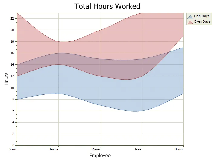
The Range Area chart is similar to the other Area charts except you must provide a minimum and maximum value (two y values). This can also be thought of as the start and end of a given point. This chart is useful where a range of values needs to be shown for a given point, for example, showing range of temperature for the days of a month.
Step Area Chart
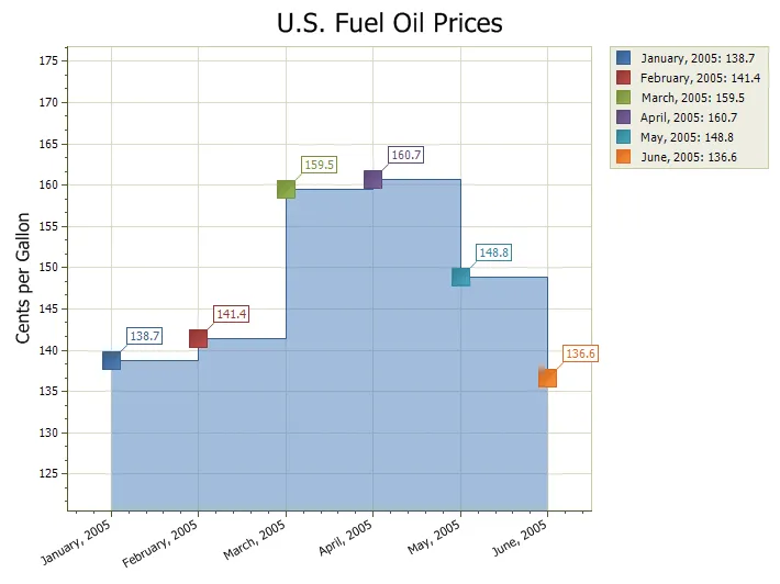
The Step Area chart is another form of an area chart. Unlike the traditional area chart, Step Area charts use vertical and horizontal lines to connect the data points forming what looks like steps.
Gantt Chart
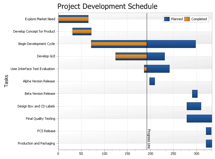
A Gantt chart is a type of range bar chart commonly used for task\schedule planning. Typically a Gantt chart is used for displaying the progression of a project and will display the length each individual task will take versus the progression of time.
Secondary Axis Chart
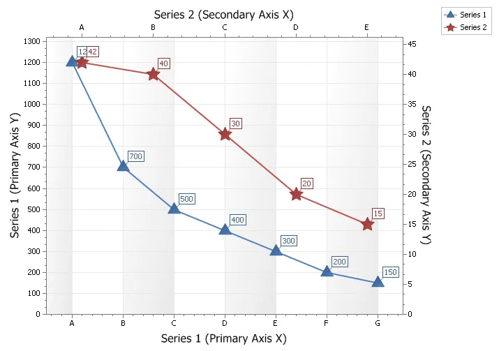
Secondary axis are useful when you need to display a series of data with values that greatly differ from each other or you might use a secondary axis when displaying two series of data with different data types (i.e. price and quantity). In both of these cases you can plot each of the series on a secondary axis so that they can both be seen in the same view. Displaying both the secondary x and y axis can be useful if making a scatter chart.
Zooming and Scrolling
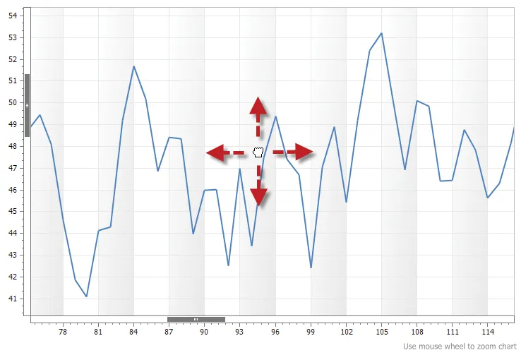
The chart control allows you to zoom and scroll charts. This makes it easy to see data points in a chart that has thousands of points. To zoom, simply make sure the chart has focus and then use the mouse wheel.
Multiple Diagram Support
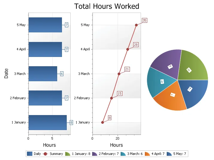
Multiple Diagram Charts are charts that have multiple regions which compare similar data sets side by side (in separate panels) rather than right on top of each other. The chart by default has one diagram that you don't have to add. This is the diagram that is worked with when adding a series. The chart can however contain multiple diagrams in the same view.
Combination Chart
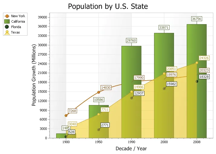
A combination chart uses two or more chart types to emphasis that the chart contains different types of data.
Line Styles
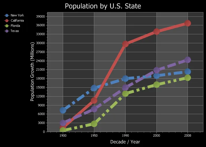
Any element that draws a line can use the supplied line styles to draw a dashed style line and set it's thickness.
Markup Title Support
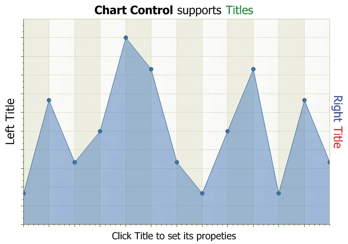
The chart can contain multiple sets of titles that can be docked to the top, bottom, left or right of the chart. You can also stack multiple titles to the same docking location. In addition to normal text, titles can contain xml Markup snippets to format the title's text.
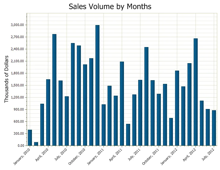
Date Time Scale
Chart in which date values will be displayed as their text representation along the axis.
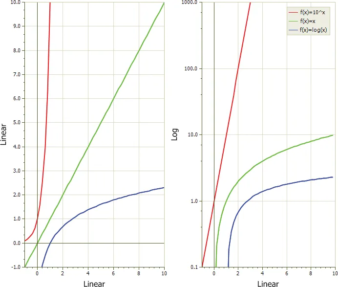
Logarithmic Scale Chart
A logarithmic scale allows data across a very large range to be displayed in an easy to read chart.
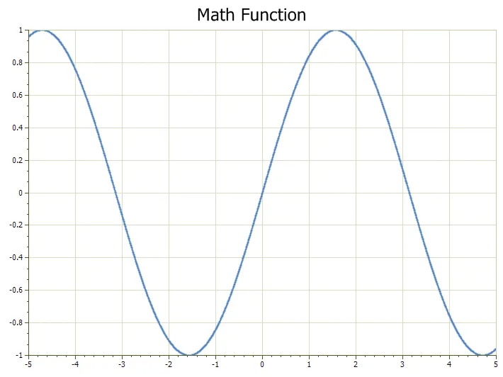
Virtual Points
To dramatically increase performance, the chart supports virtual points which should be used when there will be a very large number of points in a series and speed is important.
3D Chart Customization
All 3D charts can be rotated and zoomed in and out, both manually and programmatically, and a number of additional lighting, transparency and material settings are available for making truly realistic charts.
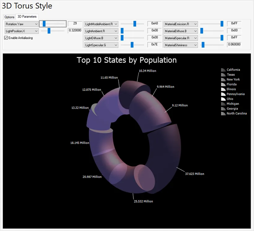
Chart Printing
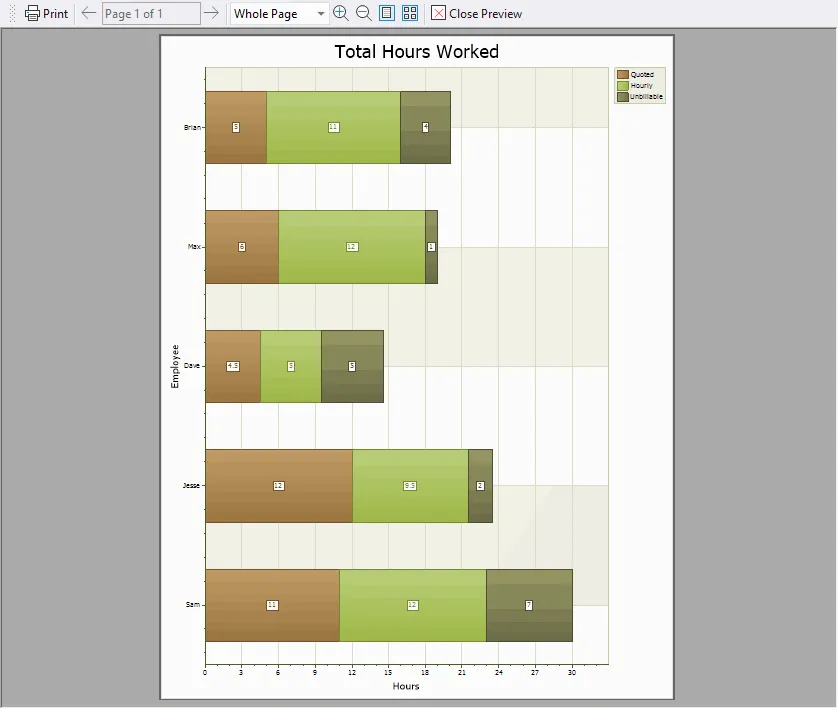
All charts, including FlowGraph charts, can be easily printed using your preferred printing method.
Saving Chart as Image
All charts, including FlowGraph charts, can be saved as an image.
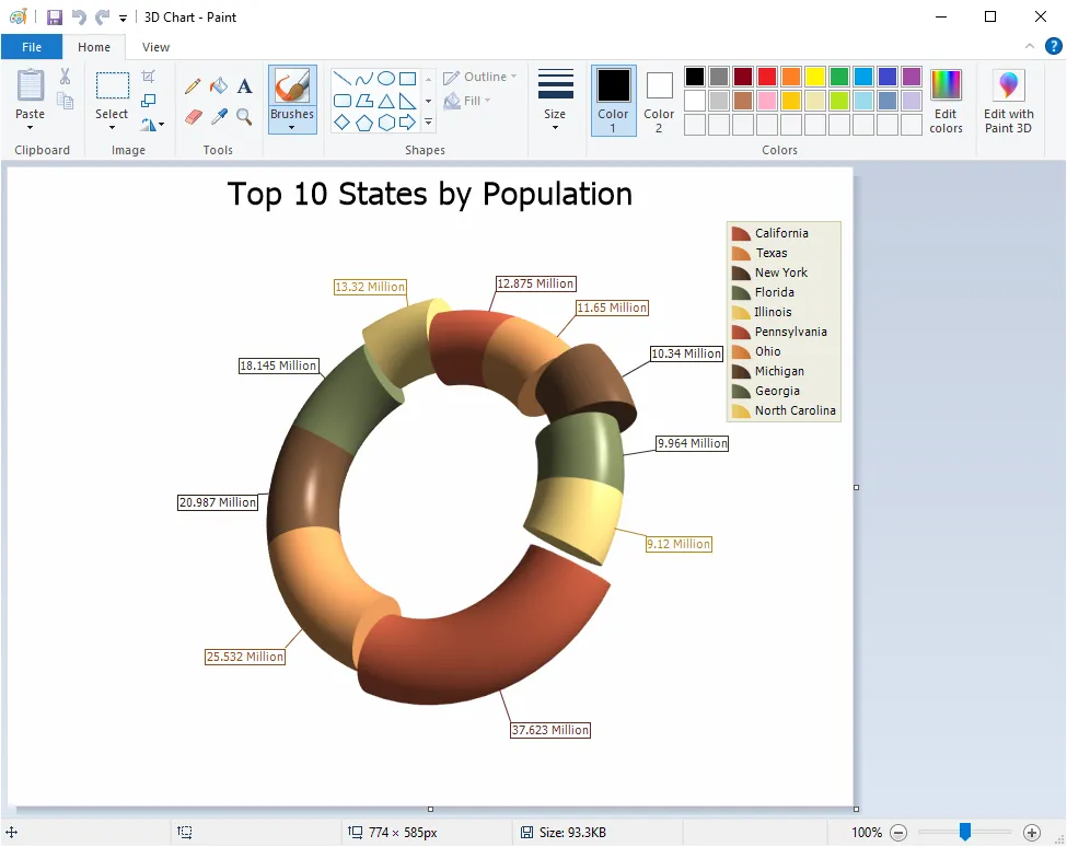
Chart XML Import and Export
All charts, including FlowGraph charts, can be serialized and deserialized in XML format, making it possible to capture and share chart states.

Chart Builder Tool
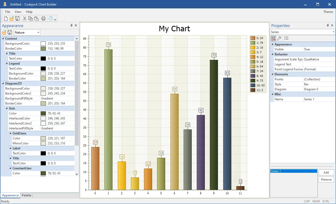
Using the supplied "Chart Builder" tool you can build your charts using a WYSIWYG editor to customize the colors, etc. and export them to an xml file that can then be loaded into the chart control.
