Features Tour
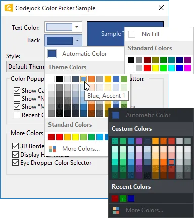
Color Picker Control
The Color Picker Button can be placed anywhere a normal button control can be placed and has several features including options for standard and extended color selection, automatic or fill color button, hex display, and an extended color selection dialog.
The Color Picker Button is shown with a default theme and the Visual Studio Dark theme. The standard colors and more colors sections can be disabled or enabled, as well as the no fill section.
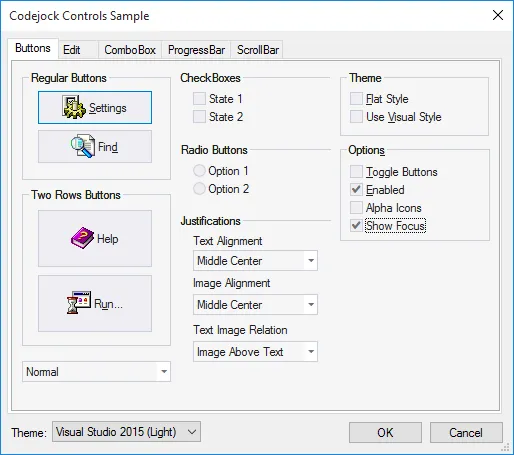
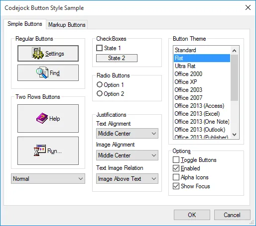
Button Styles
The themed button styles are great for displaying graphics and have several display options available. You can choose from flat, semi-flat or 3D style buttons, turn on or off focus display, center images and text or highlight the button when the item is selected.
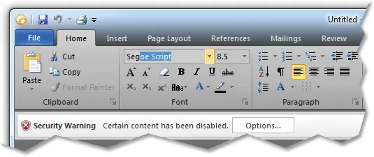
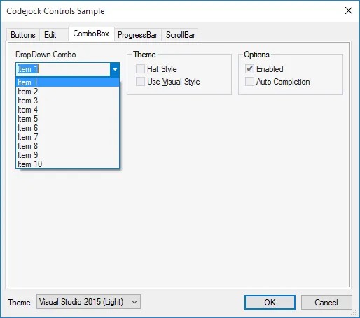
Auto Complete
Using Auto Complete will cause the combo box to suggest an item as you type from the combo box's list of items. The suggestion will get more accurate as more characters are typed. This allows users to easily find items within the combo box without having to scroll through the list of items.
In the picture below, “Seg” was typed
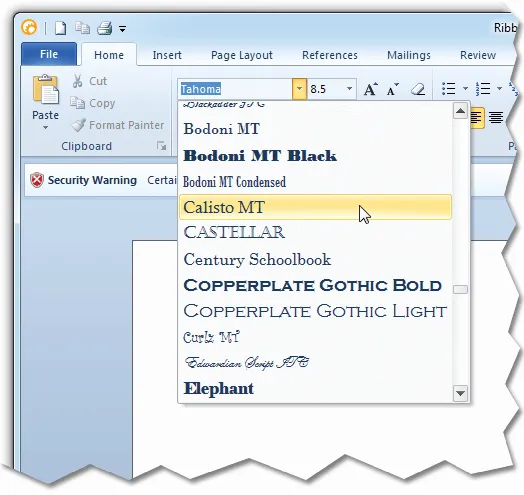
Font Selection Combo Box
The Font Selection Combo displays a drop list of fonts and visually displays their appearance to the user. The control works the way a normal combo box would work and easily allows you to define the font at startup and retrieve user selections.
* This control is available for MFC only as a dedicated control, COM must use CommandBar galleries.
Combo Box Control Themes
Several of the most popular themes can be applied to the combo box control included with Codejock Controls.
In the picture below, the "Office 2010 Silver" theme is used:
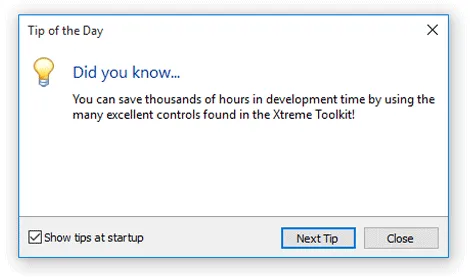
Tip of the Day Dialog
The Visual Studio style Tip of the Day Dialog is a quick and easy way for you to include a tip of the day in your application. The control reads a simple tips.txt file that you create and display messages to your end users and stores its settings in your systems registry or .ini file.
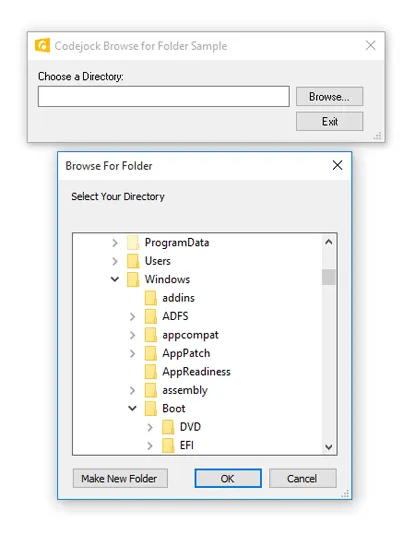
Browse for Folder Dialog
The Browse for Folder Dialog conveniently wraps the ‘BrowseForFolder’ API which allows you to display the browse dialog with a single line of code. You can quickly and easily display the startup directory and retrieve the user selection.
Resizable Layout Manager
The Resizable Layout Manager classes found in Controls allow you to easily create flicker free resizing Dialogs, Form Views, and Property Sheets. You can quickly assign how to move and resize each control located on your dialog template with a single line of code.
Keyboard Shortcut Manager Resizing Property Sheet
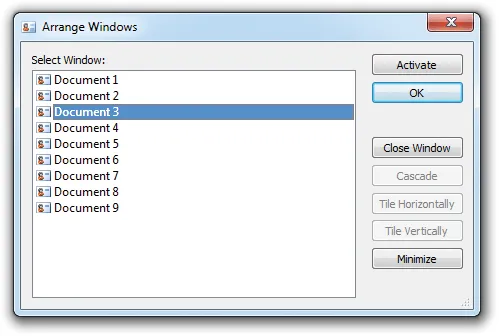
MDI Windows Manager
The MDI Windows Manager provides an easy way for you to manage your applications open documents. The manager allows you to select all or some of your open documents to easily manage them at runtime.
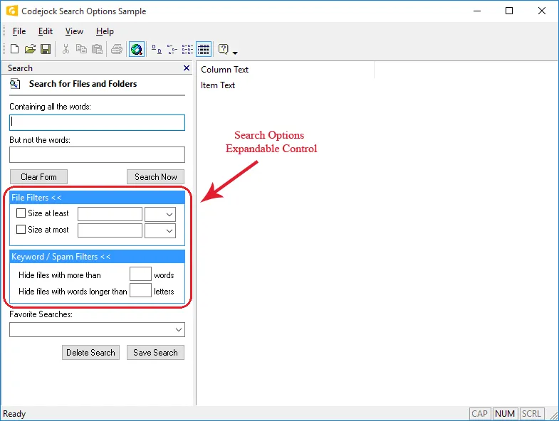
Search Options Control
The Search Options class is similar to the Search Options item found in the search pane of Windows Explorer as it is seen in MS Windows. This class allows you to associate a group of controls to be hidden or displayed when the Search Options item is expanded and contracted. You can use this to group and organize controls so that they are easy to find and at the same time can be hidden if no longer needed.
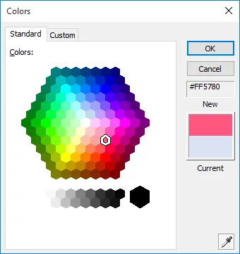
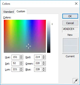
Color Selection Dialog
The Office Style Color Selection Dialog has several features including options for standard and extended color selection, automatic or fill color buttons, hex display, and an extended color selection dialog.
Standard Color Page
Custom Color Page
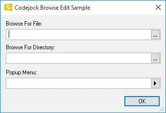
Browse Edit Control
The Browse Edit Control allows you to display a standard edit control with a browse button associated with it. Easily browse for files or folders by simply changing the object type. You can even associate a popup menu with the browse button. This dedicated browse edit is only available in MFC, however the same can be accomplished in COM using an edit control as a "buddy control" to a button.
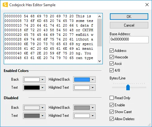
Hex Edit Control
The Hex Edit Control allows you to display and edit hex data visually. You can easily retrieve data selection and define display styles. Works great with the Controls masked edit control to display hex data.
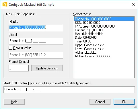
Mask Edit Control
The Masked Edit Control allows you to define a display and edit mask for the control. Easily create your own mask style for date, telephone, or any edit display. You can restrict the use of certain characters and define a default string that is displayed.
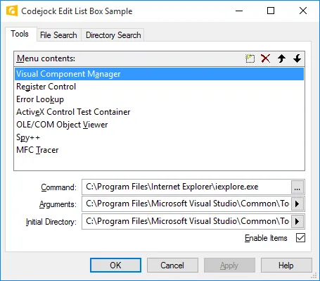
Edit List Box Control
The Edit List Box Control provides a Visual Studio style edit list box that allows you to display a list of editable items. When an item in the list is double-clicked an edit box appears allowing the text to be edited, you also have the option of displaying a "..." button on the end of the edit box. The edit list comes with a built-in control panel that allows items to be navigated, added, and deleted.
Edit Control Themes
Several of the most popular themes can be applied to the edit control included with Codejock Controls.
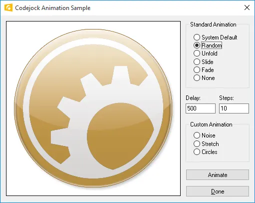
Flicker Free Drawing and Animation
Controls provides flicker free drawing and animation by extending the CDC which helps eliminate screen flicker when windows are resized, by painting to an off screen bitmap. Several handy methods are included for animating any CWind or owner drawn objects. Some of the animation types include Unfold, Slide, Fade, Noise, Stretch, and Circles.
* These methods are available for MFC only.
DPI Support
All controls are built with DPI support in mind so they are easy to scale and thus can be used with any monitor and resolution. The best result comes from combining them with Vector Icons and built-in XAML support.
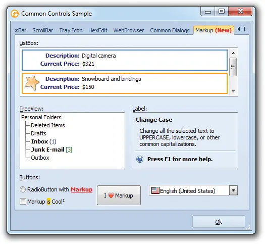
XAML Markup Support
Most controls allows you to use XAML to format the contents of the control. Codejock ships an XAML editor utility to help you make XAML snippets to place in the controls.
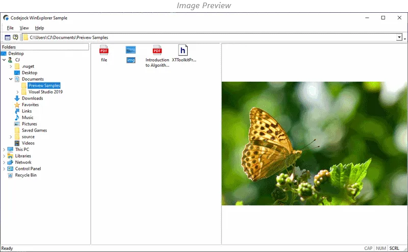
Preview Control
The Preview Control allows previewing the contents of the most common and known to the system files. Some previews are static, but others can be interactive. If a specified file type is unknown to the control, it will try to use the available in the operating system preview handlers.
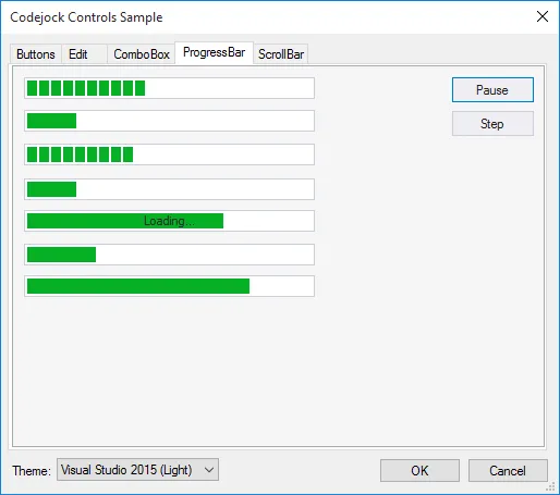
Themed Progress Bars
The ProgressBar control shows the progress of a lengthy operation by filling a rectangle with chunks from left to right. Many of the most popular themes such as Office are supported.
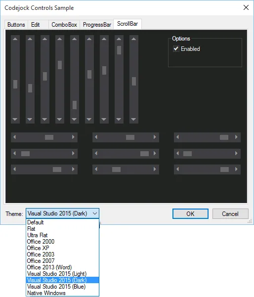
Themed Scroll Bars
Scroll bars provide easy navigation through a long list of items or a large amount of information. Many of the most popular themes such as Office are supported.
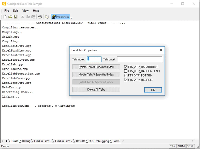
Excel Style Tab View
The Excel style Flat Tab Control is an excellent way to display several windows using a tab style interface. There are several features available including home, end, back, and forward buttons. Easily add list style or any control for display of output or data.
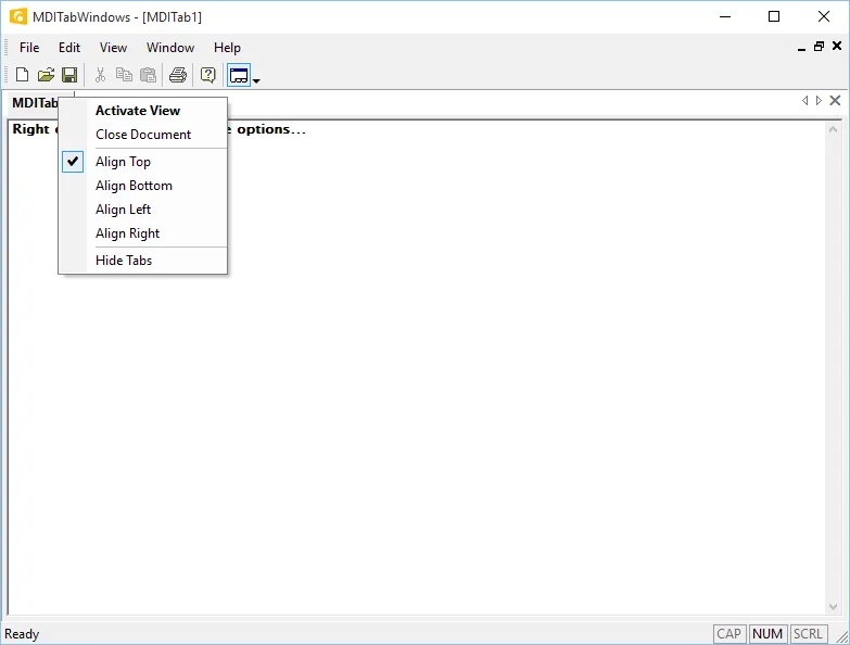
MDI Tabbed Interface
The MDI Tabbed Interface control allows you to display a tabbed MDI interface with your application. This control allows you to set the tab direction and can be included in your application with a single line of code. You can easily turn on and off this feature programmatically.
MDI Tab View Control
The MDI Tab View Control allows you to define a multiple view document. You can easily add and remove views or controls to the tab of this CView derived class. Great for displaying several different views simultaneously.
Enhanced Tab Control
The Enhanced Tab Control provides advanced features such as auto condensing tabs, tab icons and Visual Studio .NET style themes. You can easily change the tab control's style during runtime to provide greater control and ease of use.
Tab Control Themes
The Tab Control provides several of the most popular themes which include Visual Studio .NET, Office, Windows, and many more! The themes are already built in, so you don't have to spend any extra time on this.
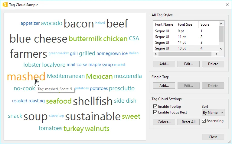
Tag Cloud
The Tag Cloud class allows you to create a tag cloud filled with relevant keywords or tags. Items can be scored for importance, which can be used to affect their font weight or color. Tags can be sorted by score or name, ascending or descending. Custom background colors are available, and so are text colors, font and size for each available score. Tag Cloud supports tooltips.
An example of the tag cloud as seen in the tag cloud sample.
Task Dialog Control
The TaskDialog Control creates, displays, and operates a task dialog. A task dialog is similar to, while much more flexible than, a basic message box. The task dialog contains application-defined messages, title, verification check box, command links and push buttons, plus any combination of predefined icons and push buttons.
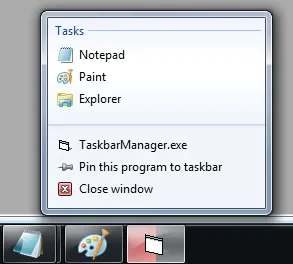
Taskbar Manager Control
The Taskbar Manager control allows you to add an overlay icon, progress bar, and jump list to the task bar button for your application while using Windows Vista or Windows 7.
Overlay Icons
Progress Indicator
Jump List
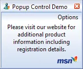
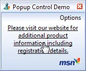
Popup Control Theme Support
Control's popup control provides several built in themes that are ready to use. You can choose from one of the predefined themes or create your own.
Custom Codejock Theme
MSN Theme
Custom Image Support

Office Theme
Custom Tooltip Theme
Popup Control Animation
Control's popup control allows you to configure how your popup window will be displayed using animation effects. You can easily choose from one of several predefined effects that include Unfold, Slide, Fade, and None.
Fade Animation
Unfold Animation

Slide Animation
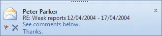
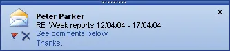
Popup Control Transparency and Hyperlinks
Control's popup control allows you to configure the transparency level of your popup window. You can easily add a hyperlink to your popup window. When you move the mouse cursor over text that is a hyperlink, the text will become underlined indicating that you will be redirected to another window or website when clicked on. And the window will become opaque again when the mouse is over the window.
Window Transparency
No Transparency
50% Transparency
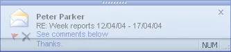
Hyperlink Support
Popup Control Animation and Delay
Controls popup control allows you to easily configure the amount of time the popup window is displayed and the amount of time it takes to complete the animation when opening and closing your popup windows. You can configure the window to open and close as long or as short as you like.
Animation Delay
Short Delay
Long Delay

Animation Speed
Normal Speed

Fast Speed
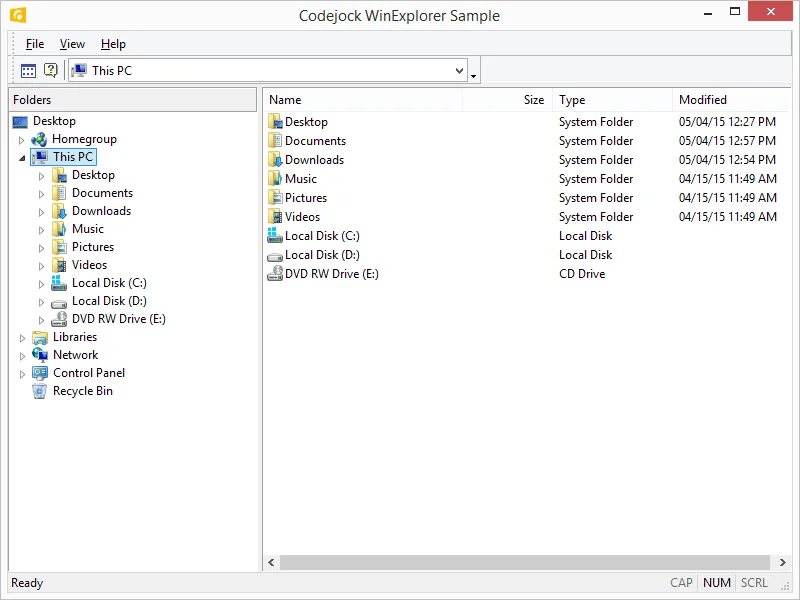
Explorer List and Tree Controls
The Windows Shell List and Tree allow you to create Windows Explorer list and tree control that you can easily add to your application's workspace. Easily browse and manage your file system using the explorer list and tree controls.
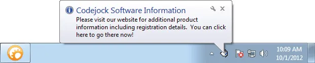
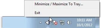
System Tray Icon Control
The System Tray Icon Control allows you to quickly and easily add your application's icon to the system tray. You can easily define popup menus, balloon tips and even animation to your displayed icons. Easily minimize to and maximize from the system tray and much more!
Shell Icon Popup Window
Shell Icon Popup Menu
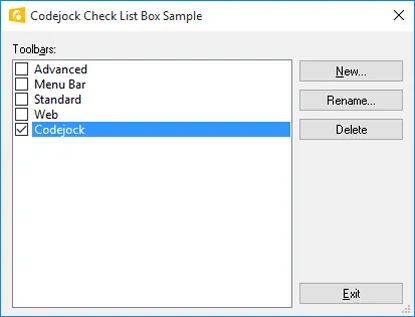
Check List Box
The Check List Box mimics the look and feel of the Office check list box control. The Check List Box allows you to display items that can be selected or un-selected by the user placing a check next to the item. You can enable / disable items or even set the check box image list for the control.
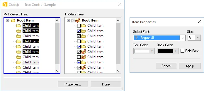
Enhanced Multi-selection Tree
The Multi-selection Extended Tree control allows you to select multiple tree items, sort and search tree items, define font style, font color and weight. Easily traverse the tree control and set the selection mode for multiple tree item selection.
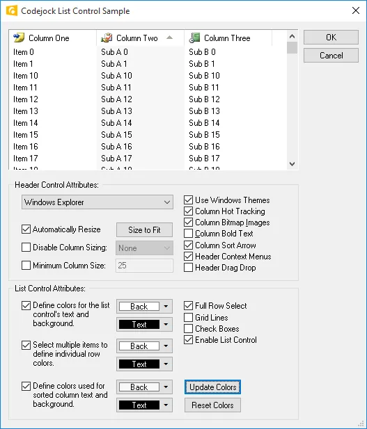
List Control
The List Control is great for creating an Outlook style list control. You can define a Windows Classic, Windows Explorer, Office, etc style header, sort arrows, bold or normal text, size columns to fit the display area, define a minimum size for a column, disable sizing or any combination of extended features.
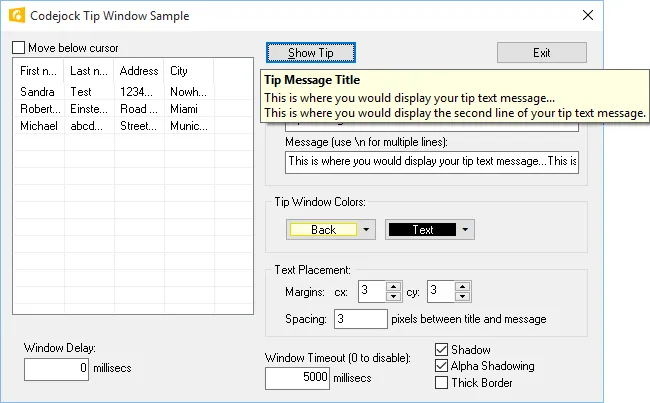
Tooltip Window
The Tooltip Window control allows you to display popup messages to the end user. You can easily define the message, tip window and border color, text location within the window, line spacing, shadow offsets, and timeout values.
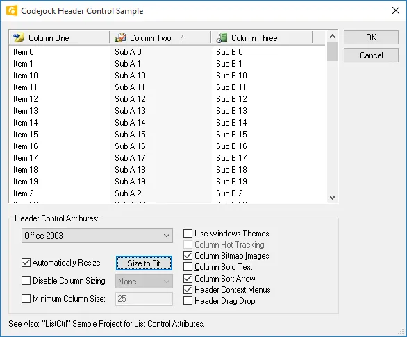
Header Control
The Header Control is great for creating an Outlook style header for your list control. You can define a Windows Classic, Windows Explorer, Office style header control, sort arrows, bold or normal text, size columns to fit the display area, define a minimum size for a column, disable sizing, drag and drop columns or any combination of extended features.
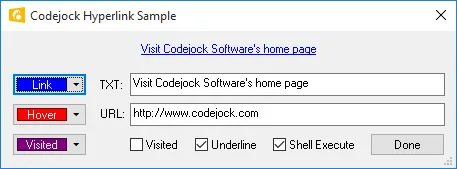
Hyperlink Control
The Hyperlink Control allows you to define static text strings as hyperlinks. These links act the same way a hyperlink would act on a html page. You can set the colors for the "normal" link text, "hover" link text and "visited" link text, or turn on and off the underline option.
* This dedicated hyperlink control is only available for MFC, however the same can be accomplished in COM using XAML Markup in a label control.
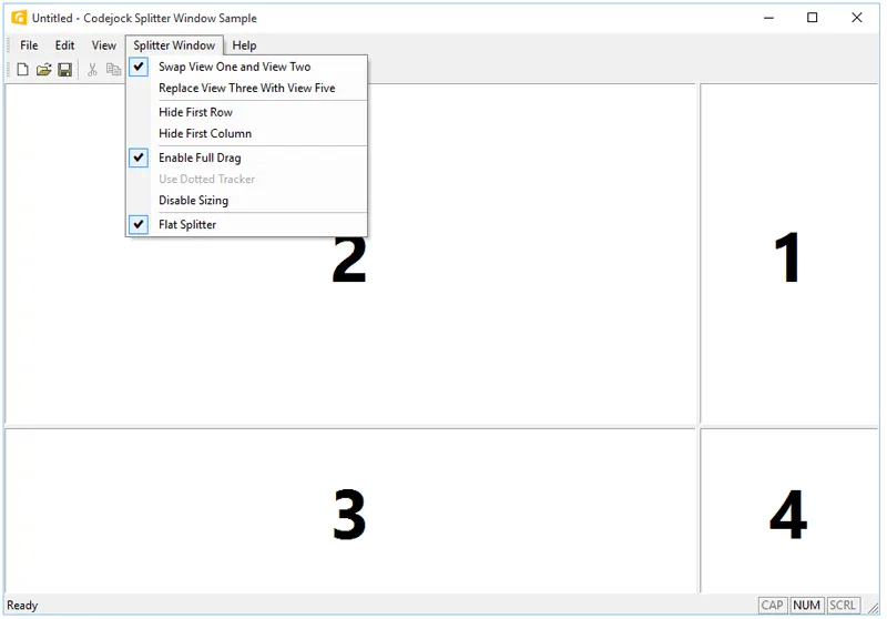
Enhanced Splitter Window
The Splitter Window class is an excellent enhancement for your application. With several features and display options you will quickly see why. Set the display to flat or 3D style borders, enable dotted, hatched or solid tracking lines, easily swap and replace views, remove rows and columns, and disable sizing all together.
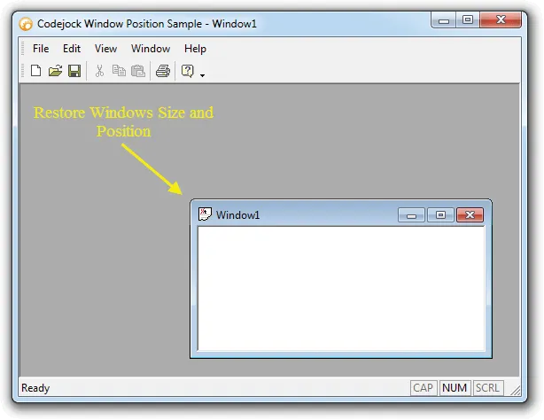
Window Position
The Window Position control will remember and restore the size and position of the last window open in the MDI view. Not only is the child window's position saved, but the main application's size and position is saved and restored too. This eliminates users having to manually resize and move windows.
Registry Manager
The Registry Manager class allows you to conveniently store and retrieve many different types of data to and from the system registry or an INI file which provides easy access for your applications. You can use the Registry manager to read and write strings, integers, and binary values to the system registry or an INI file. The Registry Manager provides many methods for saving values such as LPCTSTR, CPoint, CRect, Double, Dword, and COLORREF.
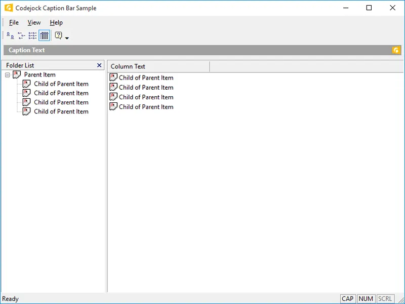
Caption Bar Control
Caption Bars can be used to display caption or as an info bar. You can easily use Caption Bars with the Outlook Bar to create a unique way of displaying information to the end user. You can also add buttons and images to the caption bar.