Controls Examples
The following sample applications demonstrate the powerful features that are available with Codejock Controls components.
Each sample is provided as a stand alone executable that can be easily downloaded. All samples are included with our products and are provided with complete source code.
Animation
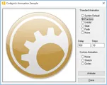
The Animation sample demonstrates how to apply the various animation styles to an object. These animation classes can be applied to any object with a valid device context in your application. Some of the animation types include Unfold, Slide, Fade, Noise, Stretch, and Circles. You can set the number of steps of the animation and the amount of time it takes to run the entire animation.
Sample Uses:Controls
Animation.zip
Size: 2.21 Mb
Browse Dialog
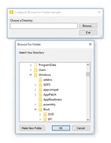
The Browse Dialog sample demonstrates how to add a browse for folder dialog to your application. The browse dialog wraps the ‘BrowseForFolder’ API which allows you to display the browse dialog with a single line of code. The startup directory can be specified and you can retrieve the user selection.
Sample Uses:Controls
BrowseDialog.zip
Size: 2.14 Mb
Browse Edit
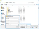
The Browse Edit sample demonstrates how to implement three different types of browse buttons for an edit control. The Browse Edit Control allows you to display a standard edit control with a browse button associated with it. Easily browse for files or folders by simply changing the object type, you can even associate a popup menu with the browse button.
Sample Uses:Controls, Command Bars
BrowseEdit.zip
Size: 2.16 Mb
Button
The Button sample demonstrates how to add themed buttons to your application. You can choose from flat, semi-flat or 3D style buttons, turn on or off focus display, center images and text or highlight the button when the item is selected.
Sample Uses:Controls
Button.zip
Size: 9.32 Mb
Caption Bar
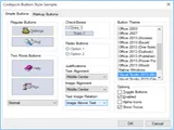
The Caption Bar sample demonstrates how to implement an Outlook style caption bar drop-down popup window for the Caption Bar control. Caption Bar controls are added to the drop-down window to organize groups of items displayed in the window.
Sample Uses:Controls, Command Bars
CaptionBar.zip
Size: 2.34 Mb
Check List Box
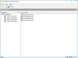
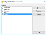
The Check Listbox sample demonstrates how to implement a Listbox that contains a check box for each item. This is the Listbox that is used in the Command Bars customization dialog for adding, renaming, and deleting toolbars.
Sample Uses:Controls
CheckListBox.zip
Size: 2.15 Mb
Color Picker
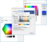
The Color Picker sample demonstrates how to implement a color picker button anywhere a normal button control can be placed. The color picker button has several features including options for standard and extended color selection, automatic or fill color button, hex display and an extended color selection dialog that can be used as a drop in replacement for the MFC CColorDialog wrapper class.
Sample Uses:Controls
ColorPicker.zip
Size: 7.69 Mb
Controls
The Controls sample demonstrates how to use many of the Codejock enhanced common controls such as buttons, edit controls, scrollbars, radio buttons, buddy controls, combo box's and much more.
Sample Uses:Controls
Controls.zip
Size: 9.97 Mb
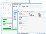
Customize Tree
The Customize Tree sample demonstrates how to create a customized dialog using the Tree Control.
Sample Uses:Controls
CustomizeTree.zip
Size: 2.15 Mb
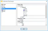
Edit List Box
The Edit Listbox sample demonstrates how to add a Visual Studio style edit listbox to your application. The edit list box allows you to display a list of editable items. When an item in the list is double-clicked an edit box appears allowing the text to be edited, you also have the option of displaying a "..." button on the end of the edit box. The edit list comes with a built-in control panel that allows items to be navigated, added, and deleted.
Sample Uses:Controls, Command Bars
EditListBox.zip
Size: 2.17 Mb
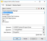
Excel Tab Dialog
The Excel Tab sample demonstrates how to add an Excel style tab control to your application. You can add, modify, insert, and delete tabs. You can hide\show the navigation arrows and home\end arrows.
Sample Uses:Controls
ExcelTabDlg.zip
Size: 9.56 Mb
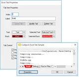
Excel Tab View
The Excel Tab View sample demonstrates how to add an Excel style tab control to a dialog. You can add, modify, insert, and delete tabs. The color of the text, backcolor, selected text, and selected backcolor can all be changed. You can hide\show the navigation arrows and home\end arrows. Tabs can be displayed horizontally, vertically, or at the bottom of the tab control.
Sample Uses:Controls, Command Bars
ExcelTabView.zip
Size: 9.68 Mb
Flat Combo Box
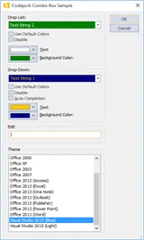
The Flat Combobox sample demonstrates how to add a flat combo control to your application. You can change the color of the text and background, enable\disable, and change the style. Styles include, drop list, drop down, and flat edit. The flat combo can use Auto complete. Using Auto Complete will cause the combo box to suggest an item as you type from the combo box's list of items. The suggestion will get more accurate as more characters are typed. You will also see how to apply some of the most popular themes like Office 2003.
Sample Uses:Controls
FlatCombo.zip
Size: 6.42 Mb
Flat Header
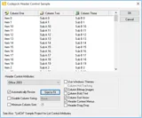
The Flat Header sample demonstrates how to add an Outlook style header for your list control. You can define a Windows Classic, Windows Explorer, Office 2003 or Office XP style header control, display sort arrows, bold or normal text, size columns to fit the display area, define a minimum size for a column, disable sizing, drag and drop columns, or any combination of extended features.
Sample Uses:Controls, Command Bars
FlatHeader.zip
Size: 2.17 Mb
Font Combo Box
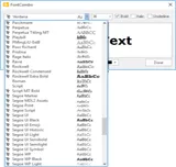
The Font Combobox sample demonstrates how to add a font selection combo box. The font selection combo box displays a drop list of fonts currently on the system and visually displays their appearance to the user. The control works the way a normal combo box would work and easily allows you to define the font at startup and retrieve user selections. The sample allows you to change the color, size, and type of the sample text.
Sample Uses:Controls
FontCombo.zip
Size: 7.72 Mb
Hex Edit
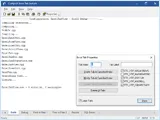
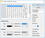
The Hex Edit sample demonstrates how to add a hex edit control to your application. The hex edit control allows you to display and edit hex data visually. You can retrieve the data selection and define display styles. The control can display the address, hexcode, Ascii, and 4/8 data representations. You can specify how many bytes are on a line, allow deletes, make it read only, and change the color.
Sample Uses:Controls, Command Bars
HexEdit.zip
Size: 2.2 Mb
Hyper Link
The Hyperlink sample demonstrates how to use the hyperlink control. The hyperlink control allows you to define static text strings as hyperlinks. These links act the same way a hyperlink would act on a html page. You can set the colors for the "normal" link text, "hover" link text, "visited" link text, or turn on and off the underline option.
Sample Uses:Controls
HyperLink.zip
Size: 2.18 Mb

List Control
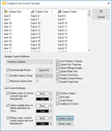
The List Control sample demonstrates how to add an Outlook style list control to your application. You can define a Windows Classic, Windows Explorer, Office 2003 or Office XP style header control, sort arrows, bold or normal text, size columns to fit the display area, define a minimum size for a column, disable sizing or any combination of extended features. You can specify whether the entire row is selected when clicked, hide\show grid lines, display check boxes, and change the colors of grid lines, sorted columns, and normal columns.
Sample Uses:Controls, Command Bars
ListCtrl.zip
Size: 2.2 Mb
Marquee Progress
The Marquee Progress Bar sample demonstrates how to create a custom marquee progress bar that allows you to control the transparency, gap, width, and interval of each chunk in the progress bar.
Sample Uses:Controls
MarqueeProgress.zip
Size: 2.14 Mb

Mask Edit
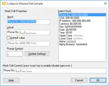
The Mask Edit sample demonstrates how to add an edit mask for an edit control. You can create your own mask style for date, telephone, or any edit display. You can restrict the use of certain characters and define a default string that is displayed.
Sample Uses:Controls
MaskEdit.zip
Size: 2.17 Mb
MDI Tab Windows
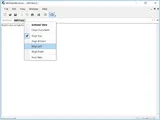
The MDI Tab Windows sample demonstrates how to display a tabbed MDI interface with your application. The MDI tab control allows you to set the tab direction and can be included in your application with a single line of code. You can turn the tabs on and off programmatically.
Sample Uses:Controls, Command Bars
MDITabWindows.zip
Size: 2.31 Mb
Popup Control
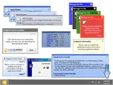
The Popup Control sample demonstrates how to create a popup window similar to Outlook and MSN Messenger. The popup control provides several built in themes that are ready to use. You can choose from one of the predefined themes or create your own. The animation, animation delay, show delay, and transparency or the popup window can all be customized.
Sample Uses:Controls
PopupControl.zip
Size: 3.15 Mb
Property Sheet
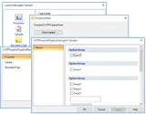
The Property Sheet sample demonstrates how to use Property Sheets with many different controls such as a navigator list, navigator tree, and custom navigator.
Sample Uses:Controls
PropertySheet.zip
Size: 3.23 Mb
Scroll Bar
The ScrollBar sample demonstrates the various ways you can manipulate your projects scrollbars. The scrollbars can be changed based on the selected themes and the sample also shows the different options available to the application's horizontal and vertical scrollbar.
Sample Uses:Controls
ScrollBar.zip
Size: 3.19 Mb

Search Options
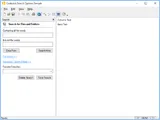
The Search Options sample demonstrates how to add search options similar to the Search Options item found in the search pane of Windows Explorer as it is seen in Windows 2000 and later. This Search Options class allows you to associate a group of controls to be hidden or displayed when the Search Options item is expanded and contracted.
Sample Uses:Controls, Command Bars
SearchOptions.zip
Size: 2.32 Mb
Shortcut List
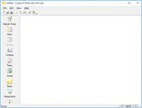
The Shortcut List sample demonstrates how shortcut icons can be added to a project for quick access.
Sample Uses:Controls
ShortcutList.zip
Size: 2.33 Mb
Splitter Window
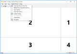
The Splitter Window sample demonstrates how to add a splitter window to your application. You can set the display to flat or 3D style borders, enable dotted, hatched or solid tracking lines, swap and replace views, remove rows and columns, and disable sizing all together.
Sample Uses:Controls, Command Bars
SplitterWindow.zip
Size: 2.3 Mb
Tabbed View
The Tabbed View sample demonstrates how to use the MDI Tab View Control to define a multiple view document. You can add and remove views or controls to the tab of this CView derived class. This allows you to display several different views simultaneously.
Sample Uses:Controls, Command Bars
TabbedView.zip
Size: 2.31 Mb
Tab Control
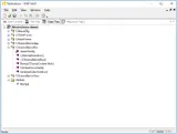
The Tab Control sample demonstrates how to use the enhanced tab control which provides advanced features such as auto condensing tabs, tab icons, and Visual Studio .NET style themes. You can also change the tab control's style, switch to multi-row tab view, hide or show navigation arrow, and hide or show the close button.
Sample Uses:Controls
TabCtrl.zip
Size: 2.19 Mb
Tag Cloud
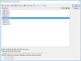
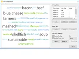
The Tag Cloud sample demonstrates how to use a tag cloud control which presents a list of user generated words that vary in size based on their importance score. The control allows for customized fonts, font sizes and colors, and you can change the background colors and tooltips.
Sample Uses:Controls
TagCloud.zip
Size: 2.21 Mb
Taskbar Manager
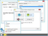
The Taskbar Manager sample demonstrates how the taskbar application button can be manipulated by allowing overlays of icons, showing various types of progress status bars, and allowing to add programs under the Task List.
Sample Uses:Controls
TaskbarManager.zip
Size: 2.19 Mb
Task Dialog
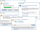
The Task Dialog Sample shows you how to implement a task dialog for your application. You can choose to use the Codejock built in task dialog or windows ComCtl32.dll, when on the Task Dialog will use Windows's API. With a task dialog all the information a user needs to make an informed decision can be presented to them in an easy to understand and concise format. The design of the task dialog looks better and is much simpler, which improves usability by stating the purpose, providing self-explanatory responses, enabling expandable content for added instructions and rich text support to better layout information.
Sample Uses:Controls, Skin Framework
TaskDialog.zip
Size: 2.34 Mb
Tip Of The Day
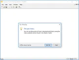
The Tip Of The Day sample demonstrates how to display a Visual Studio style ‘Tip of the Day' dialog in your application. The control reads a simple tips.txt file that you create and displays messages to your end users, the settings are stored in your system registry or an .ini file. The sample uses the system registry to store settings.
Sample Uses:Controls, Command Bars
TipOfTheDay.zip
Size: 2.3 Mb
Tip Window
The Tip Window sample demonstrates how to display popup messages to the end user. You can define the message, tip window, border color, text location within the window, line spacing, shadow offsets and timeout values. When the mouse is moved over an item in the list control a tip window with the current settings will be displayed.
Sample Uses:Controls
TipWindow.zip
Size: 2.19 Mb

Tray Icon Demo
The Tray Icon Demo sample demonstrates how to use the system tray icon control with your application so you can place an icon and tooltip in the system tray. You can define popup menus, balloon tips, and even animation to your displayed icons. The sample application can be minimized to and maximized from the system tray.
Sample Uses:Controls, Command Bars
TrayIconDemo.zip
Size: 2.3 Mb
Tray Icon Dialog
The Tray Icon Dialog sample demonstrates how to minimize an entire application to the system tray. You can define popup menus, balloon tips and even animation to your displayed icons. The sample application can be minimize to and maximize from the system tray.
Sample Uses:Controls
TrayIconDlg.zip
Size: 2.15 Mb
Tree Control
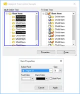
The Tree Control sample demonstrates how to use the multi-selection extended tree control to select multiple tree items, sort and search tree items, define font style, font color and weight. You can traverse the tree control and set the selection mode for multiple tree item selection.
Sample Uses:Controls
TreeCtrl.zip
Size: 2.21 Mb
Window Position
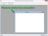
The Window Position sample demonstrates how to use the window position control. The window position control will remember and restore the size and position of the last window open in the MDI view. Not only is the child window's position saved, but the main application's size and position is saved and restored too. This eliminates users having to manually resize and move windows each time you application is opened.
Sample Uses:Controls, Command Bars
WindowPos.zip
Size: 2.29 Mb
Windows Explorer
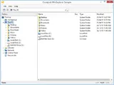
The Windows Explorer sample demonstrates how to create a Windows Explorer list and tree control and add it to your application's workspace. You can then browse and manage your file system using the explorer list and tree controls.
Sample Uses:Controls
WinExplorer.zip
Size: 2.37 Mb
